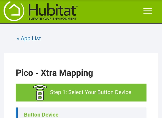
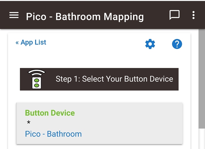
2 items from my wish list crossed off. UI login and z-wave info page last sent/last received column sorting. The UI visual is so much more visual appealing for sure. Great job on such a big change.
@cuboy29 I'm seeing the same.. I have 2 hubs, one at home, the other at work. The one at home appears to be fine (and has way more devices and apps). My work one though has like 5 devices and maybe 2 webcore pistons and crawls... Takes almost 15 minutes to load anything. Reboot seems to fix it for a few minutes, but it very obviously starts to big down and then crawl.
Nothing showing up in the logs or the dev console in the web browser either. The only thing I can think of is that at work I'm behind the corporate firewall and maybe it's timing out thinking something can talk directly to it from outside? Don't have any good explanations...
Of course, an hour after writing all that.. now its working fine... go figure. 
Yeah.. mine started working normally again.
And with the HotFix Hammer the excellent HE team have turned my OP into all likes....well except for the font size...but that's the least of the lot.
Muchas Gracias  :
:
Have you tried adding a custom RM command for these? I am traveling at the moment and haven’t been able to upgrade and verify with my motion switch. But have done this with my Ecobee to get those device specific commands available.
I like the "Last Modified" column in the Apps Code table, I hope it gets added to the Drivers Code table as well.
He's referring to device preference options, these are not exposed via commands.
So now that we can turn on logging for a rule. What about an "Events" button on the rule page to see them just like a device?
Next release.
The more you give, the more we want. 
Keep up the great work.
I love the new UI btw. This is great stuff!
Yeah..it's a significant improvement. Every thing feels a bit more polished. The new coca brown theme caused me to change around some of my ABC app ui to match.
Was going to look like this:
Will probably end up looking like this
Just discovered in the Settings the ability for User Administration. AWESOME!! Now my HE is "secure" at least for quick access.
I do like all of the new functionality that I've tried. Especially no round tripping of app inputs and user app URLs.
I do not like much of the UI changes.
- general comment: it looks a lot like an effort to make things look better on a phone or tablet. I don't think some of it works well on a computer with a mouse. Being able to work on a computer is one of the Hubitat selling points to me.
- as others have commented, the font is too large.
- On the device page, the DNI column is way oversized, longer than any of my devices. That squishes the last updated column, which then goes on to force extra lines in each row. I'm using Safari on MacOS Mojave.
- There is still no remembering of sort order between visits on the device page.
- The extra large cards on the settings page aren't necessary and force large mouse movements that make unwanted choices more likely
- The cards on the settings page are not consistent for reboot and shutdown. There is already additional confirmation.
- Drop shadows are out of style (rightly IMO).
I'd really like some UI improvements in organization of devices. I believe that some improvement is in the pipeline. I'd like something as configurable as Gmail labels including hierarchies and multiple labels. There should be some system level labels such as rooms and groups. The labels should be usable in apps.
I understand why DNI is a large field, because that value is open to all of us to free form, especially on Virtual Devices.
Can that column be moved far right, maybe? that way it can remain a large fixed width.


