If you want a fall back. Copy your entire JSON to a new dash before you start. If you get sick of it, you can use the old one until you complete the transition. Or just forget the safety net and dive in! Lack of a dash will be motivation 
1 Like
FYI, for positioning something like tile #0:
#tile-0 {
  position: absolute;
  left: 50px;
  top: 50px;
  height: 200px;
  width: 200px;
}
That would position a tile relative to the previously positioned ancestor. For tiles, that would be relative to the wrapper div containing all the tiles. If you don't want it to scroll, it can be something like:
#tile-0 {
  position: fixed;
  left: 50px;
  top: 50px;
  height: 200px;
  width: 200px;
}
I'd recommend the larger grid, though. The px element can be replaced with other length units, like %, em, cm, pt, vw, etc. For length unit examples see:
https://www.w3schools.com/css/css_units.asp
1 Like
I like your thermostat mod and I am trying to do the same, but I am missing the CSS to enlarge the up/down buttons. Are you willing to share that as well ?
Edit: Read down a little more and found the answer in the thread here: The Noob's (in)complete guide to CSS for Hubitat
I like the approach for the up/down arrows. I played around with it and it turns out that you can address both arrows in one line:
.thermostat .pl-3, .pr-3 {
font-size: 30px !important
}
1 Like
How would I do this with a dimmer tile?
I want to hide the "open" and "100%"
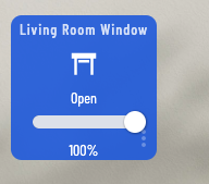
Here is the code from inspector.
it would be something like this, you'll need to replace "tile-12" with whatever the ID for that tile is for you (it will be the
surrounding the html in your screen shot)
#tile-12 .tile-primary > div:not(.dimmer) {
	display: none;
}
if you want to hide the text but keep the spacing, use this instead
   #tile-12 .tile-primary > div:not(.dimmer) {
    	visibility: hidden;
    }
1 Like
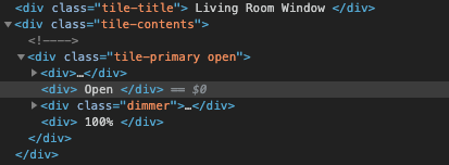
So close! This got rid of the text like I wanted but also got rid of the icon. How do I keep the icon? Here is the fully open inspector for that tile if it helps.
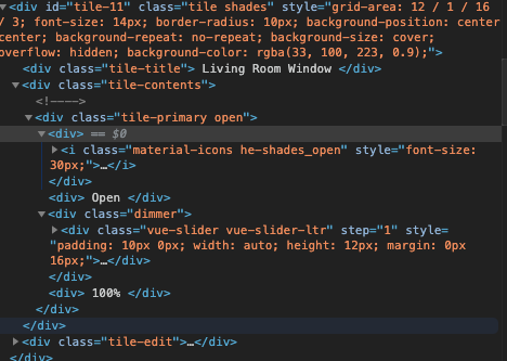
On another note while im here, How do I go about making this icon more centered?
For removing "Open" you can do something like (looks like your tile ID is tile-11):
#tile-11 .tile-primary > div:nth-child(2) {
    display: none;
}
I've removed text like that using that kind of CSS. For example, I removed the text from my motion displays with:
.motion .tile-primary > div:nth-child(2) {
    display: none !important;
}
If it doesn't work, add !important (I'm not sure I needed it in mine...).
1 Like
You can't. The text and icon are part of the same element so it's all or nothing. The alternative is to substitute your own icon for the one that came with the tile. Try this approach from here.
My bad. @BrianP's approach does work. I'm still a noob and my knowledge is incomplete! 
@BrianP how do you tell which child it is? I can't for the life of me see it when inspecting the source.
@michael.sbrocchi it looks like you are using smartly with the quarter mod. It's recommended that you turn off helper text when using that mod. That will remove that text you speak of and adjust the icons.
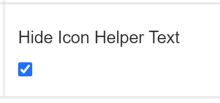
as mentioned in the other thread you can use the code below to adjust the icon location as needed, once the helper text is removed. (setting gear > options)
#tile-7 .material-icons{position:absolute;top:-5px;right:18px}
That selects the 2nd <div> in the .tile-primary class that is contained within the <div> with ID = tile-11. The first is the <div> with the icon. The 2nd is the <div> with "Open." The first is the <div> containing the icon, and the 3rd is the <div> with class="dimmer".
The > means a direct descendant of that element, and :nth-child() just counts descendants. So for example:
#tile-11 .tile-primary > div {
    display: none;
}
Would select all the <div> elements in the .tile-primary class, but no elements that are inside that, so a <div> inside a <table> in the .tile-primary class would not be selected. Like below:
<div id="tile-11">
    <div class="tile-primary">
        <div>Something</div> <!-- This is selected -->
        <table>
            <tr><td>
                <div>Something in a table.</div> <!-- This is not selected -->
            </td></tr>
        </table>
        <div>Something else</div> <!-- This is selected -->
    </div>
</div>
-Brian
3 Likes
So in my original post I can change the tile background colour, but how can we change the colour when the tile changes its state, for example the standard tile for a contact sensor turns red when triggered, how can we change this?
EDIT: Solved here
EDIT 2: Unfortunately this solution only works for switch tiles, contact sensors are no - no 
You can edit the Template for "Contact Sensor" to select the Color, Background Color and Custom Icon for each of the two states ("open" and "closed").
Here's what it will look like in the "Layout" - this combination provides a white check mark on a green background for "closed", and a white "X" on a red background for "open":
"customColors": [
  {
    "template": "contact",
    "bgColor": "rgb(174,0,0)",
    "iconColor": "",
    "state": "open",
    "customIcon": "clear"
  },
  {
    "template": "contact",
    "bgColor": "rgb(0,128,0)",
    "iconColor": "",
    "state": "closed",
    "customIcon": "check"
  }
]
1 Like
I've seen a workaround to this elsewhere in the CSS threads, at least-- use 'Door Sensor' for those you want inverse and change the standard color.
I'm using a background image on my dashboard. By default the background-position is center center. I would like to right align the image "right center". Is it possible to get to the background via CSS?
I know how to write Firefox and Chrome addons, also known as extensions. I could write one that would do all of the CSS mods automatically.. Any interest in that?
1 Like
It would be a browser addon. When it recognizes you are on your dashboard it would apply the css with no intervention from you. Firefox is the easiest browser to support but I think I could support Chrome also. Just a thought, I have not decided to do it yet.
1 Like
I haven't tried it but this in your custom CSS should do it:
html {
    background-position: right center;
}
or maybe
html {
    background-position: right center !important;
}
for sure will want that "!important" as the version without it will not be "more specific" (and therefore not respected/followed)
I have tried both. Didn't work. 

