Hi guys,
Thanks for a great product!
So, the data is there, the temp history on a temp device in the event history. Why not easily show this as a graph on the dashboard?
Simon
Hi guys,
Thanks for a great product!
So, the data is there, the temp history on a temp device in the event history. Why not easily show this as a graph on the dashboard?
Simon
I think graphs for dashboards is a good feature request. I think it would be fine for me if the graph was static (didn't update real-time and required a page reload to refresh).
It's also down on my list of priorities though especially since I know about how long it would take me to implement and I would definitely have that time used for stability and troubleshooting tools at this point (for me).
Well, basically I can understand if graphs on the dashboard is somewhat too far from core, but the data should in that case be exportable I think. Or just possible to list the temp log as a tile.
My need is based on a new greenhouse where I'm analyzing the temperature and how it correlates to the outdoor temperature. Need to find a good AC-solution based on the analysis. Now I'm refreshing the event log, changing to 100 results per page and search for 'temp'. Works, but a bit complicated for the need. 
Depending on how far you want to take this, there are some custom apps / drivers that allow exporting this temperature data as it is logged. The databases and charting systems I have in mind (InfluxDB and Grafana) are typically hosted on a separate hub / server such as a Raspbery Pi or "always-on" Windows machine. I set this up on a new Pi over the weekend and am quite happy with the result. If you are interested let me know and I can provide some more details. There are also some forum posts with cloud hosted alternatives that I can find if you haven't already.
On a side note, I made a similar post to this recently, making a similar observation / request around making things like charting more accessible for people to setup. While I still feel there could be some enhancements, I have been convinced by those who responded that there are benefits to the current situation, making users more engaged with the setup of their smart home and stimulating collaboration between community members.
Simon
Simon
And hello to a fellow Simon, I am assuming...
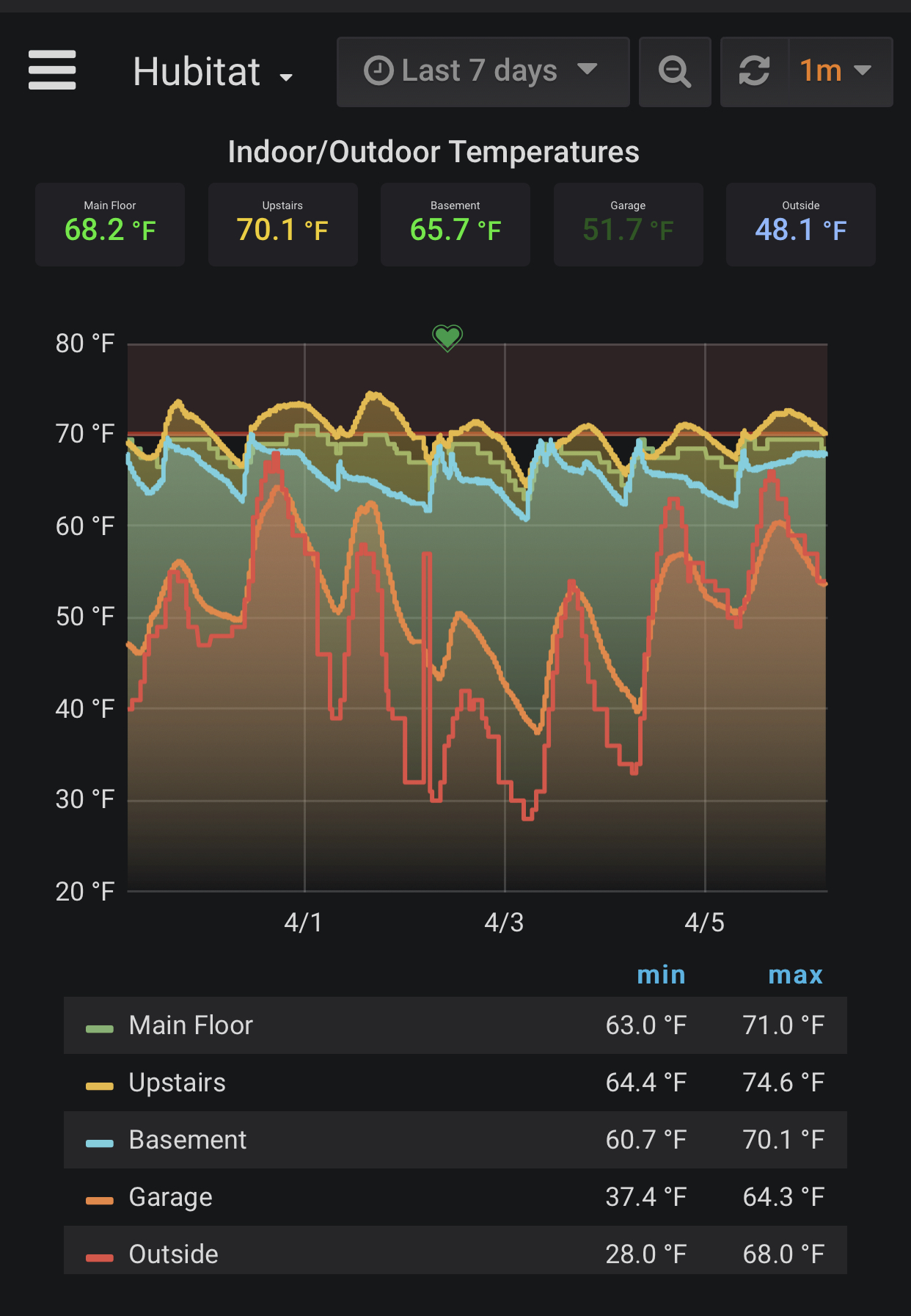
Like @sburke781 mentioned you can do this with additional hardware and software. Here’s an example of a chart that graphs indoor and outdoor temperatures for 7 days.
Thanks for your replies, and hello fellow Simon
I have seen some solutions including the above, but I'm sorry to say I don't have the time to fix it. My time and knowledge limits me to use the standard features, and I hope I'm still the target group for the product
What I don't understand though is why you would need an extra db when the log data is already stored in the Hubitat native db. Would be easy to just make it accessible in my world. But I'm sure there are things around this I don't understand. I leave it up to you pros. However, my need stands.
Kind regards
I'd also like to see this. At a minimum, I'd like to be able to set red/yellow/green thresholds and have the tile change color. I don't need a beautiful graph, but I'd like the tile to turn red, for example, when the fridge temperature is too warm or the basement is too cold.
There is now a community-developed solution that runs on the hub and is quite simple to setup. As the thread title says, it's still in alpha stage but has been improved substantially since the thread was first created and is at least closer to being beta now. So far I think it's great, and judging by the feedback in that thread, so do many others.
Thank you! I will check it out!
Ist this using grafana?
Yes it is.
This is is great stuff I need this
Search the community for influxDB and grafana. There are several threads on how to set this up on a raspberry pi. To get the HE data into the database I’m using the InfluxDB app.
https://raw.githubusercontent.com/HubitatCommunity/InfluxDB-Logger/master/influxdb-logger.groovy