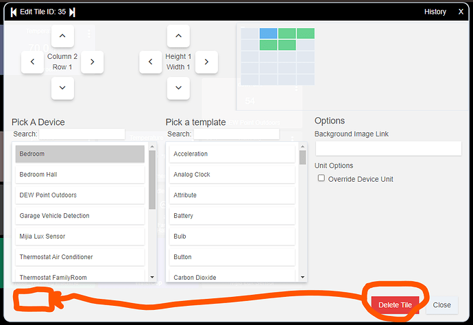
I read a thread that suggested he Hubitat UI will be getting some work. If so I would suggest the [DELETE] button in the dashboard tiles be moved to the far left. When I'm creating or moving a tile I tend to go to the bright button without even paying enough attention to the text. I'm too used to the Microsoft [OK] [Cancel] positioning.
Thanks


