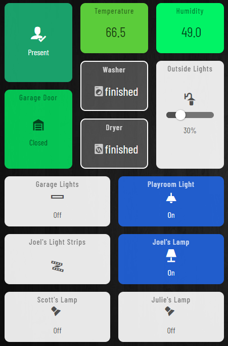
I have noticed that with devices that have batteries the percent remaining is automatically displayed on top left corner of a tile for that device. Multi-sensors will display temperature on a (motion) tile.
My question is, is it possible to customize a driver to change which attribute is actually displayed? I have several power switches (with customizable DH) and would like to display the Power (W) being drawn.
Those tiles just show an attribute and right now I don't have a super easy way to reset the status back to idle. If it were a switch, I could still show idle, running, finished status and tapping the tile would activate the switch that resets the status back to idle.
That is what I am doing now but that is not what I was looking for. I wanted 1 tile for the switch which showed power at the top left corner of the tile.
The built-in drivers are not open source, so you cannot do this with stock drivers.
There are a couple tile apps that can combine or make custom tiles. The users BPTWorld, and Cobra are two that have these apps come to mind, but there might be others.
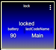
Yeah, the best you can do there natively is to create an overlay tile and style it with CSS to make it look like one tile. This example is actually 3 tiles:
I was actually think of my own DHs. I have a Temp/RH DH that includes a battery capability. When I use this DH for my custom devices the battery % is displayed but certainly not because of something I did to the DH
Tile 5 is the main lock tile, 6 is the battery attribute tile, and 7 is the last code attribute. If you make all 3 occupy the grid position in the dashboard and then modify the CSS to read: