This sounds like a grid settings issue. I documented the process in my Guide to HE Dashboard write up.
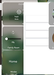
Thanks for the link! Useful into there. I did not have the grid set up properly (now I do) but the issue of some tiles overlapping the modal seems to be brought about by a line of css I added:
.tile { -webkit-backdrop-filter: saturate(3) blur(20px); }
when I remove it, everything is fine. When it’s there, the "Change mode to:" modal for example is overlapped by any tile added to the dash after the "Mode" tile, which brings about the modal. ![]() Grid setup seems not to affect it.
Grid setup seems not to affect it.
Talking about the grid setup, the coloring of cells in the mini-map confused me briefly initially, I expected the filled (green) cells to indicate placed tiles / occupied cells and empty (light gray) cells to indicate the available grid slots rather then green indicating availability. Hope we can boost Hubitat’s business enough for an investment in some kind of drag-and-drop solution in the future ;).
Using smartly you can add your mobile devices (both portrait, and landscape) to the calibration section and it will size your dashboard correctly. smartly will create a custom CSS entry for each of your device.
I had no idea about Smartly. Thank you - just duplicated my dashboard to run off of Smartly! Lots of the aesthetic choices I’m going for are squarely shared with Smartly for both the overall dash look and esp. the layout inside specific tiles. The few things I prefer about the default dash styling are easy enough to tweak (larger & full-size tiles, font). Smartly does remove the awkward margin from the right which is great (I do prefer to see a sliver of any off-screen tiles as an indication that it’s not the end the dashboard).


