This sounds like a grid settings issue. I documented the process in my Guide to HE Dashboard write up. I have reposed the applicable section below. Make sure your grid has been adjusted to allow for enough space to add additional tiles where needed, and not on top.
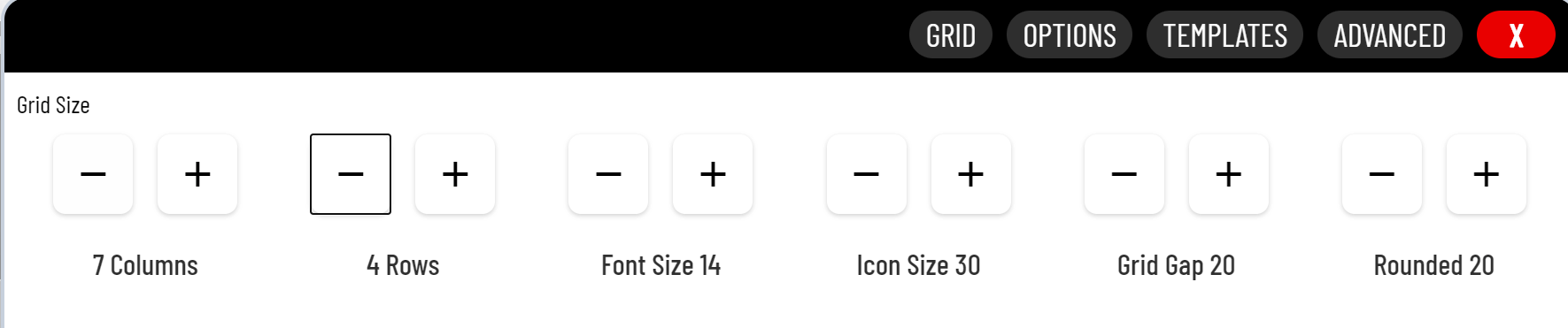
Grid Columns and Rows
The amount of columns and rows available on the gird is set in the Options (gear icon). This comes in mostly when adding new tiles. The system will automatically chose the next tile location given the settings below.
When adding a new tile, be sure you are placing it's location on a green tile. If you see a blue tile, that means you will be overlaying an existing tile (shown below). If no more green tiles are available you will need to adjust the grid settings above.
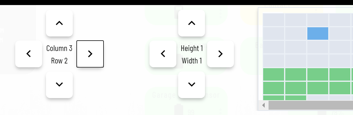
The system will allow you to place tiles outside the grid setting, so this is not a limitation. It's just very helpful when placing new tiles to make sure they do not overlap, making it harder to adjust afterwards.
Using smartly you can add your mobile devices (both portrait, and landscape) to the calibration section and it will size your dashboard correctly. smartly will create a custom CSS entry for each of your device. My iPad calibration (I only use landscape since it is mounted) looks like this....
@media screen and (max-width: 1024px) and (min-width:1020px){.dashboard{zoom:0.94;}}
With that code in the CSS my screen is perfectly sized with no tiles bleeding over the edge. Since smartly makes lots of other changes to your dashboard, I do NOT recommend you run this dash thru it (not without a good backup first). Instead I suggest you create a new dash (copy the current JSON if you want) and run that "test dash" through smartly. Pick all your devices for calibration. Apply the smartly changes to your "test dash" and see how it looks. If you like the format, but not the other smartly changes copy the @media screen lines to all your new dashes for the calibration to remain.
All and all a very good start!

