Newbie here. Is there an overall UI/UX subforum? If so, I can't find it though there's plenty of help to be offered. If not, here's a request for improvement of Define a Rule's subpage Select Trigger Events.
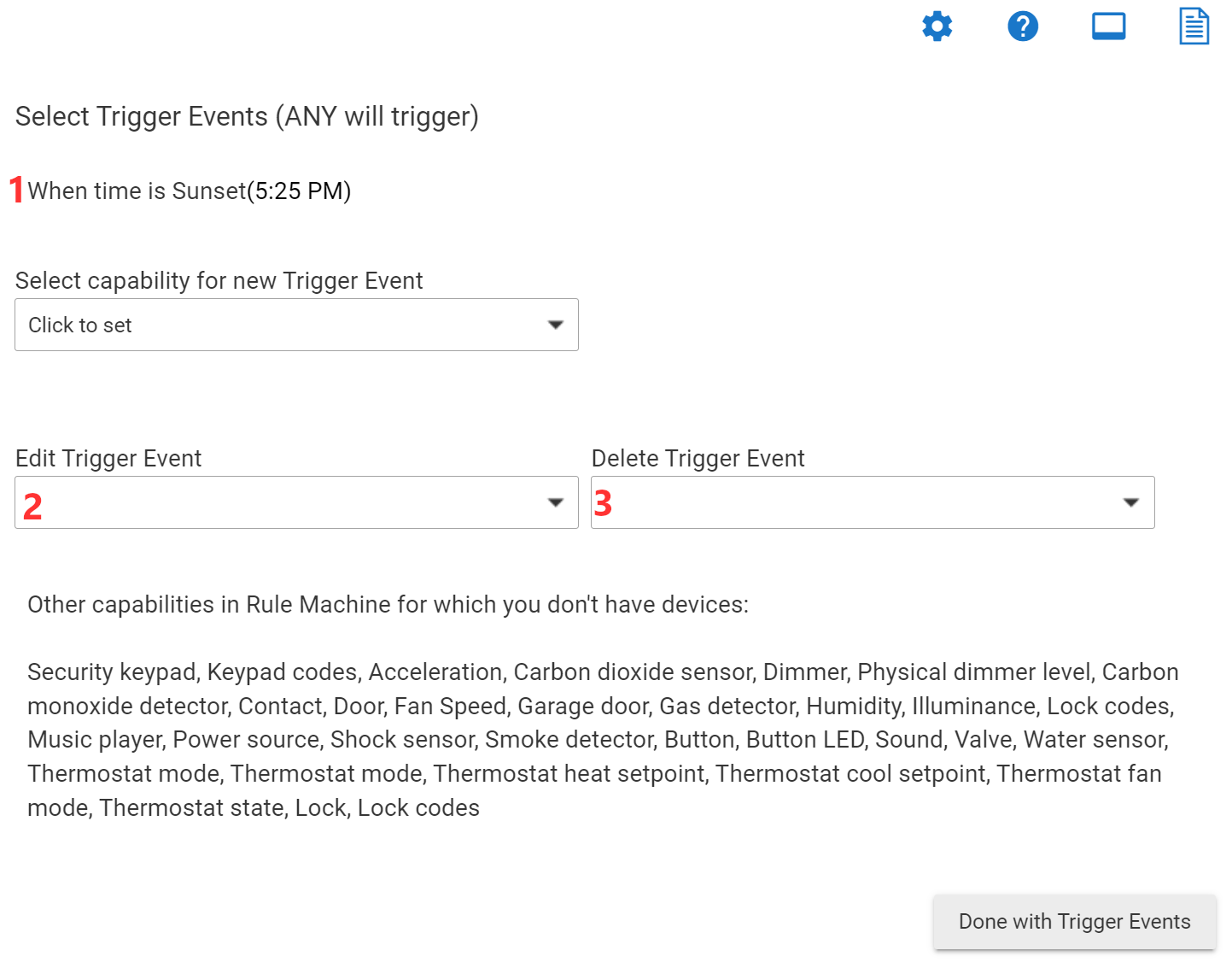
Currently, the trigger events are listed three times:
- an inert list (right below the page title)
- a dropdown list for editing
- a dropdown list for deleting
End the duplication! Please.
Make the first list useful by adding clickable icons for editing or deleting each one. Add the icons in front of each trigger's name (because trigger names are of variable length and it's easiest to see which icons go with which triggers when right next to each other). Typical icon candidates are pencil and trash can or X.
Remove the two trigger dropdown lists.
While you're at it, change the Done with Trigger Events button caption to Close. That's a well understood standard, less verbose, and widely usable elsewhere.