First things first, I'm going to say that there is a special place in Hell for whoever created the new rule machine.
EDIT - Disregard - I found I missed a setting. The above sentence still stands.
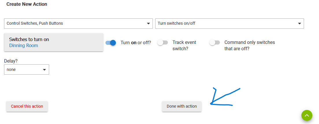
That said, here's my issue. Normally, Hubitat will set my mode to home or away, based on my phone being home or not. However, I'm wanting to set it so that if I'm away, and someone comes over, and unlocks the lock, it sets the mode to home, then back to away when the door is locked again. What's actually happening is even if I'm home, as soon as I lock the door, it sets the mode to away. Below is a screenshot of my rule.
The trigger is the door being locked. But, as soon as I posted this, I caught something and went and checked. It turns out that in my testing, I had manually set my phone as not present in devices. I thought I had set it back, but I missed that.
So, that rule is working, but my first sentence still stands.
I guess the good news is that you can still use RM Legacy as long as you want. Or likely even the older versions of RM5 as song as you've got at least one rule you can clone.
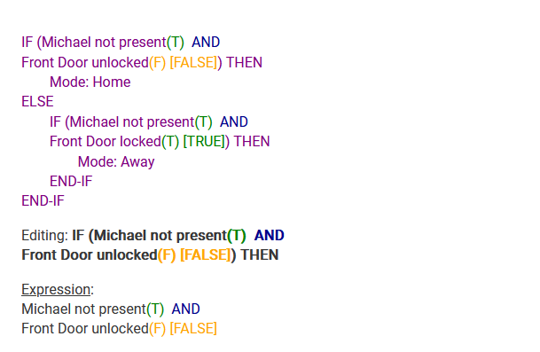
I see you have this figured out now, but in the future, you can use the evaluations of the conditions and expressions (in parentheses and brackets) to see their current true/false values. In your case, seeing that "Michael not present" is "T" (or true) would mean you're away and shouldn't expect the automation to do what it does when you're at home. Perhaps you would have figured this out faster knowing that.
As for other comments, can't speak to those, but I happen to prefer the new interface. From your screenshot, it appears you might be on a phone. A desktop/laptop or tablet will always give you a better experience with Rule Machine, though it should still be usable on smaller screens either way. Most people seem to prefer it as well, though of course everyone has their own opinions. If you have questions about how to use it, the written documentation has been updated, and I think there are videos that were either recently published or coming soon.
The screenshot was on my laptop, in edit mode. I didn't catch the fact that my phone was showing away, even right there in the conditions, because I wasn't looking at it when editing. After I posted it here, that's when I noticed it. I would have deleted the post, but there were already a couple responses.
The big problem I have with the interface is that you go set a step, then have to say done with actions, then go back and add a new action, instead of the old rule machine where you just added another action. It's just a lot of all over the place, and having to go back to the main page for that rule between each action, and it doesn't let you see the whole thing when you are adding something.
When editing, you have to use the drop down to pick which line to edit, instead of just clicking on it. Things like that.
If you're hitting "Done with Actions" to go out to the main Rule page and then back into the Actions page, you're adding an extra step. There is one extra click involved compared to previous versions in that the dropdowns to add new actions aren't just always at the bottom of the Actions list, but you can just hit the "+" button at the bottom of the action table (or anywhere in the table if you don't want it at the end) to insert an action.
I actually never noticed this extra click until I went back to an older version to check, FWIW--guess I like it enough I never noticed.
This is not true; you can click on the action itself. This is an improvement over the previous interface where the dropdown was the only option (I actually don't think it is available for this purpose in the new interface, though there are others; each is also available per-action, generally faster and easier, if that's all you need).
If neither of these appears to be the case for you, something might be odd with your device or browser. I'd try it on a desktop first to see it at its best, but it should work on a smartphone or other smaller screen, too (just, as is often the case with complicated interfaces, probably not as easily).
When you're done adding and action, you hit done with action, then end up back at the list of actions, instead of just maybe having an add another action. It is only a couple more clicks, but there's a lot of "just a couple extra clicks' in the whole thing, and more going back and forth than before. The old version was clunky as well, but it was still easier to use than this, with a couple exceptions.
Conditional actions are one that the back and forth is kind of a pain. It used to be that you set the If part, then it would take you to the Then part, instead of Then being a separate action that you added.
On editing, my apologies - yes editing actions you are correct. But editing trigger events and conditions has the one drop down for delete them, and another for edit them. Looking back at it, I guess the old one had this too. It still would be easier to just click on the condition or trigger.
As I'm writing all this out, it doesn't seem like it's really a big deal. But I've been updating some of the ways I have Hubitat run things, and also setting up things for my Mother from scratch on hers, and when doing so, it's been frustrating to use.
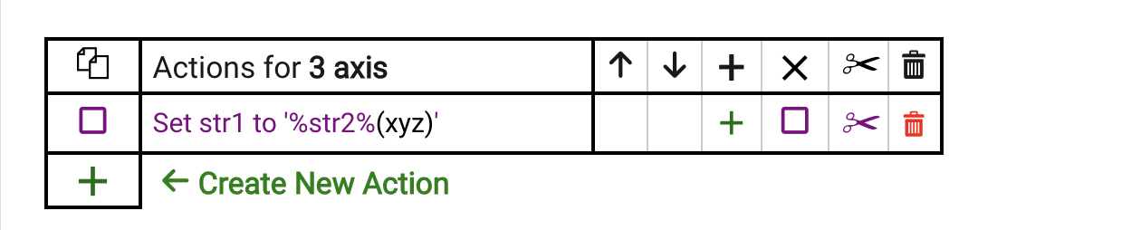
Click the big green + to create the next action. You don't have to go back out of the Actions section to add another action.
All actions have to have a Done with action button like you show above, and always did have this. Once you hit that button, it's a single click to create the next action. I'm missing what the complaint is about this.... ?
That's actually what I'm saying. It takes you back to that list instead of maybe a button to add next action. It can get to be a lot of back an forth. Conditional actions are the same way. Those used to have it where you did the If part, then the Than part in one screen. It's been a while since using the old Rule Machine, but I don't recall it having as much back and forth between pages.
As i said, it's sounds like no big deal when discussing it here, but after having to do a number of new rules on two Hubitats, it really got frustrating. I'm used to doing scripting, particularly on Filmeaker Pro, and I can whiz though writing a script much faster than writing a rule here. Something like that has everything in one place. You have your whole script on the left, and the operators on the right that you can either click on, or start typing in the list, and it narrows it down. I can understand not having the typing part, but it's really easier if everything were on one page.
I ran into a couple other things that I can't recall right off that just didn't seem straight forward.
Well you are correct. There is a new page structure wherein creating an action happens on its own page, whereas before it all happened on a single page. This is the old Actions page:
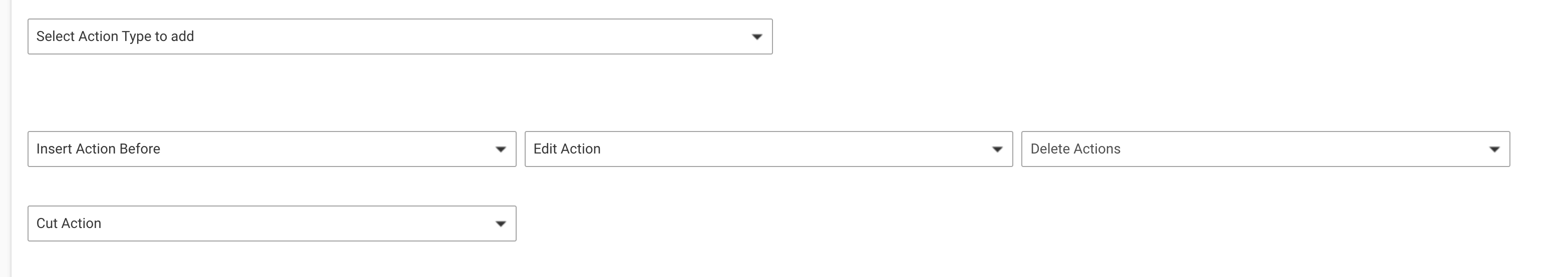
This has 4 pull-down menus. Now, all of that information about what one can do to an existing action is clickable in the action table, and the action table opened up some new functionality as well.
There is no right way or wrong way to do this. This is the way I decided to do it, and I'd say that the vast majority of users that have commented about it prefer the new UI over the old UI. You're the only dissenter that I can recall. When we first brought this to beta there was unanimous support for this approach vs the old.
Sorry that you don't like it. Can't please everyone.
I finally had a chance to sit down with this, and set up actions in the new rule machine, then in an existing rule in the old rule machine. I don't recall If/Then conditions being two step in the old one, but they are. However, the big difference is the fact that in the old rule machine, when you click on Done with this action, then you just stared working on the next action. In the new one, it takes you back one page, then you hit plus and go back to the add actions page. On it's own, that doesn't seem like much, but it really is quicker and easier on the old version.
I don't know if it is a extra click here or there, but I do know that editing a rule is SO MUCH easier than the old version that I can't imagine going back.
The issues are as follows: These are dynamic pages. That means that any change to the page causes it to be re-rendered. Once the table was introduced, putting the action creation on the same page would mean that the table would be re-rendered on every entry to setup the action. As the number of actions grows, this would slow down more and more, a very undesirable UI phenomenon, and one that we took steps previously to avoid. So, putting the action creation on a separate page allows just that page to be re-rendered, which is adequately fast. Returning to the actions table page re-renders just once, not multiple times, so that is sufficiently fast as well.
So it boiled down to having the table, which is quite a nice feature, and having a separate page for action creation/editing, or not having a table at all, just a flat list (like before). Can't have it both ways. Worth an extra click? In my book, yes.
 From your screenshot, it appears you might be on a phone. A desktop/laptop or tablet will always give you a better experience with Rule Machine, though it should still be usable on smaller screens either way. Most people seem to prefer it as well, though of course everyone has their own opinions. If you have questions about how to use it, the written documentation has been updated, and I think there are videos that were either recently published or coming soon.