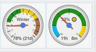
Hello... I looked through the existing dashboard tile templates and the forum and did not find a tile template that could add a tile to the dashboard to represent a circular gauge. Closest thing was a virtual dimmer (with a slide bar that can show 0 to 100).
I'm trying to find something like this:
In webCore there is a handy code that creates a gauge in the webCore interface. The settings can be adjusted to whatever values you pull from a device or variable. Such as temp, or energy production from solar, instantaneous whole house power consumption. The gauge can be setup with negative and positive values, and the colors can also be adjusted.
A really slick code. This is the custom "title value", but the full dialog box is shown below too.
[chart-gauge min=-6000 max=0 greenFrom=-6000 greenTo=-3000 greenColor=Green yellowFrom=-3000 yellowTo=-2150 yellowColor=DarkOrange redFrom=-2150 redTo=0 redColor=FireBrick minorTicks=5|Production]

I'd love to use something like this on the dashboard. Does it exist in HE?

