I'm monitoring devices with a battery level below a given threshold. The first examples are <= 25. Then I upped that to <= 45 to add the second device.
Just did and "auto" fixed it! Yay! Thanks for your help.
I'm monitoring devices with a battery level below a given threshold. The first examples are <= 25. Then I upped that to <= 45 to add the second device.
Just did and "auto" fixed it! Yay! Thanks for your help.
Can you post a final picture of it.
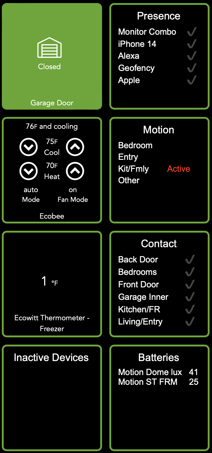
Sure! Here's the same slice of the dashboard as above, with my OCD almost happy. (I need to play with row spacing just a bit.)
Jim, that's pretty great right out of the gate. I like the leading icons. I remember someone posting about using icons in the device name about 2 years ago, perhaps that was you. I wish the emoji library for Home Automation was a bit wider. Here are a couple of things you may not know about.
But nice work, keep sharing.
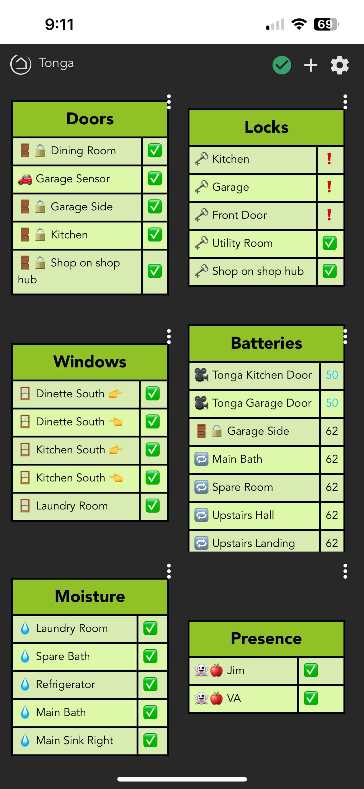
Looks good. What is the CSS for the green border? I like the definition it adds.
I also like your idea for motion sensors to only show an Active state and leave inactive blank.
BTW have you tried styles yet? You could go to the Presence tile, Save the style as "My Style" and then when you create subsequent tiles you can apply the "My Style" style and not need to deal with individual settings. It's a big time saver but more importantly it's more accurate that our memories.
It was probably set to 100% which is why it added all the extra padding around the elements.
So, this app is mainly to present the status of sensors in a compact way?
Not focused on control?
#tile-xx { border: 3px solid #5CA823; }
I have and it saved a lot of time. I still had to tweak a few things here and there, but not a lot.
I didn't find a way to update a style other than to delete it and recreate it. Is that the case? I then had to reapply it to the other tiles with that style. Not a bit deal, but not really intuitive.
Sensors yes, but also status of controls like switches and bulbs to provide a high level system at glance kind of thing.
You can have filtered lists so a table might be configured to only show open contacts so the space saving ratio is quite high.
The only “control” is the ability to embed a hyperlink so you could click to another dash for actual control for example. That’s what I do and don’t care if the underlying dashes are standard ugly Hubitat controls.
Thanks.
Load the style, make the changes, save the style back to the exact same name.
It would be an interesting option to have it re-apply the style each time it loads. Something to think about.
Back with another unsolicited set of suggestions for future enhancements...
AGGRESSIVE MINIFY mode/toggle, which: eliminates alpha transparency; reduces color choices to #xyz instead of #xxyyzz; universal/default alignments, font sizing, padding, etc.
NUCLEAR MINIFY mode, which: when provided the actual Tile-XX number from HE dash, will export/display necessary CSS declarations so user can paste those in manually, omitting all styling from HTML output from app.
Heck, I don't know if the Dashboards app honors CSS pseudo-elements like a::after / content(), but imagine being able to delegate all of your fixed (left-column) device names to CSS statements as well!?
This is where judicious use of End Point URLs comes into play, If the hyperlink a user adds happens to be of the Maker API variety, and the device to be controlled is 'registered' with Maker app, then it's off to the races as far as turning stuff on/off or sending other commands and parameters.
Hence, in theory (only, since I don't believe this is Gary's ultimate intention...), one could craft an entire mini-dashboard control surface within a single Tile Builder tile. The main stumbling block being, of course, the above-stated attribute size limitation of 1 measly kilobyte.
It's also feasible to take a Rule Machine trigger (Local or Cloud endpoint), add it as a hyperlink in Tile Builder, and thereby execute any rule at all (with optional variable included!) without needing Maker API in the mix!
The only caveat (I mention this because I have never tested TB's hyperlink feature) is that, if you want those hyperlinks to 'fire silently' without opening another browser pane, Gary would have to make sure that that's an option for <a> links.
I think I would want that to be an optional setting since applying a style includes the highlights. I have different sets of highlights for different tiles, and I wouldn't want those overridden. (That was one of the things I had to tweak when applying a style.)
I kind of went back and forth on this when I was writing the app, to include or not include that was the question.
I have experimented with this and I can get it to work but I thought I would focus on status vs control for the initial release. The URL's are quite long and I did not want to create 1:1 paradigm for controls. Even though they would be much nicer to look at it just didn't feel like the right path. Now a switch bank, that would be another story but with only 1,024 it hits the wall pretty fast.
The HTML commands are entirely formatted by the user. Basically you enter them in brackets and it switches them to angled brackets. So it's free form but the input could be friendlier as the strings are usually wider than the text entry box.
I’ll try 1 & 3.
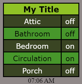
2 - I am currently already using the two slots to get rid of “on devices hub” and “on garage hub” so I need a third slot for “on shop hub”.
This part you can do today by loading the style Everything Off.
I have thought about converting (255,255,255,1) to #FFF (as an example) as it's quite a space saver and will include this in some future release.
I have considered offloading some CSS to the dashboard and the docs even talk about it and includes an example I think, but I don't think it'll ever be mainstream in my app. One of my goals in writing the app was that someone could achieve attractive results without knowing anything about CSS or even that it existed For the more techy among us they have overrides to give them a huge level of control. I'm hoping if we can get enough people using TB that we can lobby for an increase in the 1,024 limit. Even 2,048 would be huge.
Ah yes, I could not remember if it were you that requested an extra slot. You'll have it this weekend.
Agreed, and I sense most advanced users would be comfortable lobbying for 2k as the new payload limit. Dashboards are certainly coming into their own these days, and the expanding CSS/HTML lexicon is not helping matters.
At first glance, it's unexpected to find device attributes capped at 1K, dashboard tiles at 4k, and Hub Variables (ergo their Connector Devices) of type String, for instance, constrained to only 256 bytes (with clipping), while Rule Machine's Local Variables can each hold over 300K without skipping a beat.
So it's clearly not a database limitation, just a practical one. One must balance bandwidth, rendering time, system responsiveness and other realtime considerations against users' desire to push the bounds. (Example: The discovery that it's possible to sneak a bitmap image into a Tile by pasting uuencoded text.)
Wonder if anyone has already run a bunch of time trials, to test the extreme cases. @sburke781 ?
Download the Hubitat app