Hi @thomas.c.howard
I thought I would start from scratch as the problem didn't resolve itself.
So...is it fixed? Also, set the opacity to 100%. I’ll look at that in the next 5 minutes
I set opacity to 100%, default was 90%, and this has made no difference.
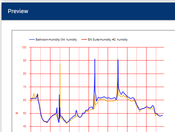
From the screenshot above you can see that there is a difference between the legend at the top and the actual colours of the line graph.
Basically the same as before.
I'll carry on playing. 
So...you took the latest update? If you look at the code (Hubigraph Time Graph) you should see the following on line 813: "color" : stroke_color,
I ran a test and got this:
Thanks for the quick feedback on this. I updated (using package manager updater) and confirmed that I did see all of the fields for setting the values of the state of the thermostat. I re-edited the graph but now getting this error:
I see what has happened.
For some reason there were 2 instances of the "Time Graph" app installed.
The old and the new one.
I deleted the graphs and then the old app.
Re-installed and everything is OK now.
Thanks again.
@TemptingTime, ok. We will get to the bottom of this. I know what is happening, I just need to figure out how to address it. Some questions-
Ok that makes sense. I'm using a custom driver by bcopeland (https://raw.githubusercontent.com/djdizzyd/hubitat/master/Drivers/Centralite%20Pearl%20Thermostat/centraLitePearlThermostat.groovy) I think this is the info you're needing from the driver:
def getModeMap() {
[
"00":"off",
"01":"auto",
"03":"cool",
"04":"heat",
"05":"emergency heat",
"06":"precooling",
"07":"fan only"
]
}
Hi, I’m trying to create a new Time Graph that combines temperature as line and window sensors as area graphs, with Closed being 0 and open varying from 10 to 7.
I am finding that once the graph is configured, the generation process goes to 3/4 and then after a minute or so, the window gets refreshed and the process restarts. There are no errors in the logs.
I am wondering if there is anything that I am missing...?
Also, the title in that are of the app and the default graph titles are Bar Graph when they should be Time Graph - I assume a cut and paste that didn’t get updated...:
I am running version 2.11 and have the latest version of HubiGraph.js
UPDATE: After a few retries, and attempts to go into the devices to ensure everything is correct (it doesn’t work - I can click on the “button” but the blue circle just keeps going and going... until the screen refreshes), I got the following error in the logs:
When did you refresh the code? There was an issue that allowed you to set refresh to “insane”. This causes a lockup. It looks like something is out of sync and your hub has a bunch of database requests backed up. I would give it 10 minutes, force refresh the code, and try again... As for the Bar Graph title, yea, I’ll fix that.
No rush, I appreciate all the hard work put into this app.
Thanks for the quick reply! ![]()
I don’t understand the question...
I recall selecting 10ms or something for the Integration time, and 1 hour for the refresh.
Ok, I assume I need to go to “Select device/data” to refresh the code?
Thanks again for your help and for this really awesome app!!!
No issues; yea, if the integration time is 10 ms and the Timespan is hours, that is ... a lot of data points. It might never recover. I just reproduced here locally... my hub is thinking too hard. I need to figure out what to do here.
Haha! Well, that’s good to know! I’ll start over again, and will use a longer Timespan! And here I thought I was giving it an easier time so it wouldn’t have to do much calculations... I guess I don’t properly understand what Timespan does... ![]() Lots of learning and having fun!
Lots of learning and having fun!
I have already added a calculation to the selection (with some clarifying text) so the user is better aware. I do appreciate the feedback, as it makes the app better overall.
Awesome!
That’s good! I like giving feedback... Just stop me if I give too much please. ![]()
On that note...
My graph worked great once I lengthen the value!
I notice in the units on the bar graph it says “none” and then a number. Is there something I can do to remove that text?
I think I may have asked for this already, but is there a way to show the Legend in two rows instead of having to go to a next “screen”? I find on the iPad that sometimes, that arrow doesn’t pick-up well - probably because I set the font so small so that I can see as much as possible...
And on the subject of the iPad, I notice that double-clicking doesn’t work in the app on an iPad. It does however work in the tiles. Odd...
Love the result!!! I’m trying to figure out the best time to close my upstairs windows as the day gets warmer to keep it as cool as possible. I’m hoping the visual will help me determine that, and then I’m going to adjust the timing of when Alexa reminds us to do it... Whether we listen or not will be another story, but my sons have been pretty good at opening/closing when Alexa asks up to now. Now I wonder if I had Alexa ask them to clean their room... Would that work too...? ![]()
This is upcoming fix; for now : under the Left Axis, change Number format to Short
Yup, that did it. Thanks!
Download the Hubitat app


