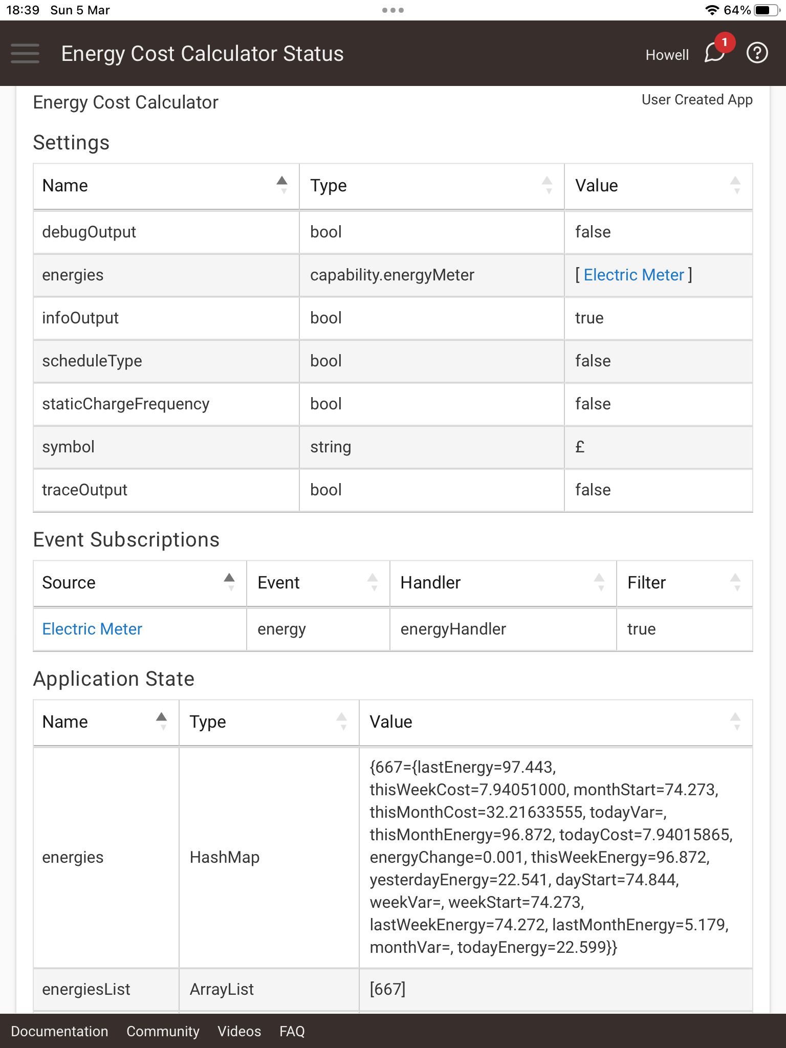
That is weird since the code that resets both the weekly cost and weekly usage is the same function. Can you post a screenshot of the app settings page (cog wheel in the upper right-hand corner of the app page)?
And this week it's reset the costs & energy OK - however, I performed a C7 - C8 upgrade and amongst all the shenanigans ended up re pairing the Frient to the hub, which wiped the energy counter. Doesn't appeared to have impacted the app though 
1 Like
I'm honestly not sure what happened last week. Best I can figure is somehow the reset job half ran.
Glad to hear everything went smooth this week though.
1 Like
Apparently my Aeotec plug is hooked into a nuclear plant and I didn't know:
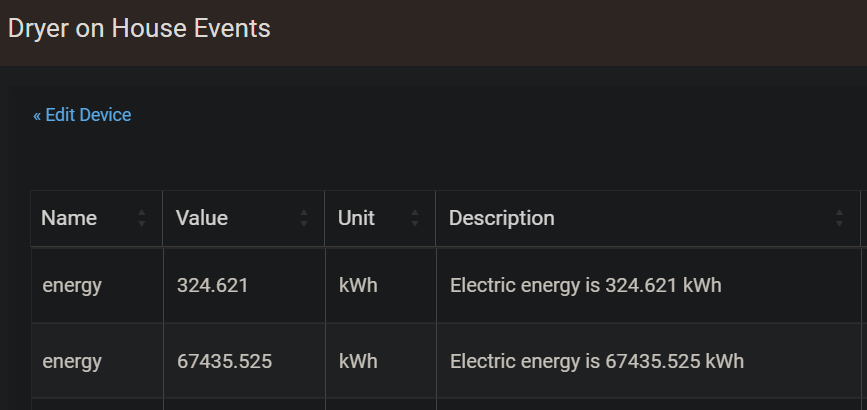
@terminal3 this looks like the problem you were having. Maybe there's an issue with the Aeotec devices in how they report. This was the first time catching it but was probably the same source of issue I had before.
Version 0.7.1 Released
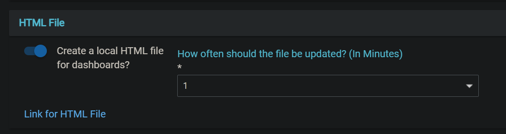
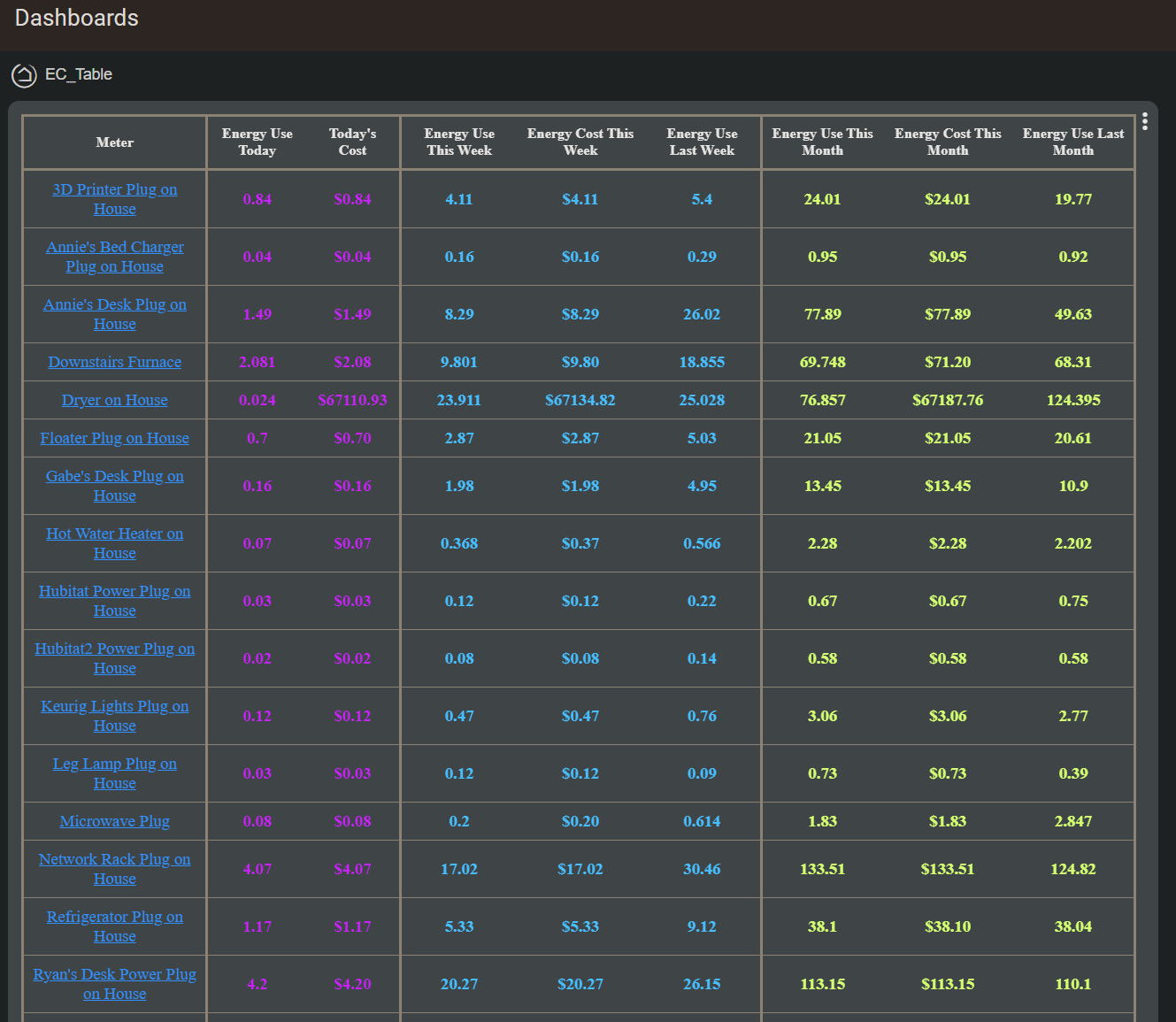
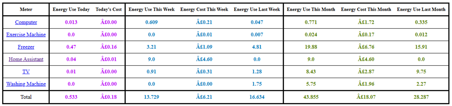
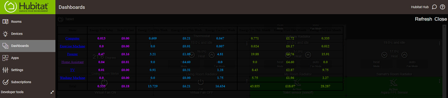
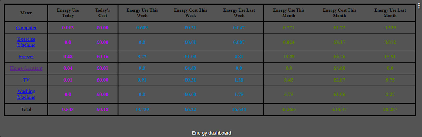
Due to popular demand, by a single person  , this update brings a small change (for you folks) to the app to support showing the main table in dashboards.
Under the advanced options page, is a new setting:
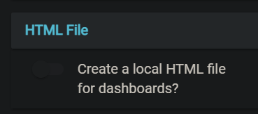
When enabled, the app will create a local file on the hub with the HTML contents. There is a dropdown selection for how often the file will be updated. There is also a direct link that will take you to the file's URL.
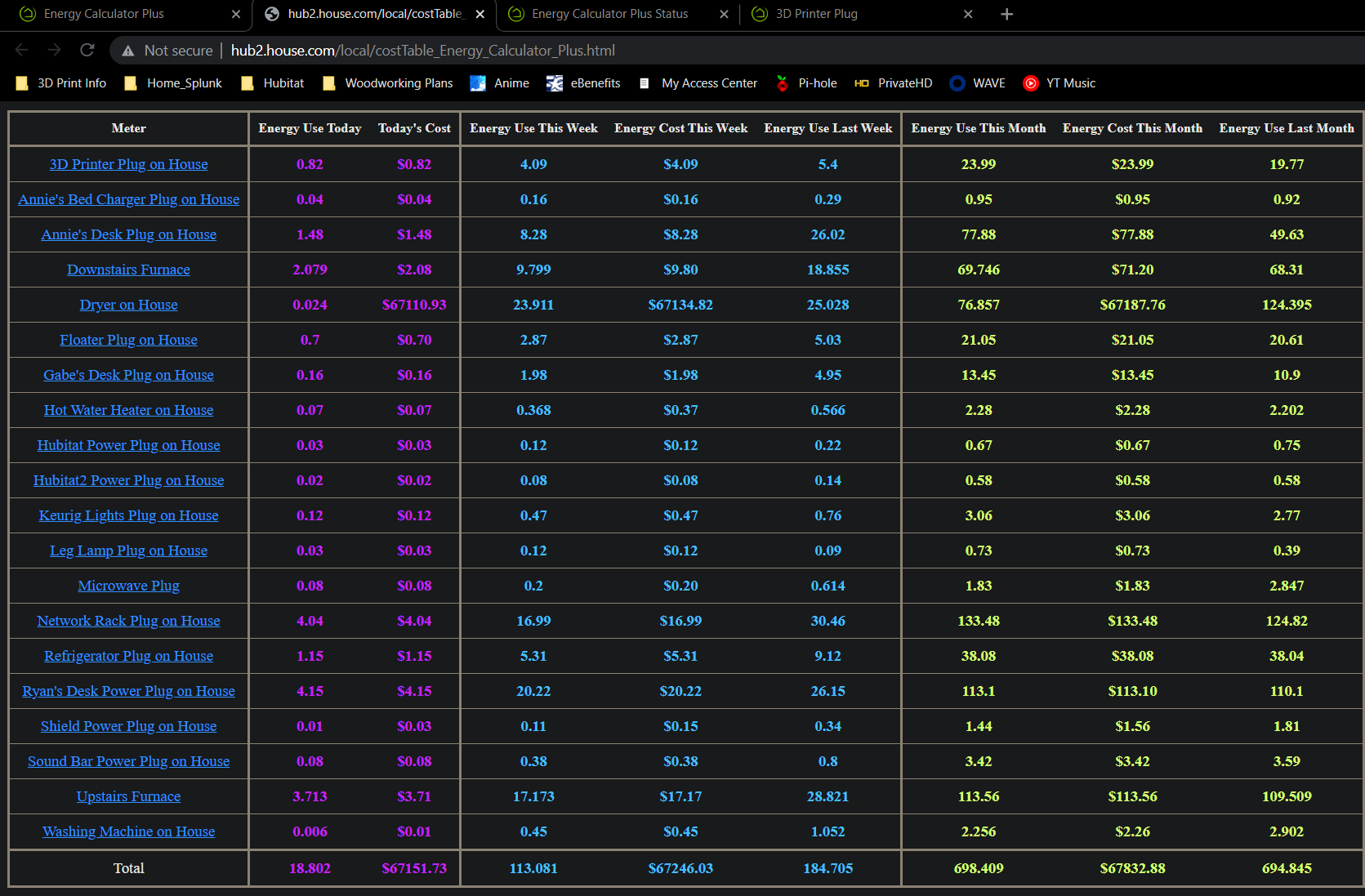
There are two main options for displaying the table on a dashboard.
1. Use the built-in option to add a 'link' tile (has some limitations).
As you can see, this option only gives you a button that can be clicked that will redirect to the HTML file. This will require backing out to the dashboard and clicking the button again to refresh the data
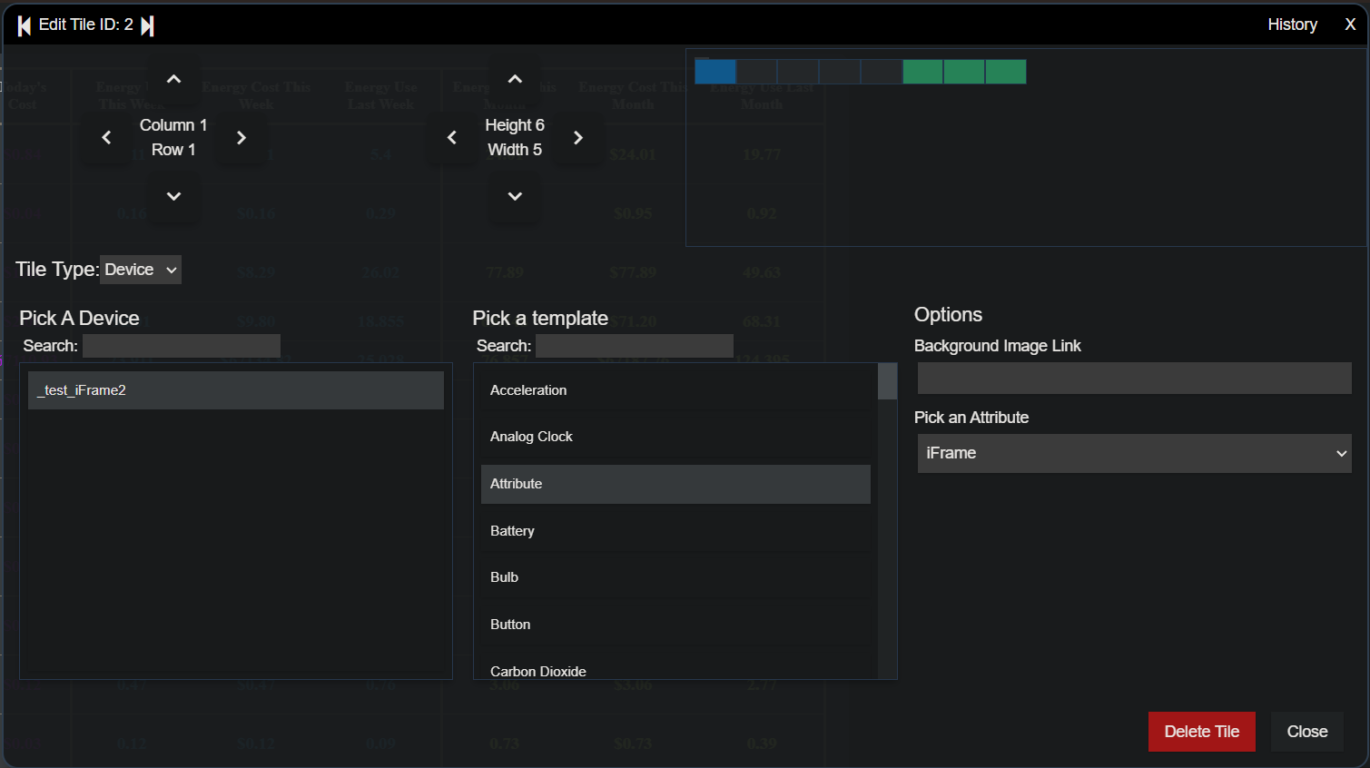
2. Use an iFrame device driver (more involved setup).
- Install the fantabulous iFrame Advanced driver by mbarone:
[RELEASE] iFrameAdvanced - Create a virtual device using that driver.
- Add your HTML file URL (can just "copy link address" from the app page or open the page and copy the url) to the device preferences and hit save.
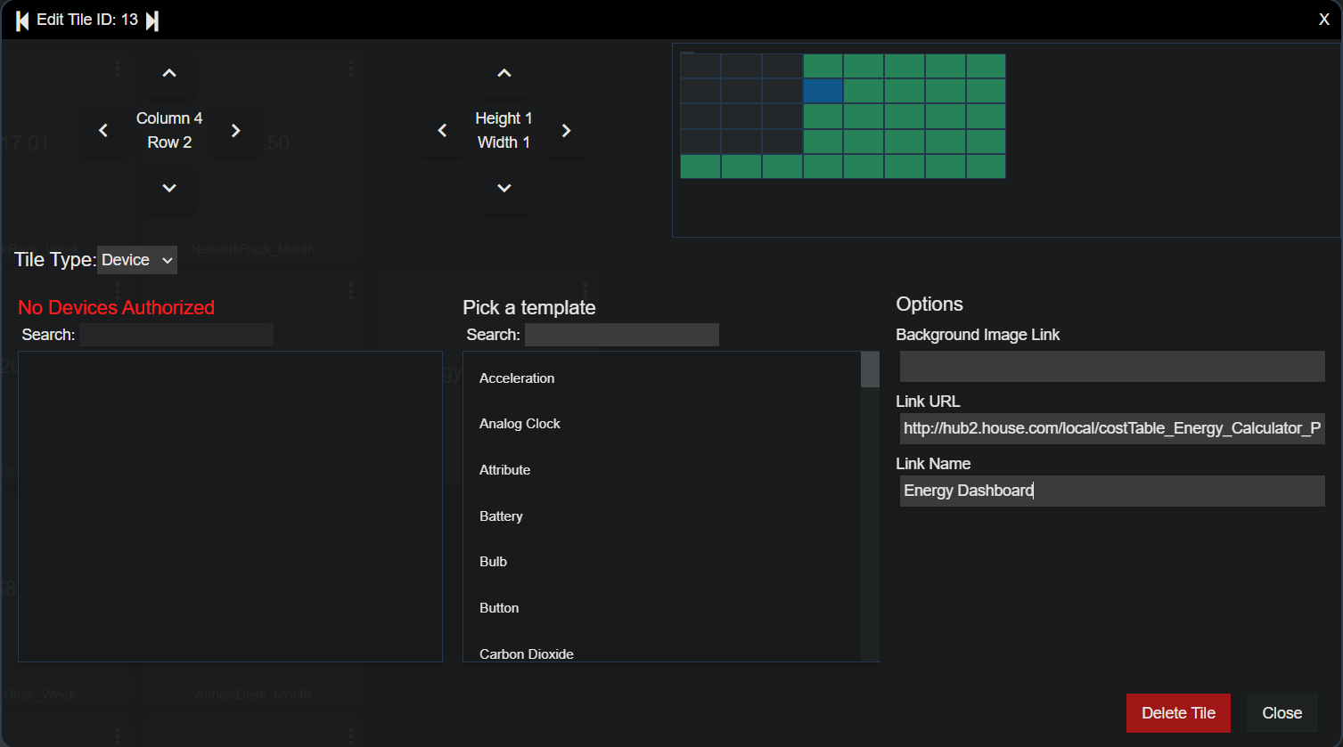
- Add the device to the dashboard. Select the "attribute" option under "Pick a template" and then select iFrame from the attribute list.
- Resize to fit your needs.
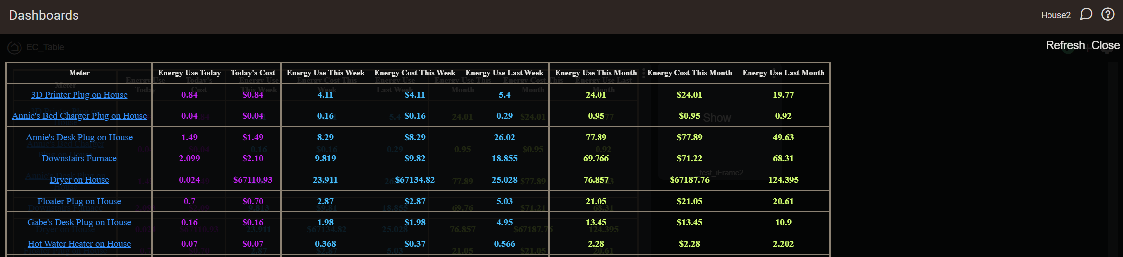
This allows you to just hit the normal refresh button on the dashboard to refresh the table.
The driver has another option called "iFrameLauncher" that can also be used.
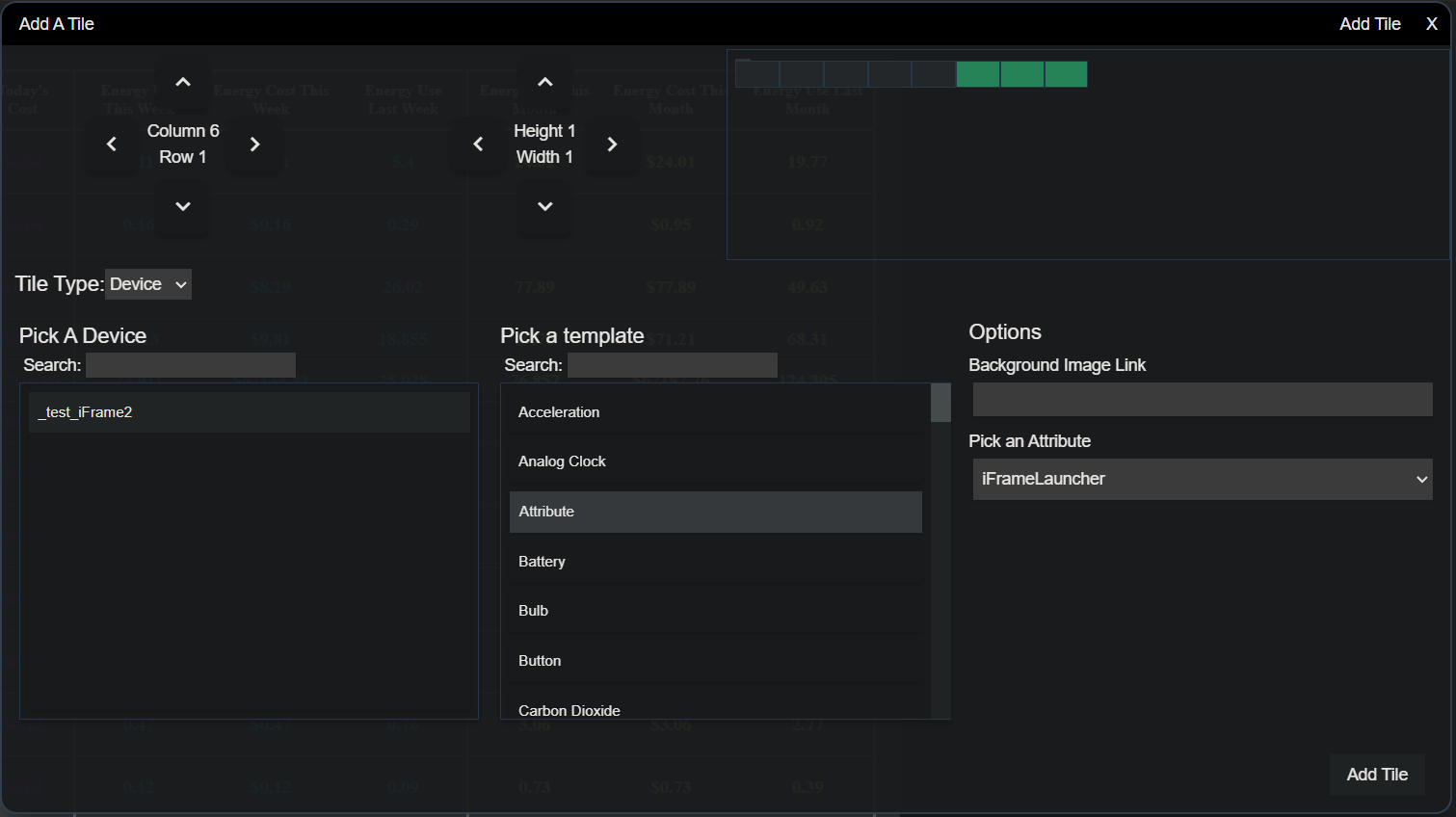
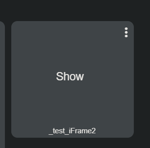
Clicking the button pops the dashboard up in an overlay with it's own independent refresh button.
This turned out to be quite the challenge figuring out how to get the data accessible to a dashboard. Even after figuring that out, there were numerous small issues with formatting consistencies. The main page is using a JS library called DataTables to provide the filter and sort functions. Unfortunately, it was also overwriting some of the CSS styling in the table. After fixing that, the dashboard view was wonky since the dashboard doesn't run the DataTables JS. The last hurdle was managing writing and maintaining the file.
Huge thinks to @bertabcd1234 and @thebearmay for helping me out with some of these issues!
6 Likes
This app is pretty impressive!
1 Like
Thanks, I really appreciate it!
@FriedCheese2006,
Amazing work - thanks for taking on the challenge and providing this popular feature!
This feature opens up more options for the dashboard; I think I will need to purchase more energy monitoring plugs!
I've not had time to fully try it at home, tried it remotely on a desktop PC and it looks great.
I initially copied the full URL of the app, then I noticed that you actually have a link for the HTML file and this is great for displaying just the data (you think of everything!).
Some minor issues:
I notice that your overlay has white text, but it displays in black text for me which is difficult to read.
Also, I was hoping the virtual device or URL link could be displayed on HD+ Android Dashboard app. Unfortunately, it just reads there is no content or session has expired and if I login then it reads "Your session has expired", oh well, will test locally when I am home.
Thanks again for the excellent work.
1 Like
Ah...I didn't catch this because I use a Chrome extension called Dark Reader that gives "dark mode" to sites that don't natively support it (like the hub's UI). It inverts the text color if it's black, hence why mine is white. This actually might be a bigger problem because I'll need to have the text be default black for the app page, but white for the dashboard...
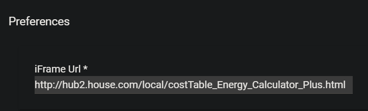
I just did some testing as I didn't think about this since I just use a VPN from my phone. The link is the local link to the dashboard. So if you are locally logged into the UI, then it's:
http://***hubip***/local/costTable_***appName***.html
But, if you're connected through Remote Admin, you get:
https://remoteaccess.aws.hubitat.com/local/costTable_***appName***.html
If I used the remote access URL, I see the same behavior for HD+, which is actually to be expected. Using the local URL will only work if you're in local mode in HD+. I'll see if I can figure out a solution for this, but it might not be possible.
There's also another limitation that if you have it in a Hubitat dashboard, it will not load remotely there either.
1 Like
Version 0.7.2 Released
Set the background color to a static grey to ensure text is displaying properly. When I get some time, I may revisit and add an advanced option with background options so folks can pick what works for them.
2 Likes
I've suggested this before and you didn't feel it was something you'd look into. App has expanded/improved since then, so I'm not sure if the potential road map has altered at all.
I'm really struggling to track 'time on' for my energy management, which would allow for a fairly accurate idea of running costs per hour / per month etc for individual devices.
Is this still something that's outside the scope of this project?
/ hopes
1 Like
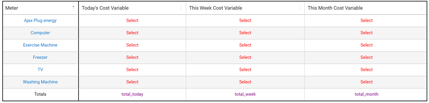
I think one concern is outgrowing the max size I can get of the main display table. Adding a time on column would certainly do that. As I'm chewing it over, I envision it would need to be an additional table, much like the main one, which I could throw into a secondary page. Have it track time on for each of the cost categories (today, this week, this month, etc.). With each one having the option for variable mapping.
The other part is having the app become too 'busy' so that it's overwhelming for a new user. I guess that's more on me for solid documentation once I get it out of beta.
Another option would be to add a column for 'average cost' for the past 7 days.
My thoughts for all of that is that there already an app to track time on where you can map the output to a variable. Maybe the solution is to simply compliment this app with that one so I'm not duplicating capabilities.
1 Like
Version 0.7.4 Released
This update brings another new advanced option to configure the dashboard background color.
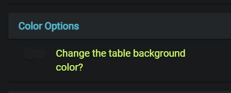
When enabled, you can select from some preset options. These are colors that give good contrast with both black and white text (to compensate for dark mode vs light):
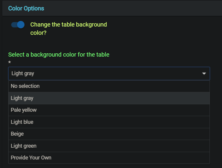
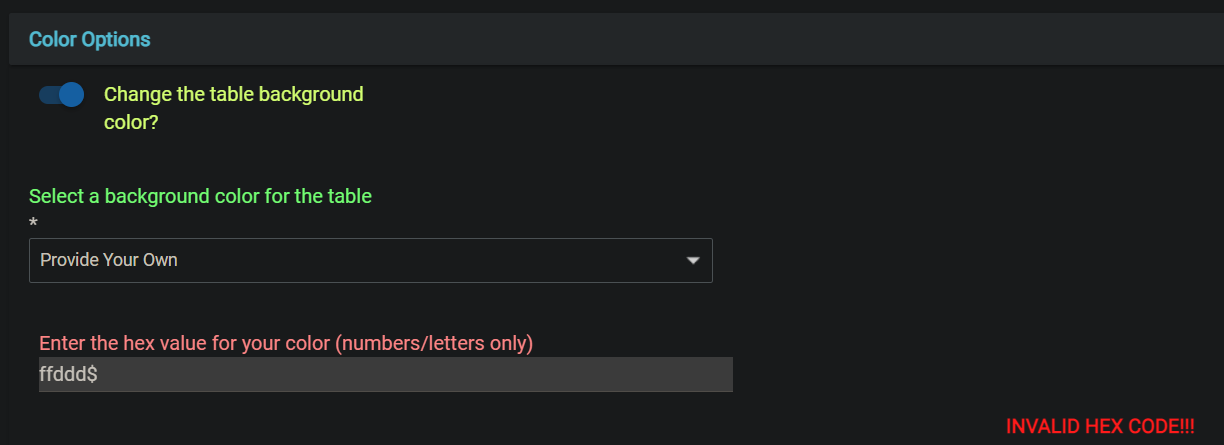
Optionally, you can provide your own color by selecting the "Provide Your Own" option. This will provide a new input where you can enter the hex code for the color you want to use. Only letters/numbers are required, the app will add the "#" for you.
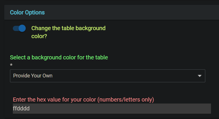
If the provided text is not a valid hex code, then you'll see an error message until it is corrected.
All changes are instant so you can have the options menu open in one tab and the main app page/dashboard in another to play around with the settings until everything looks satisfactory. The main app page/dashboard will just need a refresh after the selections are changed.
1 Like
The "time on" tracker only shows totals. No daily /monthly etc.
However you have given me an idea...
2 Likes
Well, I mean, that's all it does right now. It's only one pull request from having more.
2 Likes
I'll pretend I know what that means, take it as a positive, and wait patiently.

1 Like
Version 0.7.6 Release
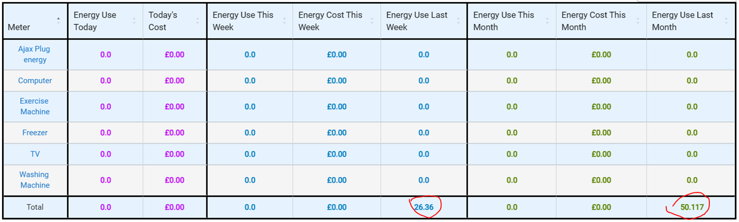
- Added logic to discard energy changes over 500 kWh as probably erroneous. If this is too low for anyone, let me know.
- Updated UI color scheme to be uniform across the menus.
1 Like
@FriedCheese2006,
I’ve “reset everything” and notice that there are still "total costs" present?
Also, all variables have been de-selected apart from the total costs.
Please advise.
I think I left those along with the reset feature because they are just historical values. They won't affect anything aside from showing on the dashboard. If it's a big deal, I can update the function to also nuke them.
1 Like

