Hello all,
I of course realize that Hubigraph is no longer being supported. However, I have been using it successfully to get a graphic representation to monitor my hub free memory, DB size and CPU usage for several months now as it is easy to use and does not require any additional hardware to host.
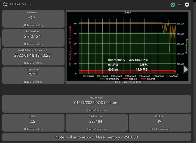
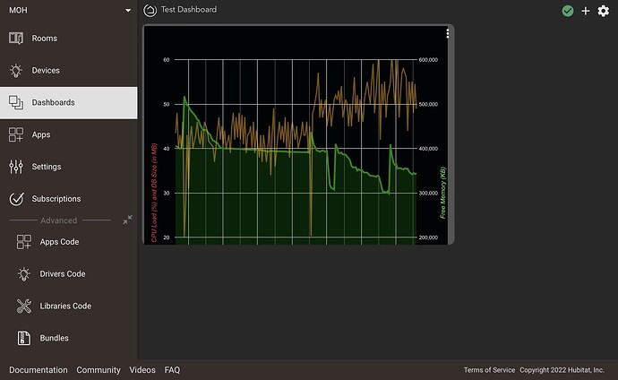
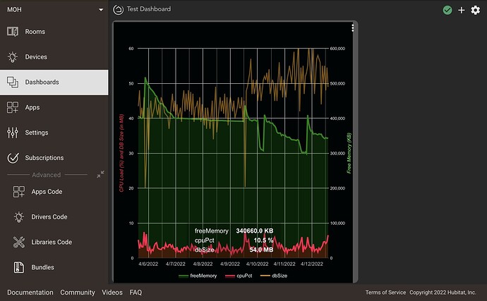
As I mentioned, I have been using it successfully for several months now (see one of my dashboards below):
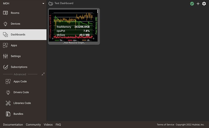
As you can see, the whole graph shows up in my tile, and when I click on the tile it expands. I had since changed some of the design of my graph but it continued to be “proportioned” to fit in my tile…that is, until yesterday.
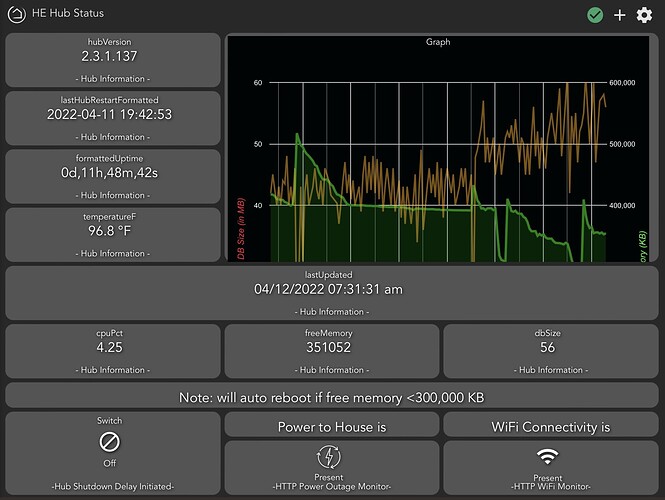
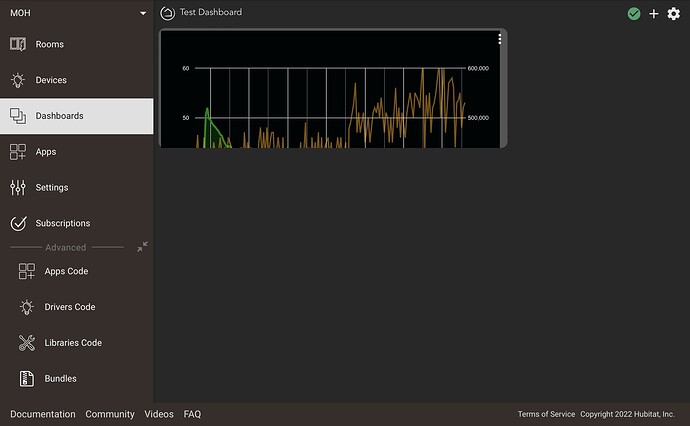
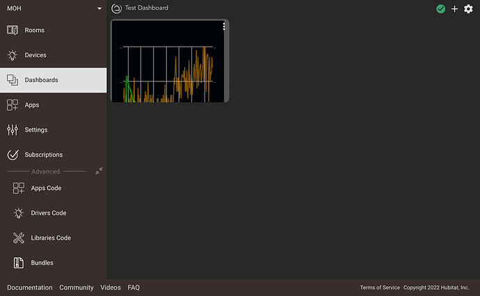
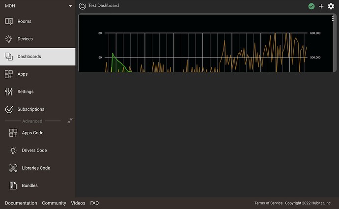
Yesterday, when I checked on my hub status, my graph no longer appeared to be “proportioned” to my tile (as seen below).
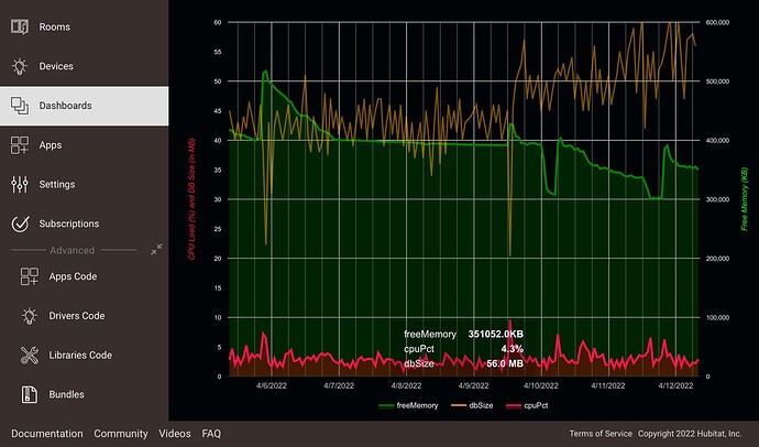
As you can see, the horizontal axis of my graph remains proportioned to my tile. However, the vertical axis of the graph no longer fits.
I did not make any changes to my graph, but coincidentally (this is an image from my iPad) I did just upgrade my iPad iOS, although I cannot see that there would be any cause and effect due to an iOS upgrade change (and I am not sure when the change in my graph actually occurred). Any ideas? Any help or suggestions would be greatly appreciated.


 I can try and take another look at lunch, unless someone else can chime in and solve it in the meantime....

