I'm now using mode switches, as I have lots of switches that change during certain modes (e.g., Away), and I find that this app makes it easier to track what's being managed by mode than the alternative (e.g., a number of RM rules). However, once the number of switches exceeds the screen size, the header is no longer visible when you scroll down.
To make it easier to remember which column is which, I suggest you shade the off columns (makes sense since off is darker than on). This will guide your eye better and make errors less likely to occur.
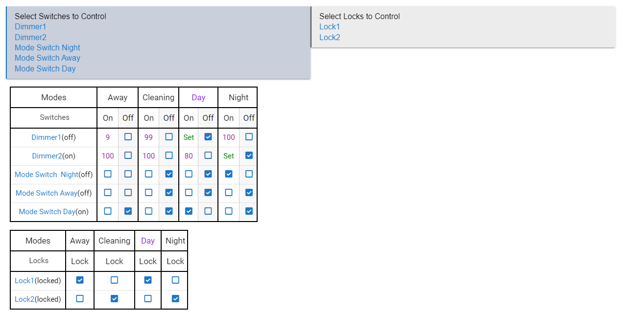
Good suggestion and actually something I did in my personal version of this community app since posting a screenshot of my version in the original thread:
Not only do I have a slight gray shading of the second column, I also have a dark black line separating the modes so its clear which options are for mode column.
Other enhancements I made:
Combined dimmers and switches into a single table and if the switch has the "SwitchLevel" capability I allow input of a number instead of just on. Works for my particular needs though YMMV.
Added Locks since I like to automate locking during Night and Away modes.