Hubitat 2.3.2.126
Over time the Hubitat logging page UI has got very busy, there are a couple consequences that cause usability problems:
-
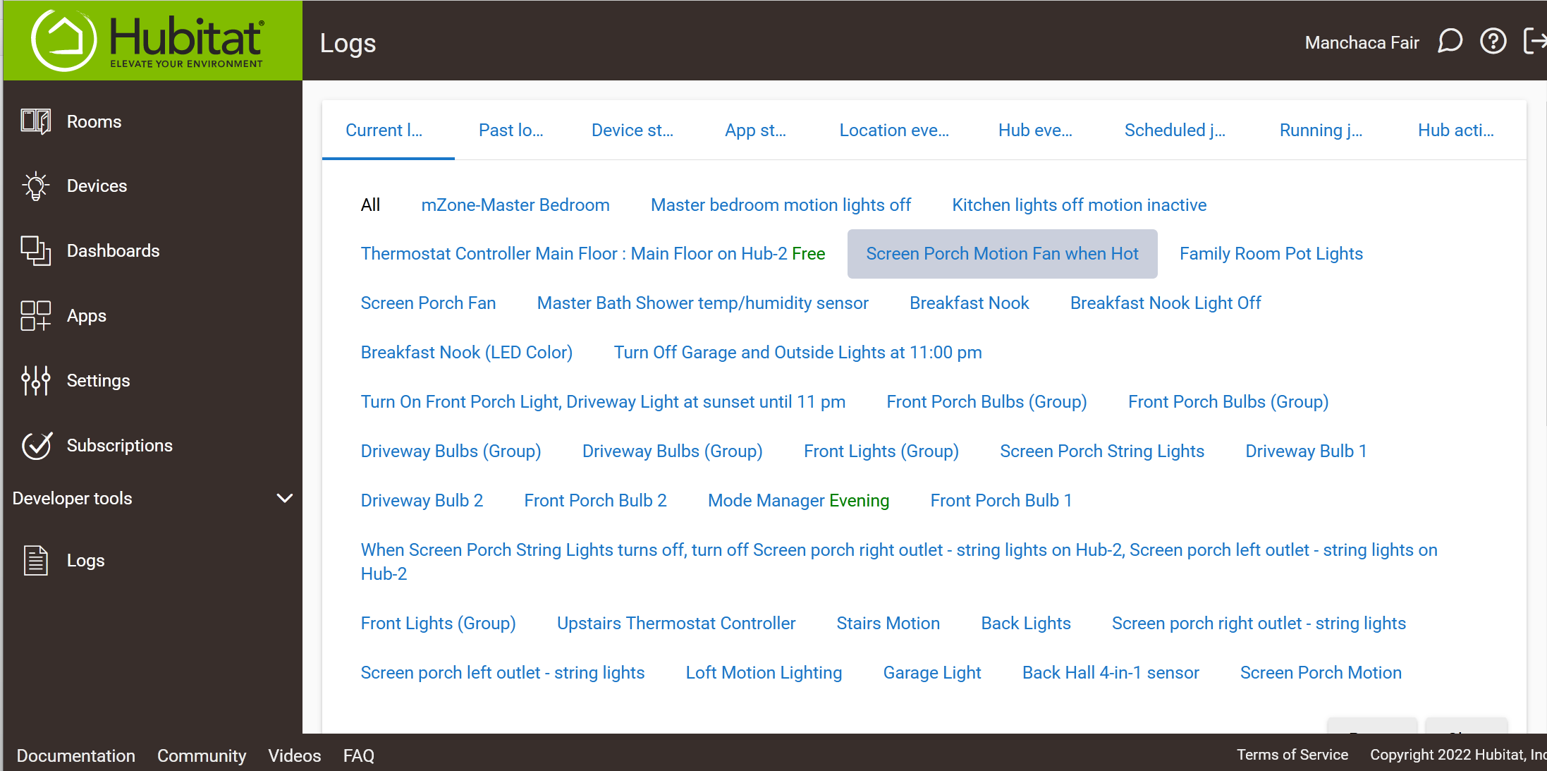
There are numerous tabs, which are listed by an abbreviated name. On a phone or tablet these are condensed to one or two characters, becoming fairly useless. Even on a traditional laptop there is not enough information to pick out a tab easily without prior knowledge Request: If the tab/paging is seen as important, please use a UI format that preserves the full tab title text in a readable format on all devices, possibly using multiple lines for the tab headers, or providing a different organization.
-
The ability to filter by device/app is very handy in Current/Past Logs, however it is limited to one device and the device list can easily take up a full screen, making it awkward to use. Request: Replace the device list on Current/Past lists by a drop-down of devices in the list that is multi-selectable. This would reduce waste on these screens, and also increase functionality when tracking behavior that is in multiple device/app log lines.
Thanks. Here's a sample log screen on my laptop showing the issues.