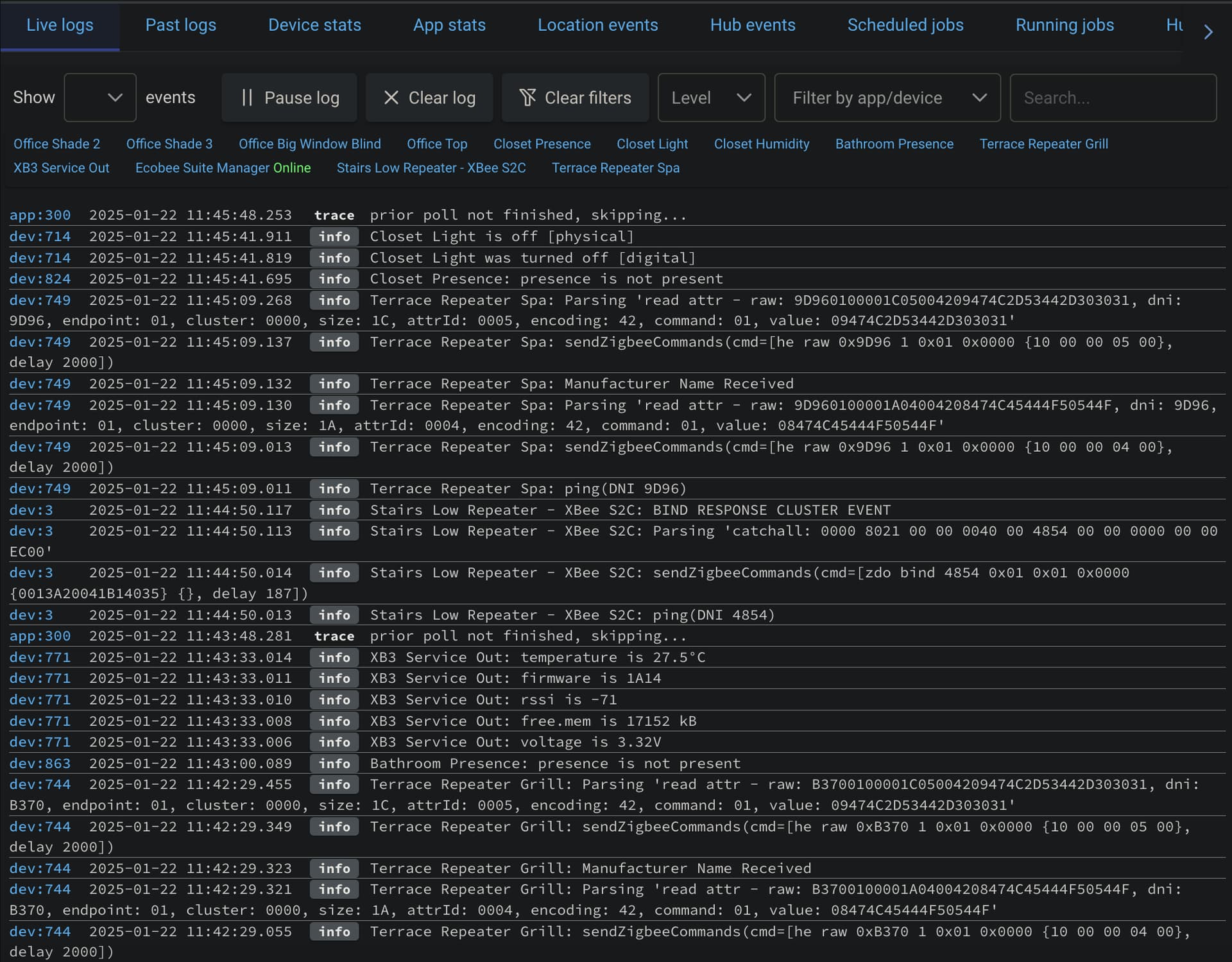
If you have to look at logs often, the default formatting of the log page sometimes gets in the way a bit, for instance confusing the 'O' letter with '0' zero, vertical spacing not optimized and etc. I've made some changes to make it better, in my opinion. Of course you can change it as you like.
Example

Or with Dark Reader extension
For Brave browser go to brave://settings/shields/filters and enter the text below in the Create custom filters field
- Important: Brave Shields must be active for the URL/IP of your hub, otherwise the changes will not be applied.
For other browsers, with uBlock Origin extension installed there should be a place to do the same.
your-hub-address.or.ip##.p-panel-header
your-hub-address.or.ip##.mb-1:style(font-family: monospace, monospace !important; font-size: 12px !important; margin-bottom: unset !important; border-bottom: grey solid 0.1px !important)
your-hub-address.or.ip##.log-time:style(width: 180px !important)
your-hub-address.or.ip##.log-source:style(width: 40px !important; border: 0px !important; font-size: 11px !important; padding-top: 0px !important; padding-bottom: 0px !important)
your-hub-address.or.ip##.log-source-link:style(width: 65px !important)
your-hub-address.or.ip##.py-1:style(padding-top: 0 !important; padding-bottom: 0 !important; font-size: 12px !important)
your-hub-address.or.ip##.p-2:style(padding: 0 !important)
your-hub-address.or.ip##.py-1:style(padding-top: 0 !important; font-size: 11px !important)
Replace your-hub-address.or.ip with the address or IP of your hub.
I would also like to make the filter section of the page smaller, but my CSS knowledge is limited.

