Loving the new update with the option of the 2 axis scales, can I ask, if it is possible to show in the legend at the bottom which graph is against which axis, so next to the first legend have (right axis) or vice versa. So someone who did not setup the graph knows which axis to use for which graph. Great work guys loving how this is just getting better and better.
New update. See above.
1 Like
Quick question,
Does this work with hub connect, ie can I graph temp sensors on a remote hub?
I believe so. An app like this doesn’t know the difference between a real temperature sensor device and a virtual one.
nutcracker, I know this sounds like a dumb question but...
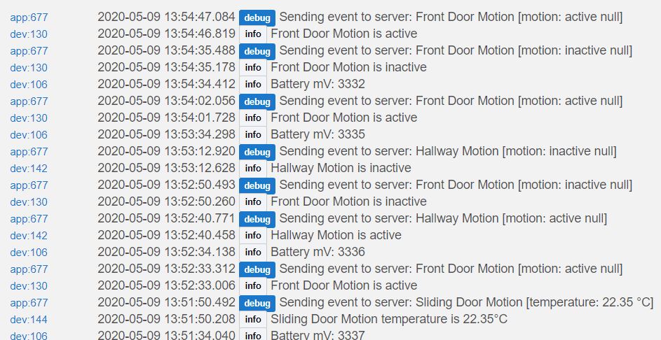
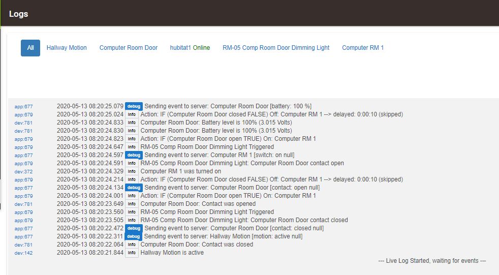
What is a 'NULL' value to Hubitat as I seem to have many devices reporting 'NULL' and is this normal?
I've included a quick screenshot below of the logs from my 1st Hubitat.
I'm got 3 x HE Hubs in total connected via HubConnect.
If this is the wrong place to ask, I apologise but I read your comment about 'NULL' and jumped at it as I can't find a solution in the forums as I'm pretty sure no-one has asked or I too stupid to understand it, lol

NULL is like empty, not set... so you’ve a device and it’s status is not known for example. I’ve not used Hubconnect but presume the primary hub where the real devices are setup and configured, they are reporting correctly? Could be a configuration issue between the hubs? Are you trying to graph devices (as per this thread)?
In the context of my issue with NULL, the variable was null (not set) and so caused the graph application to crash because it was expecting a value to be present.
HTH
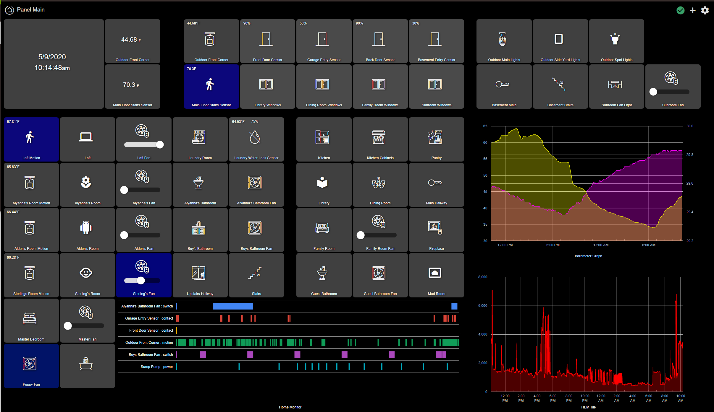
For those who asked (all one of you). Here is my home panel: Running on a Kindle Fire 10, with Hubigraph, and Fully Kiosk Browser.
4 Likes
Alright, this has been a fun project! I am just about ready to move on to the beta phase. I am going to do something (because I need to keep my son busy; who has done a majority of the programming on this). I am asking (contrary to my FAQ) for bugs, desired features, and other general comments. I want to get Hubigraphs to the point that anyone (including my wife) could set up a graph. Please understand as you submit ideas:
-
There is a code length limitation. This means the amount of overlay java script we can use is limited. We are working around this issue now with a new project: HubiPanel Enhancer. Stay tuned for more.
-
Some things are a tradeoff. Example: Loading graphs more quickly. This is a function of doing the data parse on the Hubitat server. When I load the weather using AmbientWeather there are tens of thousands of events to parse. I can do the initial load and then let the app trigger at every event. This reduces future reloads but can overload Hubitat. We made a choice to do the initial loading when you refresh the graph and then let the browser do the processing for future updates. This allow for panel functionality, but make it harder to use for "infrequent" checks.
-
We chose to use Google Charts to implement the graphs. This allowed for "generally" compatibility with all browsers. We are limited by the features that Google Charts offers. For example, it is not possible to EASILY center a title (I have no idea why). My son assures me we can make it work, but it requires intercepting events and doing all sorts of "hacks".
-
We are only doing testing on our system. I have limited access to android. We do development on Windows and test on IOS. So if you see a bug, understand, we might not see it. I admittedly have an extensive system with 200+ devices, but I don't have some device types; locks, presence, themostat, additional hubs. So I'll need some help testing "higher risk" issues.
-
We have worked hard to NOT interact with the hub, only to be a consumer and use "official" lines of communicating with the hub (i.e. app, Maker Api, etc). If you want something that will require "hacking" the hub, please don't ask (I have already received one such request). We will follow the following guidelines on the apps we release
a. No hacking the Hubitat router
b. No adding undue loading to the router
c. No using "backdoors" into the router
d. Stability is key. If it is not stable, we will not release it.
e. I cannot fix everything, but I will fix everything I can
f. At some point, I will be done fixing things.
Thanks all.
8 Likes
You can store javascript inside the JSON of a dashboard, my JS injection driver is using this. That driver is just a proof of concept, but contains an example of what I mean. Just wanted to mention it if it helps.
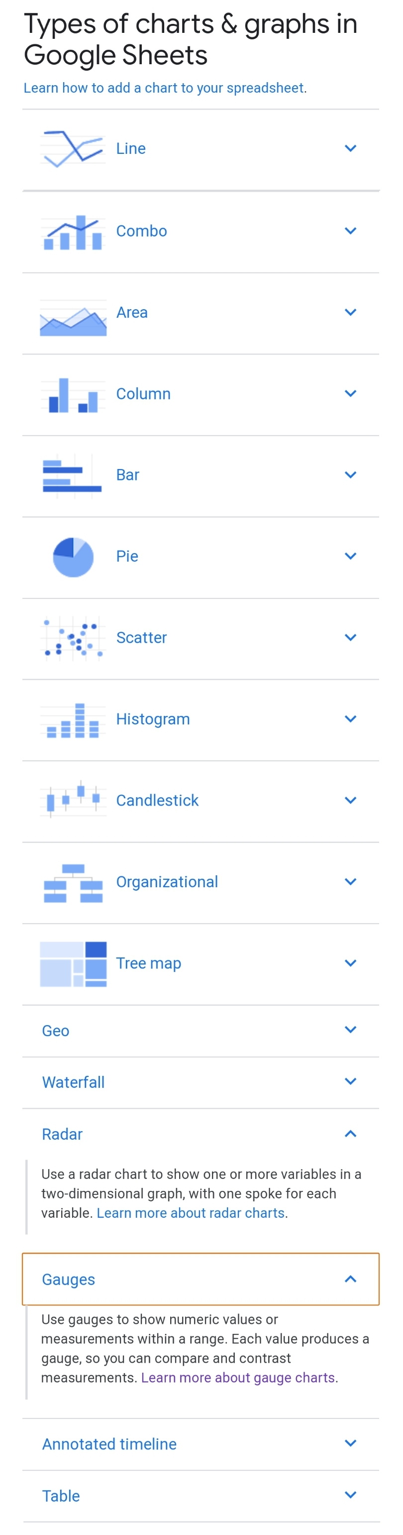
I'd like to see more Google graph types supported (like guages, scatter, radar) with the ability to use variables as some of the data points (eg. for a gauge's position and its max/min values).
Also +1 on the idea above for a 2nd vertical axis/label.
hi, when setting up a line graph, is it possible to group the devices by attribute, so basically have all motion sensors listed together using alphabetical order, then maybe all contact sensors etc, see my one below where it is mixed up and I am not sure what order this is? Maybe even if we could select the order of the devices?
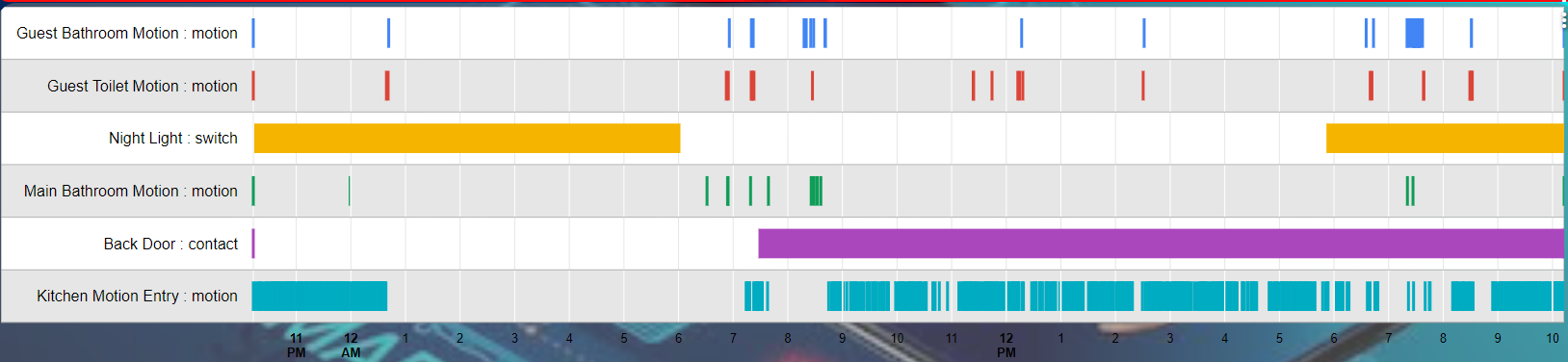
@gregish Version 0.5 now is uploaded. It implements Device ordering on the Timelines.
3 Likes
@nutcracker, @Angus_M: I spent some time looking into the dual axis (i.e. copied on both side). This has turned into a frustration/bad news/hack news situation. Here's the frustration: Google Charts has by far the most accessible, and complete Graphing ability. There are holes in their API, like someone got bored and stopped supporting it. Bad news: Dual Axis is one of those holes. There is no way to do it. Hack news: I have figured out a way to get what you want: Here's what you do:
- Set up your single attribute that you to graph.
- Add another attribute that is NON NUMERICAL (like motion or something). Because there is no numerical data, nothing will show on the graph.
- Set up your graph with one attribute on the Left and the other on the Right.
- Figure out a reasonable min and max value for the attribute you want to graph.
- Set both axis with that Min/Max.
- Done.
3 Likes
Thanks for the quick response. and apologies for my slow response.
I only started to read through this post today so I haven't installed Hubigraph yet but must say, well impressed with great work thomas.c.howard and his Son have done with it.
Without sounding like too much of a dumbass, I always thought NULL meant 'none' or 'zero' so when I noticed it coming up repeatedly in the logs for Zigbee devices on the 1st hub where the zigbee devices reside, I thought it was strange.
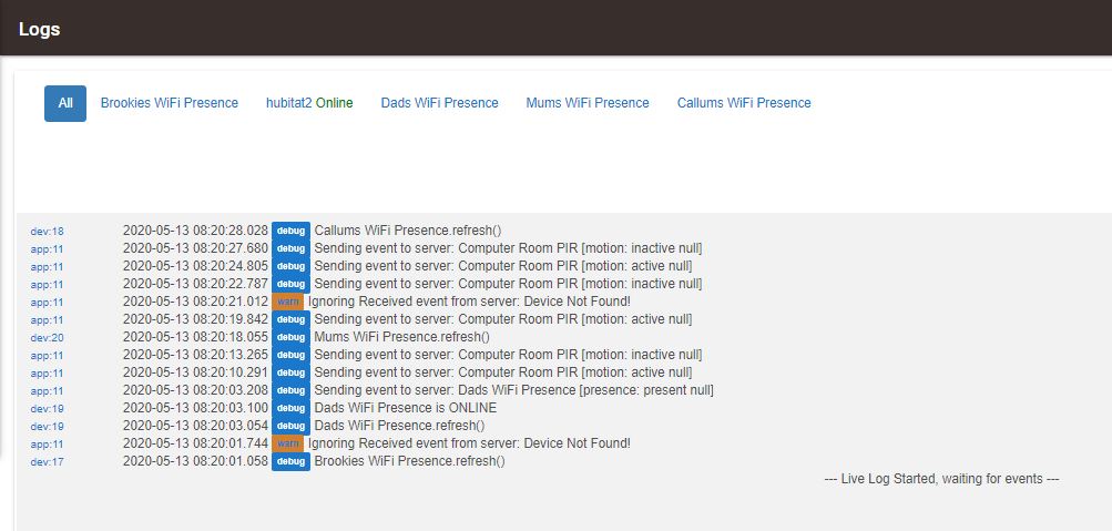
Since my original post, I've removed all devices in HubConnect from HUBs 1 & 2 which fixed the logs for HUB 3 but HUBs 1 & 2 still show NULL in the logs.
As you can see below, this is the 3 Hubs in order - 1, 2 & 3
Again, Thanks for your help and if this is the wrong place for this, I'll ask in a different forum.
I really love where this app is going. What I am looking for is historical data storage and review. I understand that this is not possible within Hubitat, but would it be possible to ship the logs (which you are already reading) to some kind of database and report from there? Either reporting from within Hubitat, or other web interface.
I know I could setup Grafana, but your graphs are more than enough for my use case if I could have historical data.
@thomas.c.howard Thanks again for the improvement efforts.
I just installed the latest line graph child and parent update, but for now have ended up rolling back to version 0.3. I like that I can switch the axis to the right, but the changes to show datetime when rolling over the graph have affected the horizontal access to make it unusable. It looks like there was also a change made somewhere between 0.3 and 0.8 to show the device name in the rollover, along with the attribute. I don't want this on my graph, so a way to turn this off would be helpful.
version 0.3 with a manual change to the code so I can see datetime on rollover
version 0.8 with datetime showing on horizontal access. Only want datetime on the rollover as shown in the 0.3 example above
There is also an issue where as soon as a switch is turned on to show extra option, (such as show right axis) the selected colors all shift by one. For example I have gray selected in my graph for the title and axis colors, and red for the graph color. But turning on these switches make them shift immediately to silver for the axis color, and orange for the graph color. Odd thing is, these are not colors I can actually select if I wanted to. If I try to select them (I don't really want them), the graph summary still shows gray for the axis color and red for the grid color. I'm able to intentionally select other colors, but if I then try to selected silver and orange, the overview still shows gray and red.
Alright @SmartHomePrimer, you now have the power. I have updated the latest build to allow the user to format the horizontal axis however you want. The easiest way is to put a Date format string. I also added a preview and help. Unfortunately for you all, it was written by an engineer. In a nutshell though, if all you want is the time, the string would be hh:mm. The string "EEEE, MMM d, Y hh:mm:ss a" would result in something looking like "Monday, June 2, 2020 08:21:33 AM". Experimenting with it, I would use this in conjunction with the Num Horizontal Gridlines
I'm looking at the color thing later....
2 Likes
Fantastic! I don't get as much help from some of the people I pay. 
Yeah, the color thing doesn't affect use (for me anyway) as I don't want silver and orange  Just an observation I thought you would want to know about.
1 Like
I just put in a minor fix.
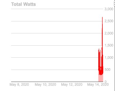
Hmmm, somethings wrong with my setup? I removed the graph and created a new one, but I'm getting results I don't understand.
Time is 8:40pm but the horizontal axis stops at 6pm. I know there's no data on a new graph, but I'm curious about the data starting at 12pm, and then spanning to 12pm again, and the ending at 6pm.
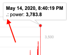
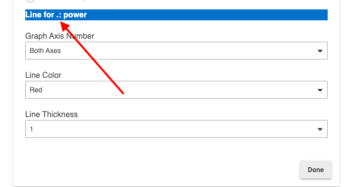
Previous build I was using 0.3 didn't have the device name included. How do I remove that? I changed the custom device names to simply a period so that they wouldn't show on my dashboard. So that's why it's showing as .: in HubiGraph, but in 0.3 I don't have that.
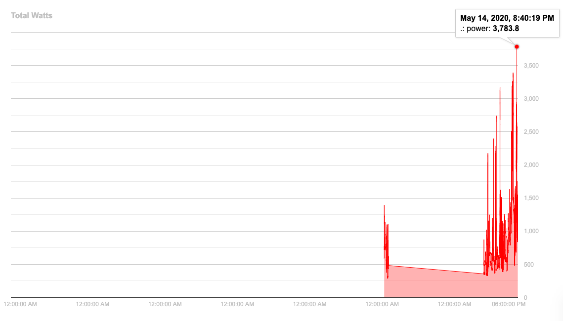
And my question about the data when I rollover the graph. Is there's something I can comment out to remove this undesired text?
version 0.3
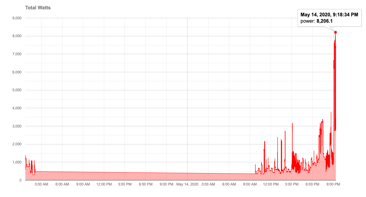
version 0.9
Maybe I'm just not setting it up right, but I cannot get the numbers to display on both axis.
Thanks for all your attention to this. I'm not in a rush for a fix, or actually even in need. Version 0.3 is serving me quite well. I'd like the new features, but I'm certainly not chomping at the bit ![]()

