So, I want minimal traffic, minimal repetitive data, but useful graphs.
Here, I am trying to graph the watts consumed on certain plugs on a Greenwave PowerNode 6.
It is configured to only report when power consumption changes by 10% or more.
The problem with this is that the resulting line graphs are wacky - the stereo was turned off at 11pm, and left off until 10am. The resulting graph makes a ramp from zero watts at 11pm up to full power at 10am. There seems no way to get Hubigraphs to NOT create this ramp. If I use a bar graph, it shows a single bar when a device is first turned on, but never shows when it is turned off.
Is there any way to provision it for these data points that assume a knowledge of a stable value of the LAST reading until the next?
Yes; first, though in the future, send support requests to the HubiGraph thread. I saw this just by chance.
What you are interested in is a Time Graph. Settings: Line or Area. Enable the “drop-line” option and give it a value. This will “drop the line to zero” after a certain amount of time.
All that being said; I found an issue in initial installation where the "drop-line" was not available. Please update your install of Hubigraphs and try again.
Re-reading your post I think you want a step-graph. Let me look into it...
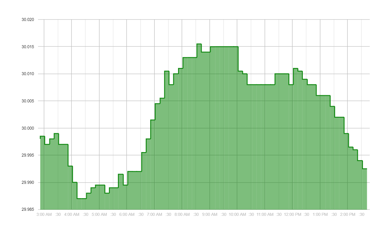
@james.fischer, okay... I got things squared away. In version 3.25 (released today) of HubiGraphs there is a new option in the Time Graph -- Stepped Graph. I believe it will accomplish what you want. See below. Is this what you are looking for?
If the top left of a step up or bottom left of a step down are the new data points, and the prior data points are previous top left of a prior step up or the previous bottom left of a prior step down, then that is exactly what is needed to show the "only report when a value change is detected" dataset.
I am sorry to take up some of your Saturday with this level of nonsense, but I am impressed!
Yep; that is what the graph is doing. It actually took me about 15 minutes to implement. Google charts supports “Area Step Graphs” and I just needed to add the options and test. Where I’m at, COVID is forcing quarantine and supporting HubiGraphs is a “free” solution to my automation addiction. Next project: Hourly Forecast Tile.