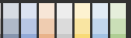
I was typing pretty much the same thing as this feature request from 2019. I too have recently joined the multiple hub club and if the hubs each had a different pale color background it would make it easily obvious which hub you are interacting with. I would suggest a limited palette of pale colors that wouldn't interfere with the usability of the interface but would make it so much easier for us mortals trying to keep everything straight.
Nice light colors like this available as a drop down or color picker on the Settings page would be sweet.
In the meantime, you may be interested in the Chrome plugin DarkReader, which allows you to at least toggle between Dark and Light themes for different sites. Different colour schemes, and in particular a built-in feature would be even better.
Good tip. But, I'm part of the Apple Cult and can't live without Safari. Sad, but kinda true.
Interesting seems that Dark Reader is available for Safari for a mere $5. Hmmmm. Free for Chrome, $5 for Safari. The Apple tax in full effect. Thanks @sburke781
Perhaps we could have Jack Nicholson appear in the top-right corner of the web page when accessing certain hubs, rather than different colours, i.e. the original request be asked for here...
It's a common option in other utilities like SQL Management Studio to colour the tabs differently depending on the server you are connected to. Allows you to provide a much more "in-your-face" indication you are working with a Production system verses a test / dev system.
Yeah, that's where my head was at, if you can identify a third-party solution you (Hubitat) are comfortable with and are happy to "support", in the sense of providing assistance to users, then that is likely the best solution. Ideally though, you would want one available for those "other people" who use that "other" operating system