I started the painful process of moving from SmartThings to HE last week. This is going to take some time to move 115 devices and recreate 145 rules. I read here that it will be worth it...
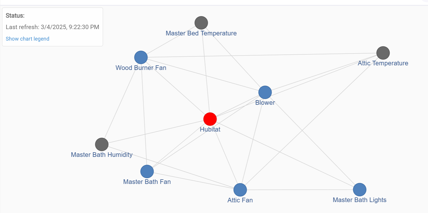
There are some nice features here that don't exist in SmartThings such as the device graph.
Can someone explain what this means and how to read this? I've only moved a small number of devices, but this might be helpful to understand this now before there are 115 devices on the graph.
The legend explains what the colors are which is kind of obvious. What I'm interested in is what the routing is telling me. (Maybe nothing)... These are the first few devices that I would expect to hop directly to the hub.(Because they are close). I'm guessing this is telling me the "alternate" routes that "could" be available...??
This is just the beginning of moving over 100 devices from ST. I hope it stays that way. Those were the closest and easiest, so we'll see how it progresses!!!
One of the things that had me confused and probably still does is master bath lights and master bath fan are two separate wall switches in a two-gang box which are literally a half an inch apart but don't seem to directly talk to each other.