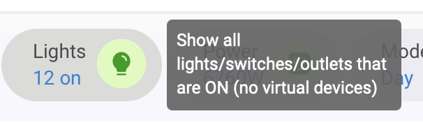
I'm sure this will be a bit contentious but why have we got these shortcuts on the Home Screen for Climate, Lights, Power? If it were Apple Home they might be useful as they're accurate but they are so far from accurate in Hubitat that an option to remove them would be good.
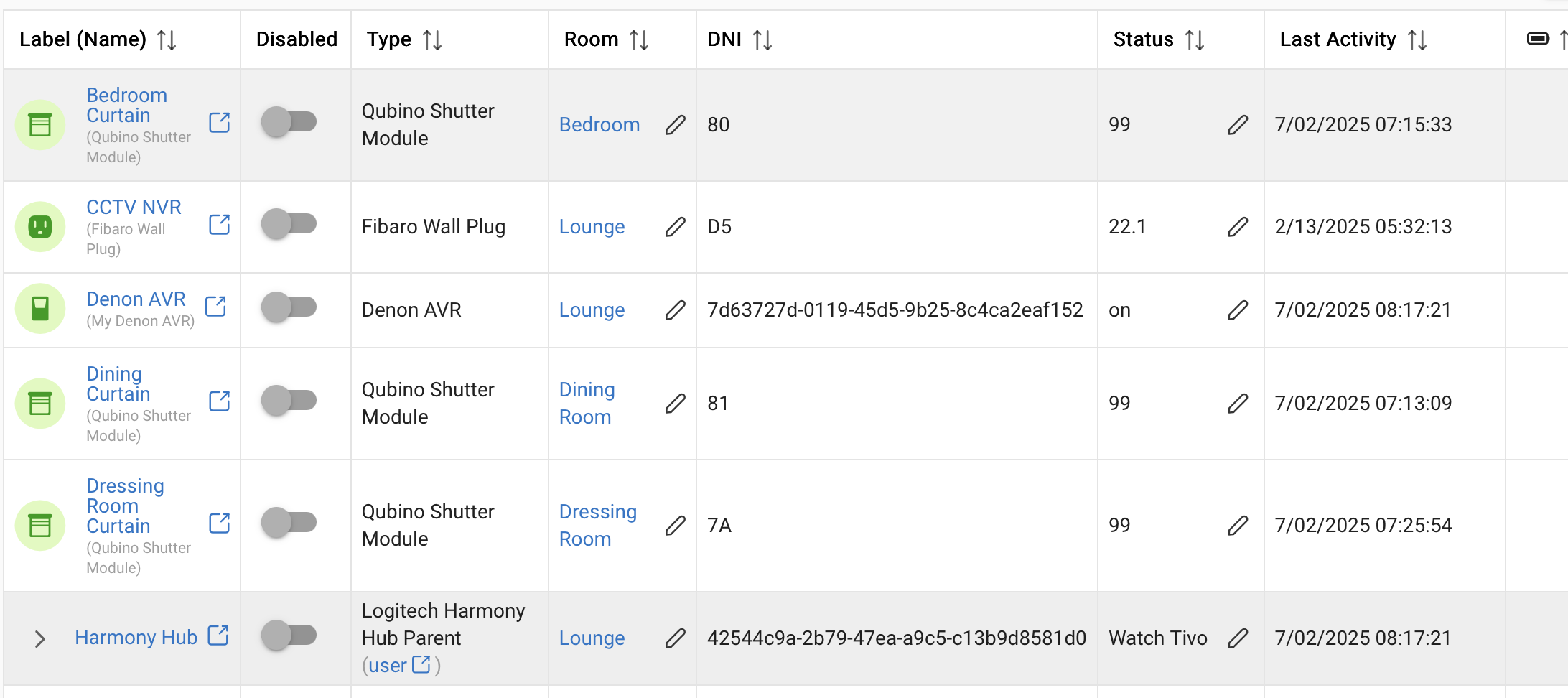
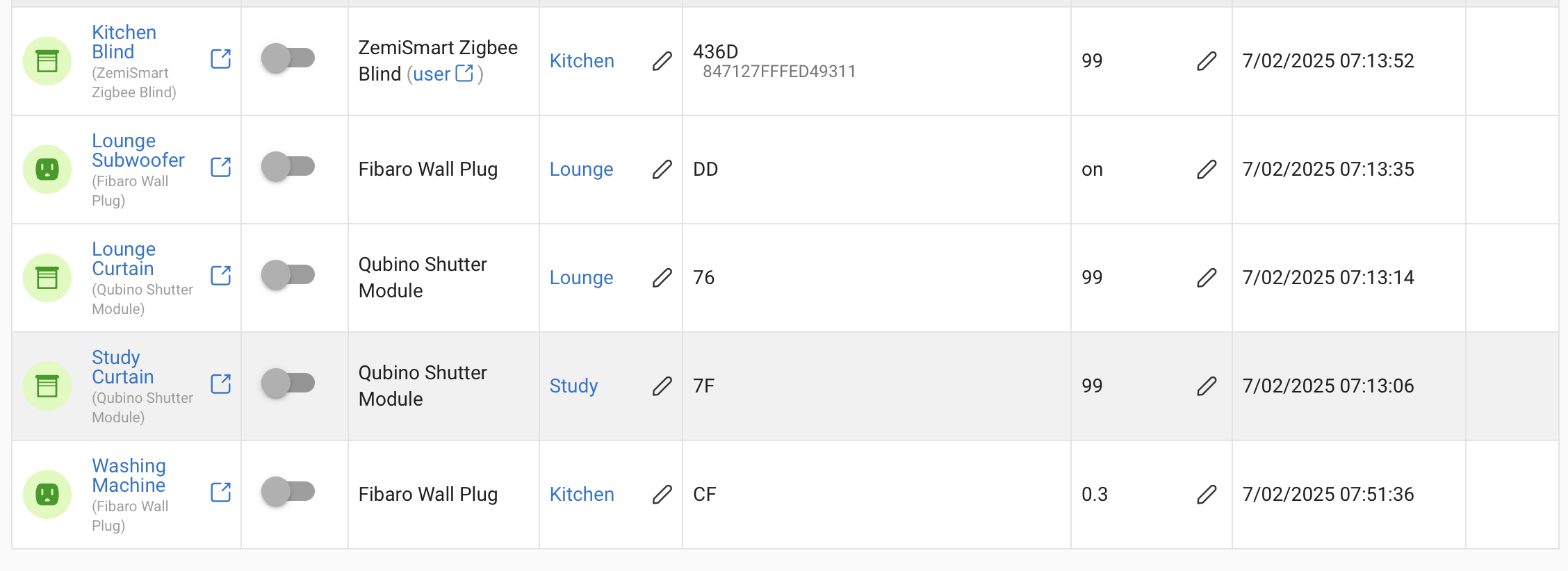
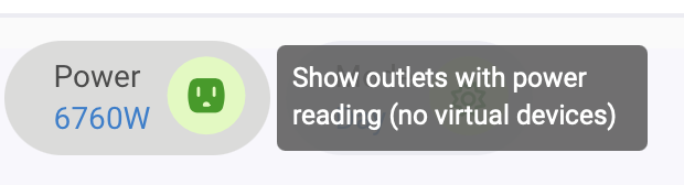
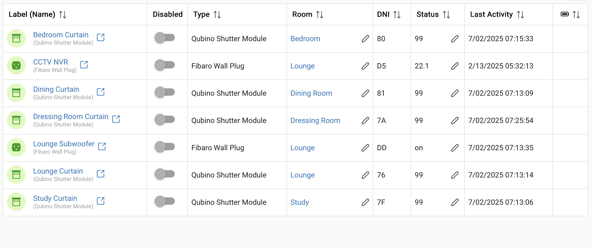
6.76 Kilowatts? Nope. From that list just the 22.1 watts from the CCTV NVR (Fibaro outlet) plus a bit from the subwoofer. It's incorrectly picked up peak power (historical) not actual power from shutter modules that are at 0 watts as they're not moving. The one thing it doesn't show is the reading from my Home Energy Monitor which would be accurate.
Yes some sort of setting to tick the devices to be included; that is assuming that it's reporting the specific attribute. Joe Page's HD+ for Android doesn't total power readings or anything like that, but does at least give an accurate number count. For instance on my dashboards, I've a folder for lights and one for outlets. The folders are badged with a count of what's on. Currently I see nothing for lights as there are non on and '2' for sockets/outlets which is also correct as the CCTV NVR outlet and Washing machine outlet are permanently on.
Ultimately I don't need those summary icons on the home page so I should really shut up, but I just keep thinking better to not have something visible at all than show inaccurate information.
+1 on useless as it is now and +1 for a switch to get rid of it until it actually works
Pretty much everything about the home screen is a mess and not worth the storage space in code it brings to the table. The rooms part is a total mess on how it's displayed when all tiles are open, how the heck can you even think this is nice looking. Each room should be a single line and expands the devices under it's room title. No messy tiles that expand next to each other and it becomes a chaos of tiles that even non OCD people want to through up on.
Even if I'm not really that keen on Apple tiles, at least the home app got that part right and someone should get inspired of it for the home screen!
Then the worst part is that when you open a tile, you can't even control the devices like lights, it's just a indication of it's status with a link to the device!!! At least make them controllable so that this page actually has a purpose in life.