General Questions About Dashboard

I find that the template customization is troublesome. When I want to select custom colors for a given state of a given device, the default colors are not listed in the color palette - the only way to see them again is to "remove" the custom color, but what if I want to use the default color for my custom setup? The "save" button doesn't seem to work at all. I can't seem to select "white" as a color for either the background color or the text.

When I create a dashboard and later decide that I want to customize the columns, the existing dashboard buttons don't auto-sort back into the newer number of columns. For example, based on how the dashboard looks on my iPhone, I have determined that I want column width to be 175, with 2 columns, height of 150-200, with 16 font, icon size 45. But I have to create the dashboard first before I can create those settings... and then once I do, I have to manually resort the buttons if, for example, they create 3 columns and I only wanted 2.

When adding a button, I'm not clear on why it prompts me to add a specific template. If it knows that the device is, say, a switch, shouldn't it for example, automatically add the switch template by default?

Is there a way to create "smart" dashboards that will add all devices of a given type, or with a given name?

Can Dashboards automatically sort devices (the ones added manually) based on alphabetical order or some other criteria, and fill in holes left by deleted buttons?

Is there a way to delete or rename dashboards?

Go to App > Dashboards > Select the dash to be remove > Delete button bottom, rename there as well.

No, sorry you have to do it.

Not necessarily. I have a dash that is just for battery reading. So all my contacts and motion sensor and such are on it, but they all use the "battery" template, not the "default"

Nothing in Dashes auto sort (thankfully) you put things were you want them. Color changes can be made in the templates or as Custom CSS. I do not fully understand you height issue, but you can change them when ever you want, but yes you have to reorganize as needed.

Some of you "view" issue might be view port relate not design related. See this post I just answered about view port sizing.

Also know you can make size adjustments to fonts and such in CSS if needed. This dash colxrow 60x22.

Thanks! Now I'm able to delete/rename, what a relief!

I'm trying to create Dashboards that look usable from my iPhone. As best as I can figure, the only way to do this that doesn't involve manually resorting tiles into 2 columns is to make the Dashboard on my iPhone App itself, that way they automatically sort into 2 columns.

I still don't fully understand the color change controls. I've used them, but they are cumbersome - the "save" button doesn't seem to work, I can't see the default colors in the color palette, and I find myself having to make several redos to get the combination of color/background color that I want. Is there a more detailed tutorial on making color changes? I only saw the basic one about dashboards on the hubitat page.

I do not create any dashboards on my mobile devices (that would drive me mad). Check out the post I linked to. Your talking about setting screen width which can be done with CSS entries or using smartly which has must entries pre-done. I like my cell dash 3x, but we have a built in option for 2x.

Not sure what you mean the "save button does not work". I use to set colors via templates until I learned CSS which allows much more customization to each tile, not every tile of a type. If using templates, be sure that the numbers change at the bottom. Sometimes I find click to somewhere I do not want to use, and then clicking where I do want to use, helps tell HE what I want.

As for CSS you can target each tile using

#tile-0 {
background-color: rgba(90, 70, 50, 0.99) !important;
}

As for learning CSS I have learned a lot from this thread.
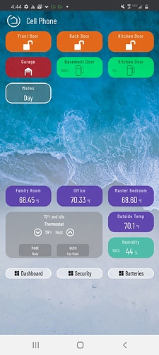
If you have multiple users in the household, do you give everyone the same userid and password login to access the dashboards, or is there a way (and/or a rationale) to have multiple users if you want to create one set of dashboards by default for each of them?

Also, how do you get dashboards to appear in landscape mode for iPads? The only way I could accomplish this is to open a browser and access my dashboard that way. Otherwise, if I use the App, the Dashboard stays in portrait mode even when I place the iPad in landscape mode.

I use separate users for notification purposes, but I do not lock down the app or access to the hub (personal choice). Using the HE app you cannot set any dashboard as a "default" in it also open to the menu.

If you use a browser you can set a link to just that dash, not link to another dash (and disable the home button, in options), and Presto each users has a separate "default" dash.

This happens by default on both my 12.x iPad and the 13.x iPad. Everything shows in landscape on my mounted iPad all the time (even though I only use the app on the iPad for inclusions). Maybe check your rotation settings.