On small screens several things seem to be no longer "optimized". Namely the logo in the upper left.
1 Like

I've got the Community "installed" as a Chrome app on my Android phone (Pixel 2XL) and the logo looks fine.
The word "Documentation" is too long and is squeezing the logo. There was a different link in the past that has been swapped for the docs link. I removed the link from small screens, so it should look better now.
1 Like
Who needs documentation anyway... ![]()
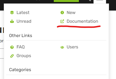
....everyone! So If you need to access the documentation from a small screen.... it's now here >>
1 Like
Yeah, I need to work on my tongue-in-cheek comments ![]() Don't tell Robert I said no-one needs documentation
Don't tell Robert I said no-one needs documentation ![]()
2 Likes
Oh they need it, but they don't read it... ![]()
1 Like
Me included more times than I should... But back to the original issue of the mobile display.... what was the issue that was originally reported... ![]()
Thanks for keeping this just between us...
1 Like
This topic was automatically closed 30 days after the last reply. New replies are no longer allowed.

