Hi,
I noticed that the new UI on a phone looks generally better than the old one. However, once i started actually trying to get stuff done, it quickly makes it obvious that there is way more whitespace, empty space.
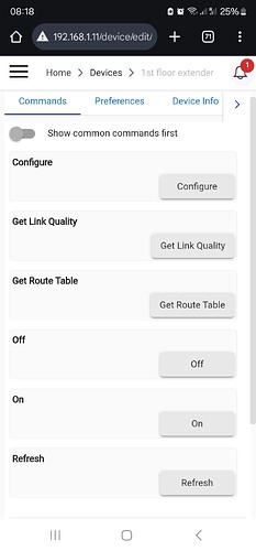
One such place is the device page. I don't see the need for sections for each action with most of the time a lot of whitespace and only a single button. And than in that section it does not show the current value.
I would suggest to:
either drop the sections and only make one that holds all the actions (buttons)
or, keep the sections, but add all the info in the section.
Here's how it looks for me:


