I’ve been using InfluxDB with Grafana - works good for what I need and local (running on a rPi right now but may move it to a Docker container on the NAS).
2 Likes
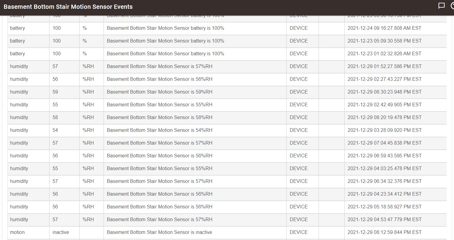
What about the Events in the device's settings page? It isn't a graph, but it does record whatever events are received. You can set events to whatever limit your heart desires, between 1-2000 events, then go back through history in that events log. See below.
To me, the million dollar question, what problem with humidity are you trying to solve? Simply graphing it certainly isn't fixing the problem. Do you plan on ventilation, running a humidifier, or what? And if so, why isn't it good enough to just automate it and forget it? Who has time to study graphs all the time? Just let the various rule apps handle this.
You could even use a variable for storage of a certain threshold number. You could act on that variable to do something (not sure what your something is?). Record the level that is too high, send an alert, turn on a switch, blink a light, or so on.
Don't take this as I don't want graphs, it would be a nice enhancement. But I don't think the graphs are what you really need here.
2 Likes
To be clear, and as demonstrated by @neonturbo, Hubitat absolutely records humidity over time. Hubitat's record is only limited by the number of events the desired humidity sensor device has been configured to retain in Hubitat's database.
The more relevant questions are whether you're prepared to accept the solutions offered to you to plot the data recorded by Hubitat, or if you have the skills to create your own bespoke plotting solution. Apparently, the answer to both those questions is no.
1 Like
Others will be able to help more than I can with this, but I believe Hubitat looks for an NTP server for time sync at every boot. There are workarounds, but I think this is the biggest obstacle to a completely offline installation.
Regarding graphing, I also believe HE can append sensor values and timestamps to a text file. From that point it should be trivial to plot the data in excel or similar program.
Looks for it, doesn’t require it and can easily be set to any local device that provides the service if desired.
Slight correction. NNTP = network news transport protocol (i.e. the protocol underlying the Usenet backbone). Hubitat looks for an NTP server (NTP = network time protocol).
And as @thebearmay indicates, that is easily set to a local device.
3 Likes
That’s up to you. If you’re going to beat a dead horse, try to at least stay on topic. This thread is about graphing.
2 Likes
Well well, at least you owned up to being the Overlord tonight.
The Thread is one thing, the most recent post we're commenting on had A LOT more in it.
Update (Warning OFF TOPIC) -
I just discovered how easy the IGNORE USER feature is to use in the forum settings.
I recommend it, even for me.
Anyone can flag a post for being off topic. Your opinions on HPM (which I use and am a huge fan of) aren’t relevant to this thread.
3 Likes
Graphing/trending can be a very powerful tool for troubleshooting or identifying the source of a problem. For example, trending indoor humidity vs. outdoor temperature and observation of condensation on my windows could allow me to see patterns in the data that aren't readily discerned by looking at tabulated numbers. The human brain excels at pattern recognition, and using graphical representations of data can be very helpful. And I think we've established that there are multiple ways to get graphs and that they are indeed helpful, although we may disagree on whether or not the level of effort required is satisfactory. That's a matter of personal preference and there is no right or wrong answer.
4 Likes
In your case you have to take the time to watch a dashboard. You have to watch for abnormalities, and hope that the pattern or trend is apparent, or that you are even home to do something about it other than to say yep, that graph looks wrong.
With my alternative method, you set up Rule Machine to catch every time that humidity exceeds 80 percent, and sends an alert to your phone while simultaneously turning on the dehumidifier.
Which one is more helpful, and which one is the hub built do do?
Edit: mean this as a discussion of methods, not that we shouldn't have a nice looking UI that can do neat tricks.
1 Like
I think where @dylan.c is heading @neonturbo, or at least I think he is..... is that while charts can provide a user visible "alerts", albeit manual, they could also inform the creation of rules based on trends that can be presented in a chart. I work in data / analytics myself and so can appreciate the value in not only having a chart for on the spot decisions, but also as an analysis tool to help people discover problems or opportunities.
4 Likes
That said, while visualisations of our data are useful (imho), the best tool and the likelihood of it being available in HE are two (three?) different things.
I think we need to accept that we can have a constructive conversation about the pro's and con's for including charts in HE, but in the end if Hubitat don't see it as part of their product, then we have to accept that.
While I would like some basic charting, I can accept it if Hubitat want to focus on automations. A company with a vision and drive to see that through, while being flexible enough to introduce new ideas or opportunities has my vote, even if I would prefer to see additional features.
4 Likes
Thank you for this information. I did not know the event log was there. I thought I had to create a dashboard to see the results. This is quite helpful.
To your question - I am not trying to solve a problem. I am trying to determine if there is a problem to solve.
I agree with your thoughts on automating things, and have done exactly that with another hub where there is a known issue - when the humidity gets over 51%, turn on dehumidifier, and turn it off when it gets to 49%. This works wonderfully, But HVAC work and it's associated electrical are expensive. I would prefer not to embark on such unless there is an actual issue. So I have installed a monitor and will review the humidity levels over time in a certain area. I would prefer to review in a graph, but that will apparently not be possible in native Hubitat.
1 Like
Case in point,
I woke up today and looked at the greenhouse temp data from @bptworld Bryan's Ave Plus App
- weeklyHigh : 90.7
- weeklyLow : 15.9
Of course this is not all I'd like to know (the average extremes) I'd also like to get a sense of the transitions, when, and how quickly it arrives at those extremes, how long the temps dwell above/below certain levels... i.e. what the full CYCLE (averaged or not) LOOKS LIKE in a GRAPH so I can make some informed decisions. Those decisions would be more empirical than analytical, no first or second derivatives required.
I post this today because I am remembering this discussion. Seeing my weekly winter time greenhouse temperature range surprised me ...and is very informative to get a sense of things. Notifications or actions aren't even required for it to be so. (Of course in the summer I trigger a fan off set points.)
To me the information offered, in just a couple of simple averages, suggests that graphing in HE doesn't have to be data intensive for it to be useful, nor does it have to offer full blown statistical analysis.
Harping on this because it REALLY is something (a dashboard attribute?) that should be a feature of HE, even if it's limited in data points.
Hubigraph was the proof-in-concept if not the PROTOTYPING;
....maybe in a C9 with expanded storage and horsepower ?
1 Like
I would happily pay more for a hub to support charting. Having to need yet another device to be able to produce a simple chart seems nuts.
4 Likes
I also ported over this app for the Initial State Service which I use, but the code could very very easily be modified to push the data Anywhere you wish.
2 Likes
beautiful. how?
/ probably above me
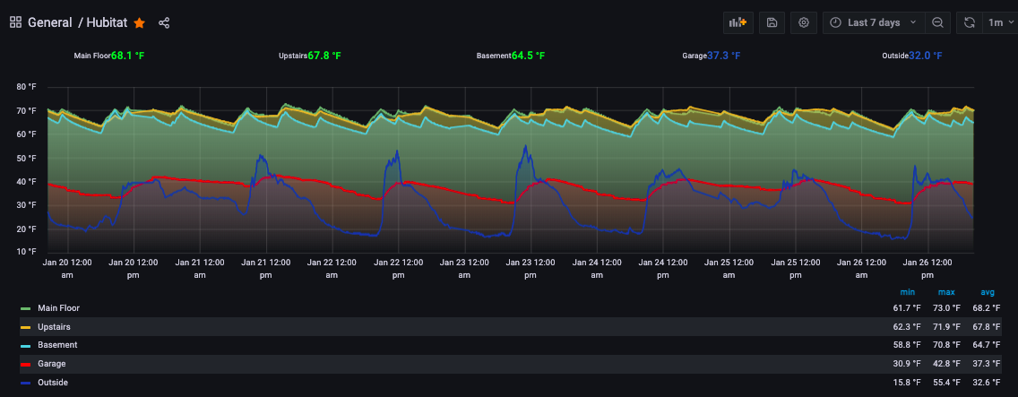
This was created using Grafana which is pulling data from an InfluxDB database. The InfluxDB gets its data from the Hubitat integration within Home Assistant. Grafana and InfluxDB are also running as addons in Home Assistant. I have to say that I agree with @mavrrick58 that the Hubitat Hub is a HA engine, and isn't a tool for analytics and graphs. Even if you expand the storage and horsepower, it still isn't the right tool.
4 Likes

