I am a new to Hubitat, I am coming from ST and Action Tiles. Action Tiles has mobile optimization which collapses and expands the tile set based on presentation. Am I missing a step here? Every time I turn the dashboard on Hubitat, it just sits there whereas Action Tiles goes with your movement?
1 Like
You will have to explain that to me as I have never used Action Tiles. But what I think you are asking is: Does the Hubitat Dashboard auto-resize or fit to width?
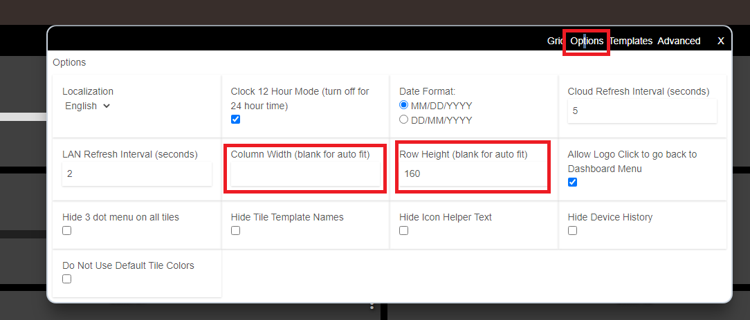
If that is what you want, then yes you can make it do that. Go to the Gear icon in each Dashboard.
- I typically set the columns to 2-3 most of the time. That is the "grid" section that comes up first.
- In the next tab over, "options" I usually leave the row height to something that makes me happy, and let the width auto size. That will make it fit to width, but you will have to scroll vertically.
- You can do auto resize for both, but I sometimes find that it does odd things on some devices so I prefer the scrolling.
My other advice is there are alternative dashboards that you might want to check out. Smartly is one, and probably the most full-featured, but there are others too. Smartly does a lot better job resizing for multiple devices.
2 Likes
What you're seeing on AT is the animation they build in to show the active wrapping of tiles. It's flashy especially when you rotate your device or change the size of your browser, where, you'd also see the tile sizes change slightly. This would be called 'column-snapping' and could be considered mobile optimization.
Note: These screenshots show the 'Force 2 Column' calibration for the iPhone 11. The default for that device width would show 3 columns wide.
Absolute vs Float Left
AT dashboards aren't absolute grid based (place a tile anywhere) like they are in HE. Instead they are left float based, similar to how ST shows their app tiles. What this means is it'll just wrap your tiles around to the next line once it reaches the right edge of your screen, reacting to how much screen width you have, so you'll never have to scroll right or left BUT there are downsides to that I'll cover below.
|Float Left Alignment (pros and cons)
The benefit to Float Left is that you don't have to scroll right or left, the consequence of this is that depending on how many tiles you have in your first Tileset (group of tiles), once they wrap for mobile or tablet, it could be pages and pages of vertical tiles for that Tileset before arriving at the next set of tiles.
Are your most used tiles easy to access?
Best example is if you let's say have a Tileset (a group) for 15 "Main Floor" tiles as your first group of tiles, then another Tileset for 2 "Master Bedroom" tiles. On a full desktop monitor, you would see all of the tiles on the screen at once. The 10 Main Floor tiles would stretch to the right, maybe wrapping to the second line, and then the next row on the screen would be your 2 Master Bedroom tiles. Very easy access if you wanted to turn the lights on in the Master Bedroom. Heck, easy access for everything but this is on a desktop monitor.
For arguments sake, let's say the first 2-3 tiles for of each Tileset are the ones you use most.
Looking at that same AT Panel on mobile, those 15 Main Floor tiles might now take up 3 vertical pages of space, and to get to your 2 Master Bedroom tiles, you'll have to scroll.. a lot. For this reason, you'd probably need to build multiple Panels (dashboards) in AT for each purpose.
| Absolute Alignment (pros and cons)
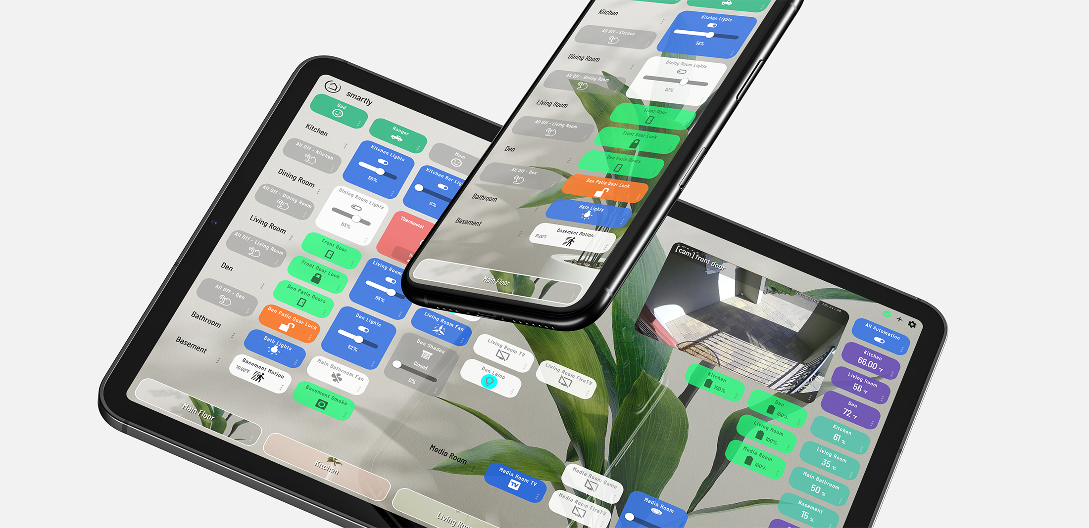
HE uses an absolute grid, so you can position your tiles however you'd like, and when the tiles extend further right than your device has screen width for, it'll allow you to scroll to the right. Using smartly to handle calibration for you, you'd normally build your dash so that the most used and most important tiles are within the first 3 columns (which would be a natural way of doing it.)
When I view on my desktop I have 100% view of everything, on tablet I have 7-8 columns of tiles, on mobile I have 2-4 columns.
So the question is, what is your preference on what happens when your screen width changes, from viewing on your laptop screen vs tablet vs mobile, portrait vs landscape?
- For AT and ST, it'll wrap the tiles to the next row when it runs out of space.
- For HE, it'll extend your tiles to the right.
- For HE with smartly it'll extend your tiles to the right, but will appear app-like by calibrating the dashboard to show x number of columns (an automatic decision based on best legibility).
What's best?
It's entirely up to preference, but my preference is to have the choice to view the same dashboard on multiple devices and rely on my most important tiles in the first few columns.
4 Likes