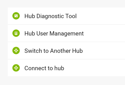
See below. Don't you want both of these screens to have the options in the same order to make documentation easier to create and follow?
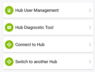
This is the screen that opens up when you tap the hub name from the main screen of the app, and has all your hub details at the top, I cropped to just relevant menu part below the hub details.
The next iOS beta update is in development and will match the current Android Beta. Don't know if the order matters that much, but at least the iOS styling will match Android more closely
I thought the order would be good to have consistent for documentation purposes. Also if users have both types of devices they would have the same experience on both.