Would it be be possible to add some padding in bottom of lists (on Android at least)?
Here is my app list:
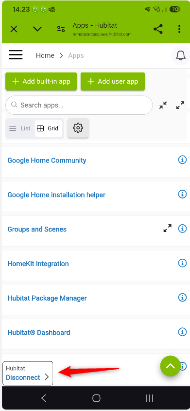
It is very difficult to select 'Rule Machine' that is being hidden behind the 'Hubitat Disconnect' overlay.
Here is my device list:

It is easier to select last device because it is multi line, but it isn't ideal.
Or perhaps move 'Disconnect' to be last element of the menu (when clicking menu-burger icon)? Then the no padding is needed for the different lists.
Please consider ![]()

