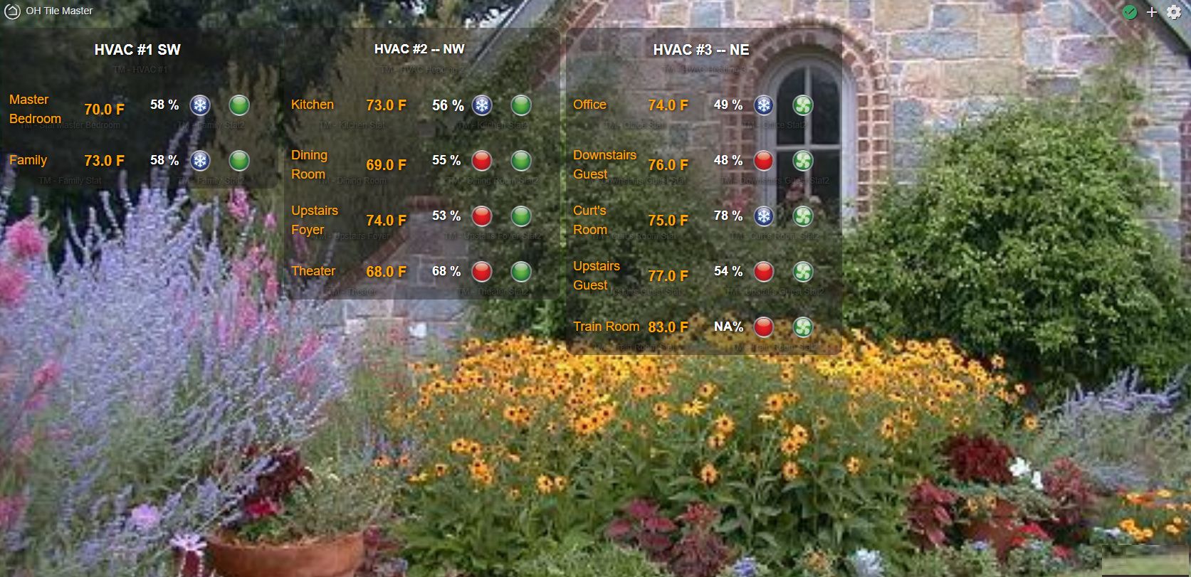
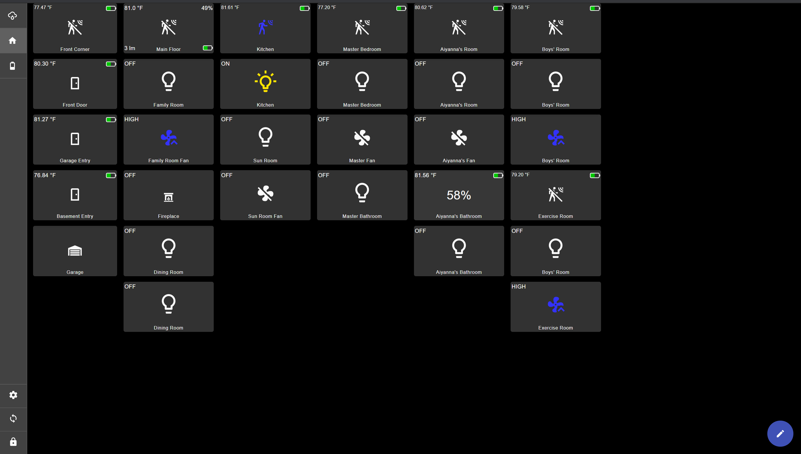
Here is my first project with Tile Master 2 -- Showing the status of 3 HVAC units with 11 control zones.
6 Likes
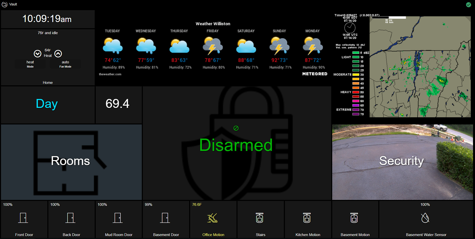
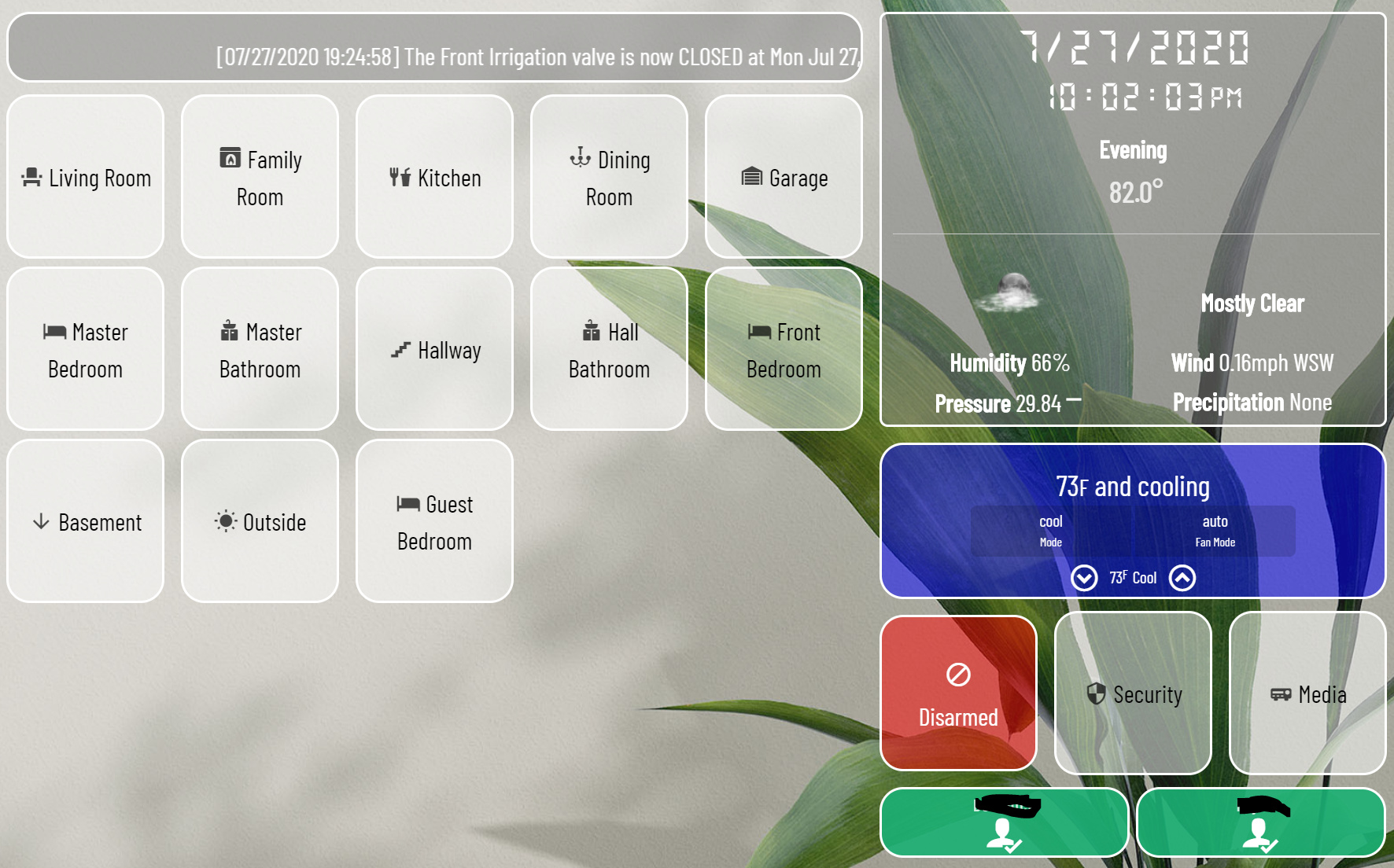
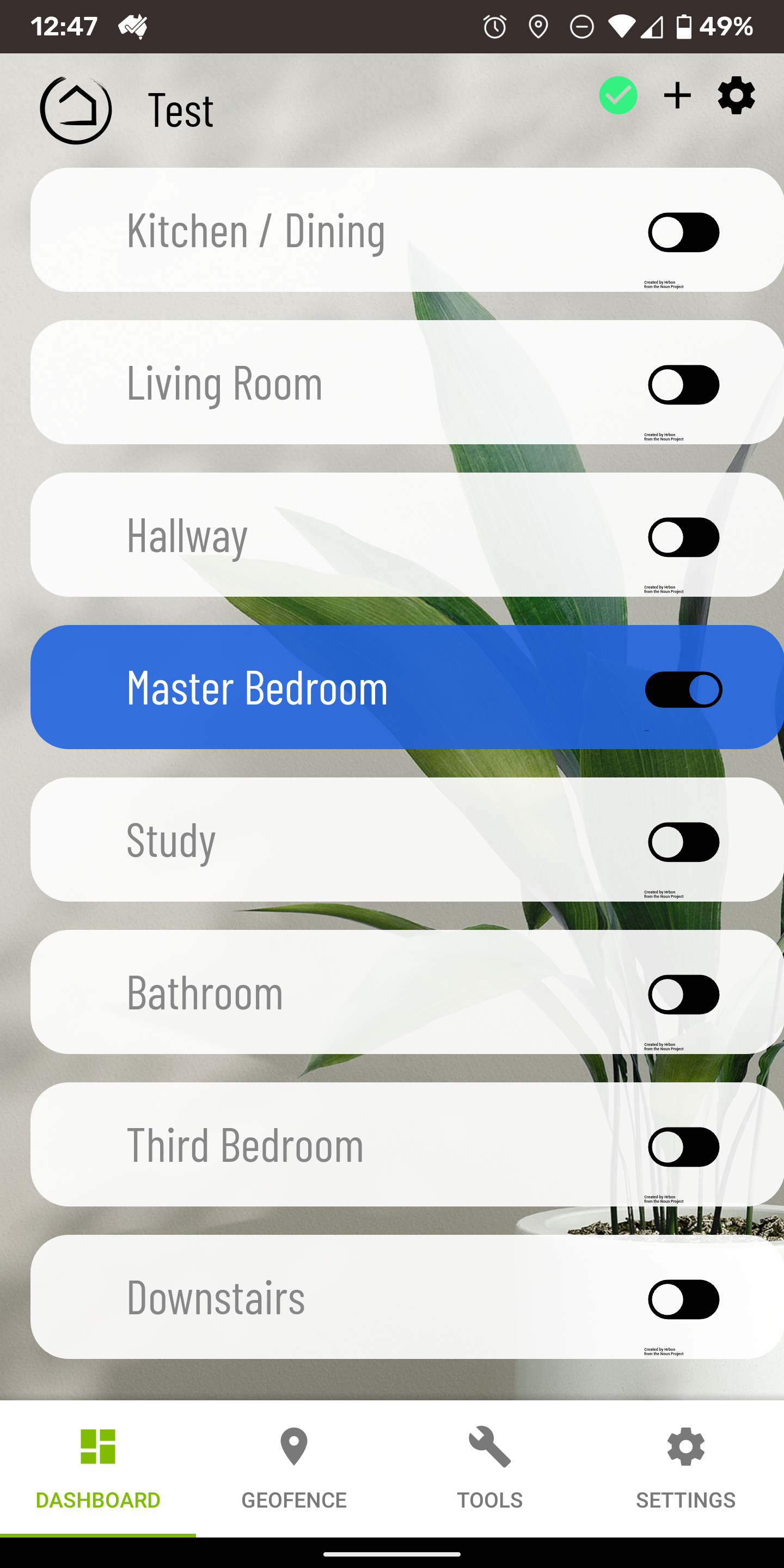
Here's my wife approved main dashboard page. I try to keep it simple so that any guest can look at it and not get overwhelmed. It mostly consists of quick references and alarm control. lighting control is mostly voice controlled but the entire house can be controlled in the rooms page.
it is scaled for a 10" wall mounted Fire HD
3 Likes
Yea... I’m replying on a very old post... But I notice you used a “Refresh” button. Could you share how this works? I have a dashboard that could really use the same...
Thanks!
1 Like
I'm happy to, but my wife was all "why don't you just click the green check mark" so I have since humbly removed it (yes dear!). Figured I would share that before you suffer the same fate 
It WAS a "link" tile that pointed to the Local LAN link for that dash. And here I thought I was being all smart.
If you see any of my new posts you'll see I added code to move those items down to the lower right. On some dashes I remove them all together but like you said this one I want to 'refresh' If you want it I can find and repost (it's posted somewhere in the CSS noob thread), but I can grab it again to. LMK
YES DEAR!! 
Haha! I’m lucky in that my wife pretty much ignores most of the home automation stuff... She just complains when lights turn off in the kitchen while she is working in it... I can’t say that I blame her for that! 
If you can fine the post, that would be awesome, but no rush! I can probably also search for it myself when I’m back home later on today 
Thanks!!!
2 Likes
Sound like you need a motion sensor or two added lol
I don't have to search for it, it's at the top off all the custom CSS right under smartly ![]()
.dashboard div .header{position:fixed;bottom:-1em;right:1em;z-index:999;opacity:.2;zoom:.6;-moz-transform:scale(.6)}
.wrapper{height:100%;margin-top:0;padding-top:1em}
.dashBack,.dashName{display:none}
.dashboard div .header>.flex-auto.justify-end,.dashboard div .header>.flex-auto.justify-end>.flex{display:inline-block}
if you want them vertical remove the 'in-line' at the end leaving just 'block'. I prefer horizontal but to each... enjoy.
gotta give props to my boy @spelcheck he is the mastermind ![]() check out smartly it rocks! (I know you use it @Sebastien just a general statement for the masses.)
check out smartly it rocks! (I know you use it @Sebastien just a general statement for the masses.)
2 Likes
What are you using for the "What Was Said" tile?
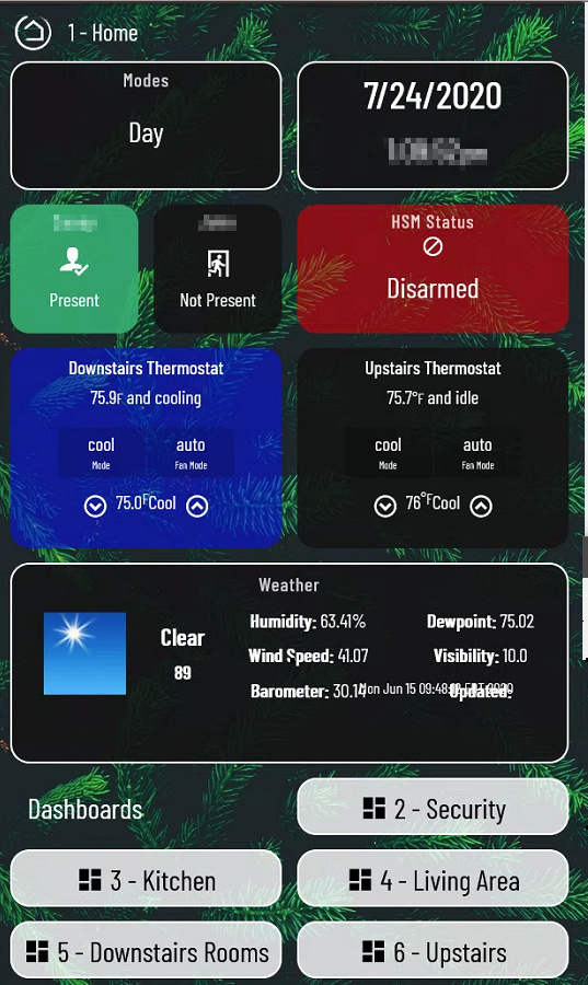
Over the past month or so I installed a wall mounted tablet (Amazon Fire 7 using one of Makes by Mike) and created several dashboards to help control items in each room of the house. Wanted to share one of the dashboards:
Last night I was sitting on the couch and my wife walked over to the tablet, turned off one of the lights and sat down with me and said, having the tablet there is super helpful, it doesn't take long to load and I can control any light in the house.
I was shocked! SAF is high and hopefully I can keep it that way.  Thanks to everyone on this forum for their help and awesome apps/drivers!
3 Likes
Lol mine just bitches when something doesn't work as expected but never says anything positive. The funny thing though when we go over to someone else's house and it doesn't automatically do something ours does she always has this monetary puzzled look on her face like "Um, what do I do now?
6 Likes
It's certainly colourful 
Nice use of your Hubigraph app that's for sure. Good to see the coder eating the dogfood (or whatever the saying is) 
What mount is that ?
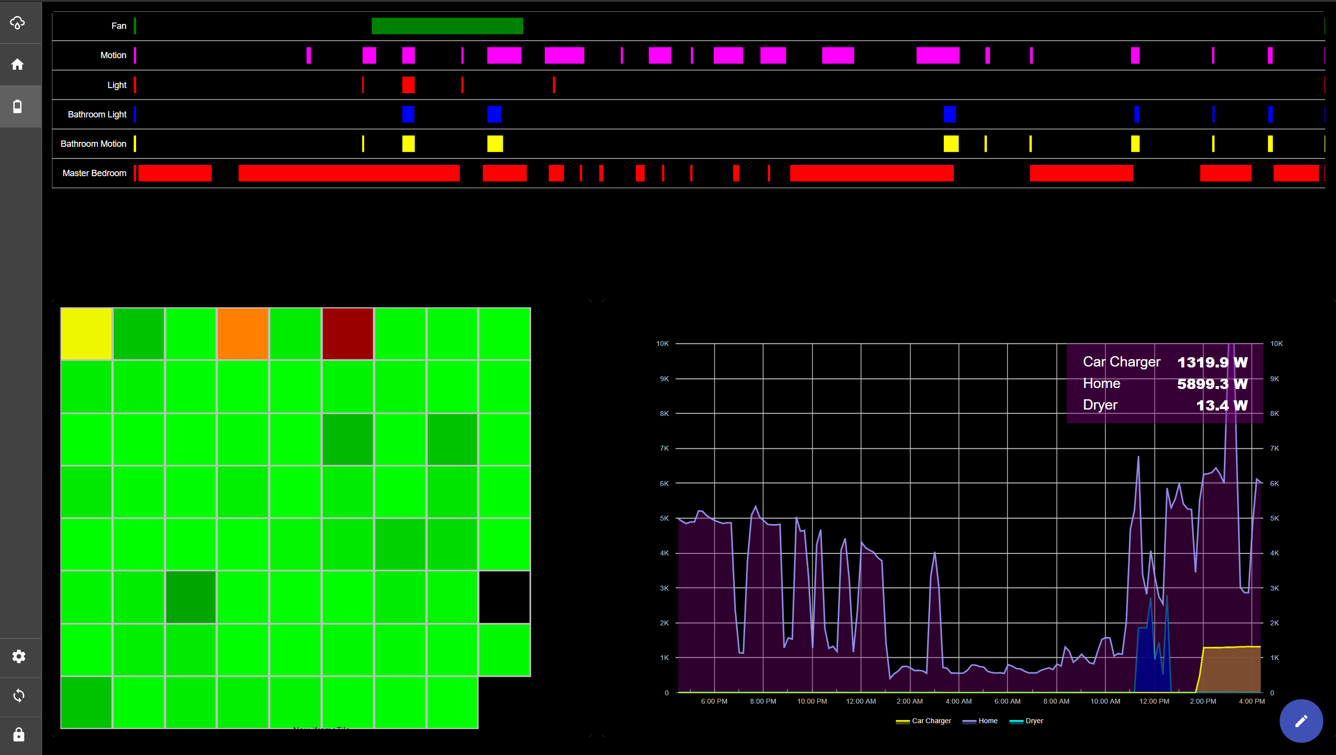
Hey @thomas.c.howard I feel pretty stupid right now, because for the life of me I can't understand how you are create the graph you have for your Fan, Motion, Light, etc. I really like that and want to create something similar. Is it a time graph?
The graph you are interested in is the "Time Line" HubiGraph (not to be confused with "Time Graph"). The other graphs on display are:
-Heat Map (supports gradient heat maps for time-decay or current value) - The above graph is all my "battery" devices and the "last time they reported in". Red is 24 hours+ and black is 48 hours+
-Time Graph (supports line, bar, area, column graphs for displaying data over time)
-Bar Graph (Supports bar/column for current value of data)
1 Like
Thank you! That is what I was getting it confused with, Time Graph & Time Line.
12 Likes
4 Likes
Very nice. If you want "the fine print" removed, send me the NP link and we can get it royalty free with our license.
1 Like
Thanks. I did intend getting in touch. Will finalise what icons I want to use and send you a message. Was just having fun setting it up 
1 Like

