Ahh I totally missed that setting..
No custom css, but I do have smartly loaded that let's you or at least used to let you drag tiles to rearrange them.
Ahh I totally missed that setting..
No custom css, but I do have smartly loaded that let's you or at least used to let you drag tiles to rearrange them.
I'm curious whether people with the advanced version are using overrides much. They have a lot of power but I don't see much discussion on here and I was wondering why that is.
Are they too obscure?
Not very relevant?
Too hard to use?
Something else?
I've added a few that will be in the next version but I'm just guessing what might be useful.
Highlight a column.
Highlight a particular cell based on grid location. Will be of more use with upcoming Multi-Attribute Monitor where cell locations are fixed.
Hide Column Separator
Align columns differently
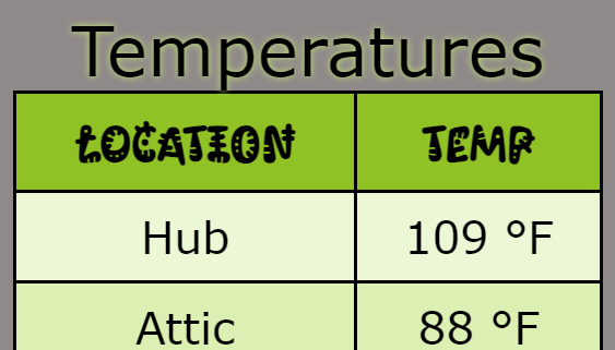
Use a google web font for entire table.
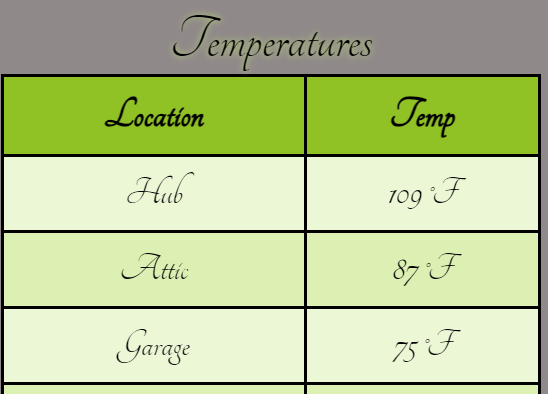
Use a google web font just for the data cells.
Use a web font for just the Header.
Please share your thoughts. If there is something that you think would be a good add to the built-in examples please let me know.
I’m finding left aligned first column with small margin, and right aligned right column with a small amount of padding, works very well.
I still think it would be nice to configure the tile completely within the app, but then have the option to export the css for inclusion directly on the dashboards instead of within the tile. I think this would reduce tile sizes, but by enough for the development effort?
I’m enjoying having the tiles work remotely, so the 1024 limit is key for me.
So many potential CSS settings and a clumsy interface to work with unfortunately.
Each tile can have about 10-20 unique classes, many of which are quite small. The class names are assigned dynamically so that the tiles do not conflict with one another, so you could end up with hundreds of classes in your CSS for one dashboard and that could be quite a mess.
It could be simplified if the dashboard supported JS and the classes could take parameters but I don't see that anytime soon.
That’s fair enough. This app has piqued my interest in css again, I hadn’t really done anything with it for 12 years, so I’ve got a lot to relearn 
I can see column highlight and different column alignment being useful, especially with the multi-attribute tile. Other than that, my dashboards are relatively simple. I tried some of the overrides, but didn't really need them. I tend to just use CSS in the dashboard rather than in the app. I think some of them are cool, though, and if my use cases were different I'd use them.
Here is an interesting effect I stumbled upon.
Using this override.
#Border#=background: radial-gradient(transparent 55%, #90c226 95%)
I'll include it in the next release.
In the next release I'm going to remove the "Highlights" elements from the Style. Too often I've applied a different Style and had my highlight parameters wiped out. I'm sure others have too. I was always a bit borderline on whether to include these or not but after a few months use I think this would be better.
The added advantage of doing it this way is that Multi-Attribute Monitor styles will be 100% compatible with Attribute and Activity Monitor.
Unless I hear something to the contrary before the next release (mid July) that is my go forward plan.
I'm going to be gone for a couple of weeks and my internet access will be limited. There will be periods as long as 48 hours where I have zero internet access so my responses will be shorter and more sporadic.
Multi-Attribute Monitor Update
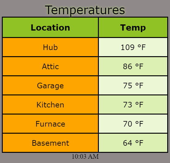
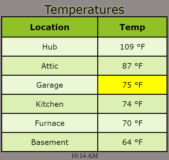
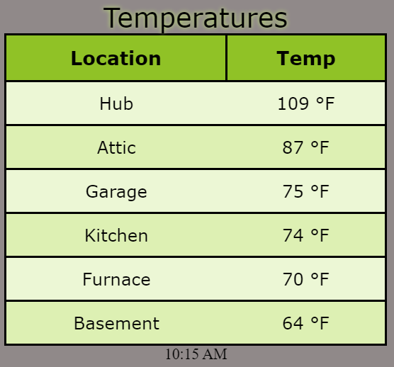
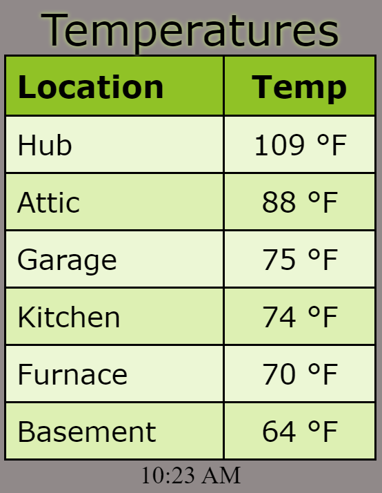
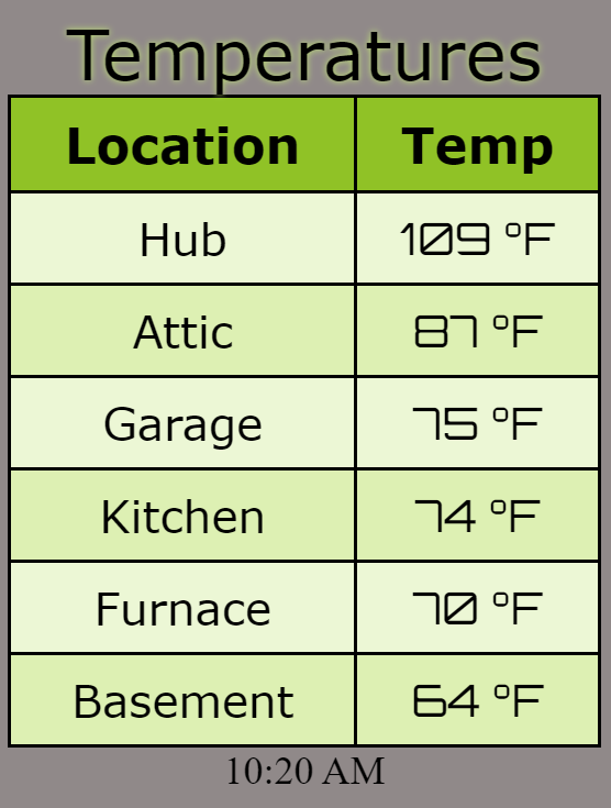
This is coming along really well. I have about 8 items on my todo list before this is complete. My current ETA for full release is mid July. This is my table to monitor my automatic fans as an example (<1,024).
Gauges
Once MAM is released my next module is probably going to be gauge(s). A key design point is to be under the 1,024 byte limit with the option to go beyond that if desired with a bank of gauges (up to 4 I think).
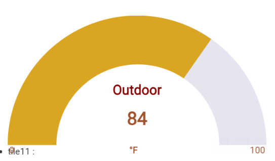
This is an early mockup of mine that just squeaks under the 1,024 mark using CSS.
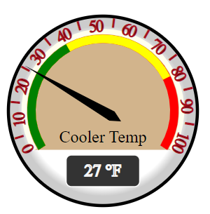
This very attractive gauge was developed by LibraSun entirely in SVG and is also under 1,024 bytes.
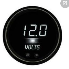
I don't really think of this next example as a pure gauge because the values are digital but it could be quite compact and might allow multiples on a single tile and still be less than < 1,024. This is just a jpg so I'm speculating here.
Anyway, please feel free to discuss or to post other examples of what you would like to see.
I'm wondering if you can cannibalize (and maintain) Hubigraphs. I think tchoward left it to everyone. Perhaps you could take it over and incorporate it,.
You know it's built into webcore now?
Not everyone wants to set up webcore..It's nice having something like that separate.
Seems pretty easy to me, it's a built in app in HE now. You don't have to use webcore rule building ability to use the the graph function. So I don't see how a separate app would be better or require any more setup.
Like I said, personally I'm not interested in loading that up. Hubigraphs on it's own works well for me.
It does feel like a worthwhile thing to have separate to what appears (to an outsider) a broader concept being webcore... Does @bptworld 's chart option not cover HubiGraphs features?
Only to a degree. I don't think it has the variations of gauges.
I took a very quick look at Hubigraph Gauge on my phone this AM and it’s built on Google Charts.
Because gauges are built on spot data they are much easier than graphs. There are three differences that come to mind right away.
#1 is the big one and makes Hubigraphs a non starter, at least for gauges.
I think it depends it on your goals. Please see my earlier response to @rlithgow1 for key differentiators\benefits of TB gauges. Some people won’t care about those, others will think them significant.
One goal behind Tile Builder was to offer a unified experience for building different types of tiles as well as handling those tiles on the backend. Although you have only seen tabular data so far my plans go well beyond that.
If someone were writing a device driver today and wish to present tabular data on the dashboard I hope they would opt to leave the latter task to TB rather than recreate the wheel.
There is a lot of fragmentation in this area, id like to simplify that for users that prefer a simpler setup.
So I didn't get to play with this last week while we were on vacation..
I still can't get my tile to take the whole height. 100% or Auto, still looks the same on my dashboard no matter how tall I make the actual tile. I get about 6 lines, and can scroll the table but can't get it any taller.
Download the Hubitat app