O.K. I'll push out a formal update tomorrow.
1 Like
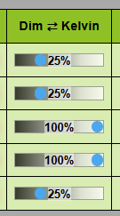
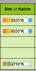
can you screen cap it? I'm missing the visual clues!
Just click on the header text to toggle. The default is Control A/B but as you can see I changed mine.
1 Like
ahha! works like a champ! thank you.
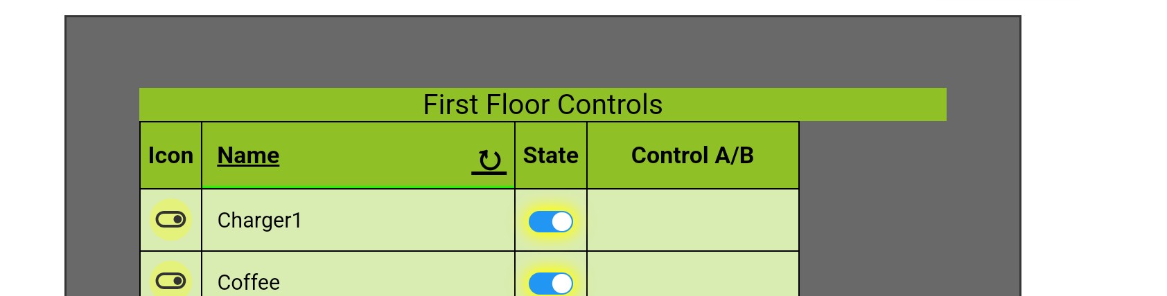
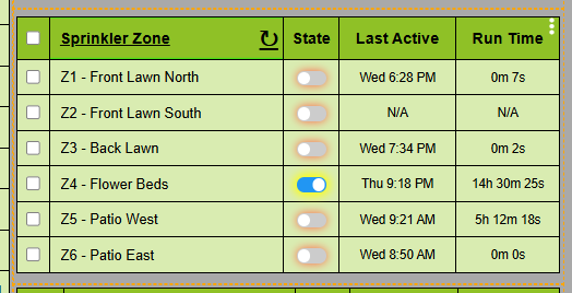
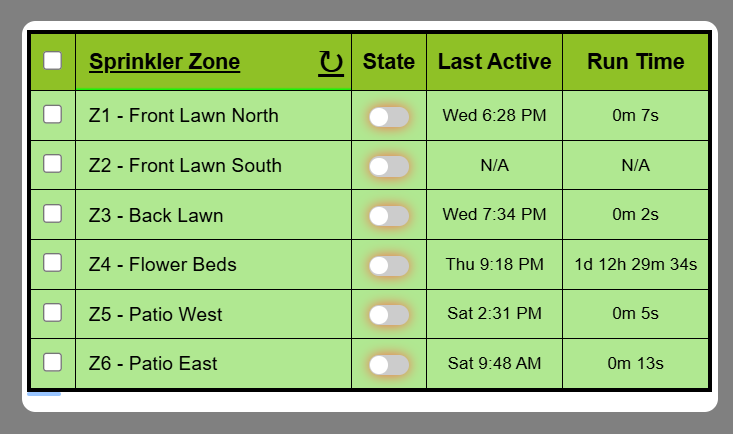
@garyjmilne Setup a new one with 3 lights, a contact sensor and a leak sensor. I marked the contact and leak sensor to only show when open or wet respectively. Yet they are showing all the time.
The filters only apply to unpinned rows. Are your rows pinned.

Was kinda thinking it would hide them totally if so marked. Okay.
I went back and forth on that. Eventually I decided that if someone wanted an item pinned then it should always be visible. Not saying that is right for everyone, that was just what I decided.
3 Likes
Options are good... 
I have a fix for that that will be out later today.
2 Likes
I pushed SmartGrid 3.1.6 to HPM. I was hoping to add a couple of other things, it's close but I need a little more time to test. So this update is purely a fix for the column hiding bug and the sensor text color bug. It is the same code I posted to two days ago at this link.
https://raw.githubusercontent.com/GaryMilne/Hubitat-RemoteBuilder/refs/heads/main/Remote_Builder_SmartGrid%203.1.6.groovy
If you have already updated using an import from this link you do not need to do it again.
2 Likes
Looking Great Gary!
I have to bring up my previous suggestion about a custom sort again.
sure, i can search and replace all devices names to have them listed as:
- Device A
- Device B......
But thats only good up to 5 replacements.
I have been playing around with the code but my kindergarten coding skills dont match up to yours.
I was thinking something like this:
Where a priority (number) is assigned to device number and that allows the rows to be sort in a specific manor.
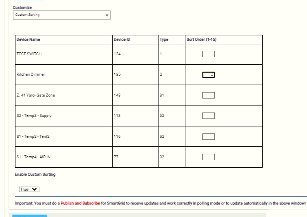
What do you think?
2 Likes
I do like the idea of a custom sort and using the device ID as the key is the right way to do it. I would actually just populate one of the Info fields with this value and use the existing sort mechanism. The hard part is the UI because as you have found it's not a very rich environment for acting independently on a variable number of elements.
I'm going to be gone for a few months so there will be no coding but it gives me time to consider how I would approach this. Once I start thinking about it then a decent solution usually presents itself.
I've made SmartGrid 3.1.8 available at this URL for those that want to try it out:
https://raw.githubusercontent.com/GaryMilne/Hubitat-RemoteBuilder/refs/heads/main/Remote_Builder_SmartGrid.3.1.8.groovy
The updates are small but may slightly affect your dashboard layout if you have it precisely configured. It has not yet gone to HPM.
This update is more exact in how the borders and padding are allocated to make the most of space. You will also find the preview is also more precise. It can still vary by a few pixels depending on your dashboard settings.
I have applied the following CSS to my Dashboard.
[class*='tile-primary']{outline: 1px dashed orange;}
[class*='tile-title']{height:0% !important; visibility:hidden;}
[class*='tile-contents']{width:100% !important; height:100% !important; padding:0px;}
The first line adds the orange dotted border for illustrative purposes.
The second line changes the title to a height of 0%. This lets us reclaim some vertical space.
The third line overrides the defaults of having margin and padding and removes them.
Now it looks like the image below.

Now I have some free space along the bottom so I can move things a little bit by adding some Top Margin (a new setting in 3.1.8) and some vertical padding to better fill the space.
In production I would now remove the dotted orange border.
There is an intentional difference between how the HTML renders between a phone\tablet and a PC so be sure to try things out on all your devices.
2 Likes
But then we would have an extra column :(. If the goal is to make a nice tidy and readable table (for people of all ages) on your phone screen then that extra column will require text to be smaller to fit everything in. Or perhaps a new option to hide the column after sorting, but maintain its sort.
With the most recent version of the code I am able to get the results I want! Very tidy and takes up the exact screen size. I had to play with the padding and also found grid gap size plays a huge roll.
I am noticing a red dotted outline visible on my phone screen only, not on PC.
[class*='tile-primary']{outline: 1px dashed orange;}
has not been added to the CSS. Any ideas?
With the new code I only updated 1 grid and spacing is great. On a PC the preview is close put not the same I get on a publish dashboard. With this version, I did not have to un-comment the //::-webkit-scrollbar {display: none;} line to make the scrollbars to not show on this grid.
I am getting the red dotted outline visible on my PC in preview and on the published dashboard. I sure hope we can get that to go away. On the phone browser it looks great, a little bigger. In the Android Hubitat App in the Dashboard tab the grid is truncated almost a whole line but is scrollable.
I am not going to update any other grids until the dotted line can be removed.
Sorry the red dotted line is a little debugging artifact that I put in there to help best diagnose spacing. I will only show up on devices that report a DPI of 150 or greater so it was for testing phones and tablets. I'm guessing that PC is also a touchscreen?
The offending line is 2091:
.container {max-width:95%; width:100%; margin:10px auto; outline: 2px dotted red;}
Change the 2px to 0px. You then have to compile any grids that have the red line on them to make it go away.
2 Likes
I do think it would be nice to have the dotted lines in the preview.
In the next version the "composer" window will have an outline (shown in white) equivalent to the size you select and it will also be adjusted automatically to account for changes in the margins and padding when selecting different tile sizes. FYI a 2x2 tile (based on 200 wide x 190 tall single tile template) is actually 410 wide and 390 tall.
It's pretty darn close at the default Dashboard tile size of 200px X 190px or proportional multiples or fractions thereof. Shown below is a 3x2 tile.
5 Likes

