It seems like this field is not willing to accept strings (like "flex"), Just numbers
Ah, right. Well, it might be better to use a different property for the bar thickness. Try this new code if you would. Enter a percentage now between 0.0 and 1.0, where 0.0 takes up 0% of the available width, and 1.0 takes up 100% of the available width (bars right next to one another).
https://github.com/lnjustin/QuickCharts/blob/main/BPTWorld.QuickChartChild.groovy
1 Like
The field Bar Width is not taking commas. So no numbers between 0 and 1.
You can enter 1, 2, 3, 4 and so on.
Here is an example with 15:
First and Last bars are not fully shown (works for me) but you might want to change the field description text
This might be a matter of commas vs periods for decimals. Try using a period instead of a comma for a decimal. Like "0.5" for 50%.
Excuse me as English is my second language. I meant it does not accept period (nor commas by the way).
I can copy paste "0.5" but it shows a red line under the number and when it generates the chart it is just like using "1". more or less.
Ah, Whoops. Didn't realize 'number' is really an 'integer' here. Re-defined as a decimal now. Hopefully there's a decimal value that will work for you...otherwise I'm not really sure why the chart is cutting off the first and last bars.....
Now it does receive numbers with period but still 1 is like 1% and 0.5 is like 0.5%.
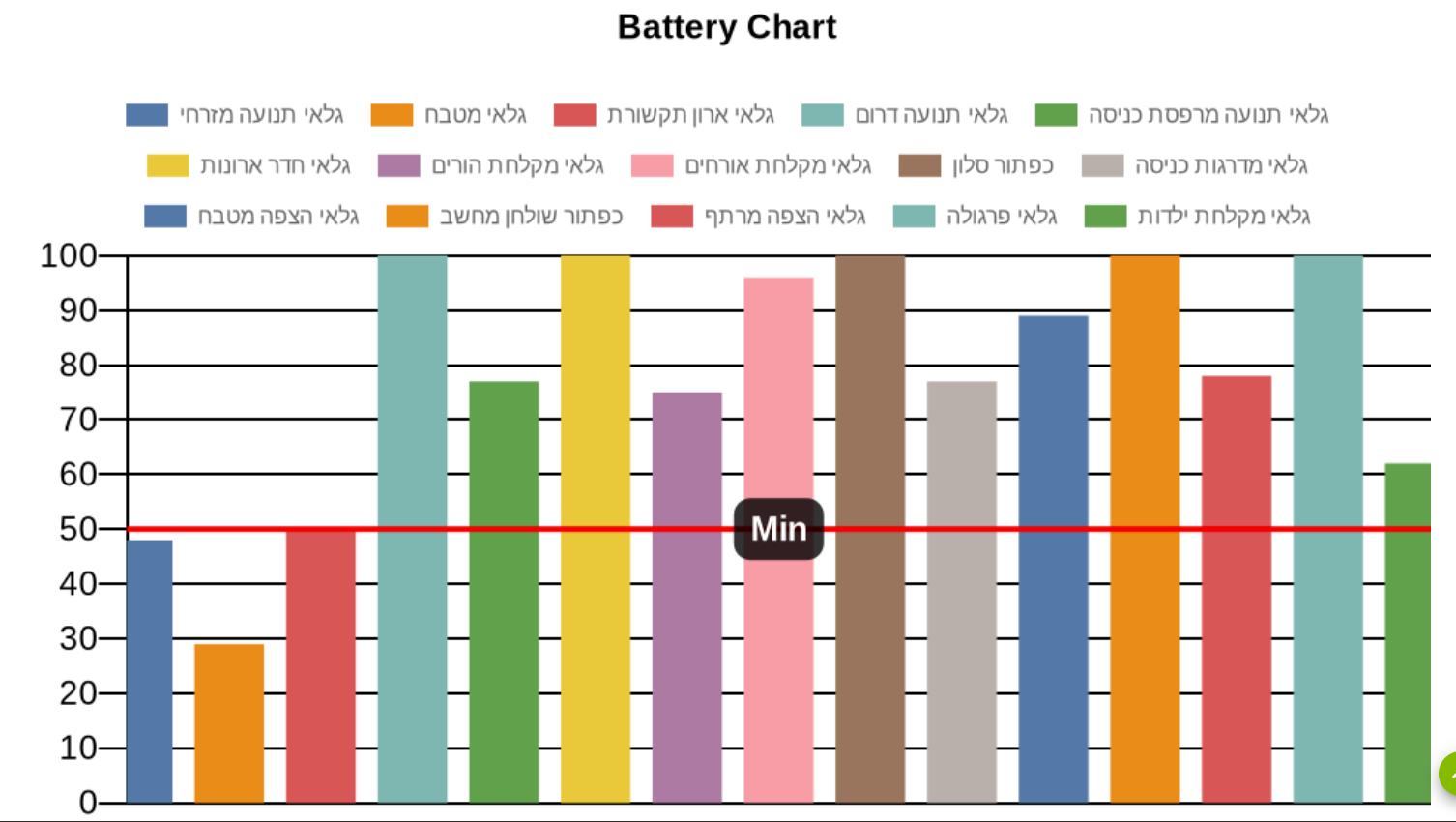
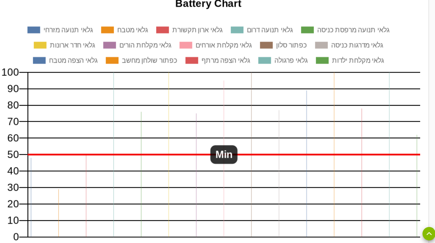
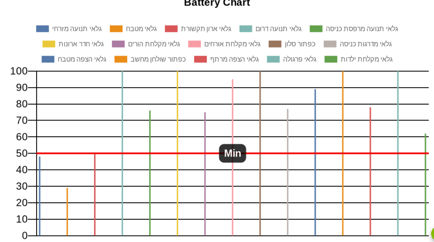
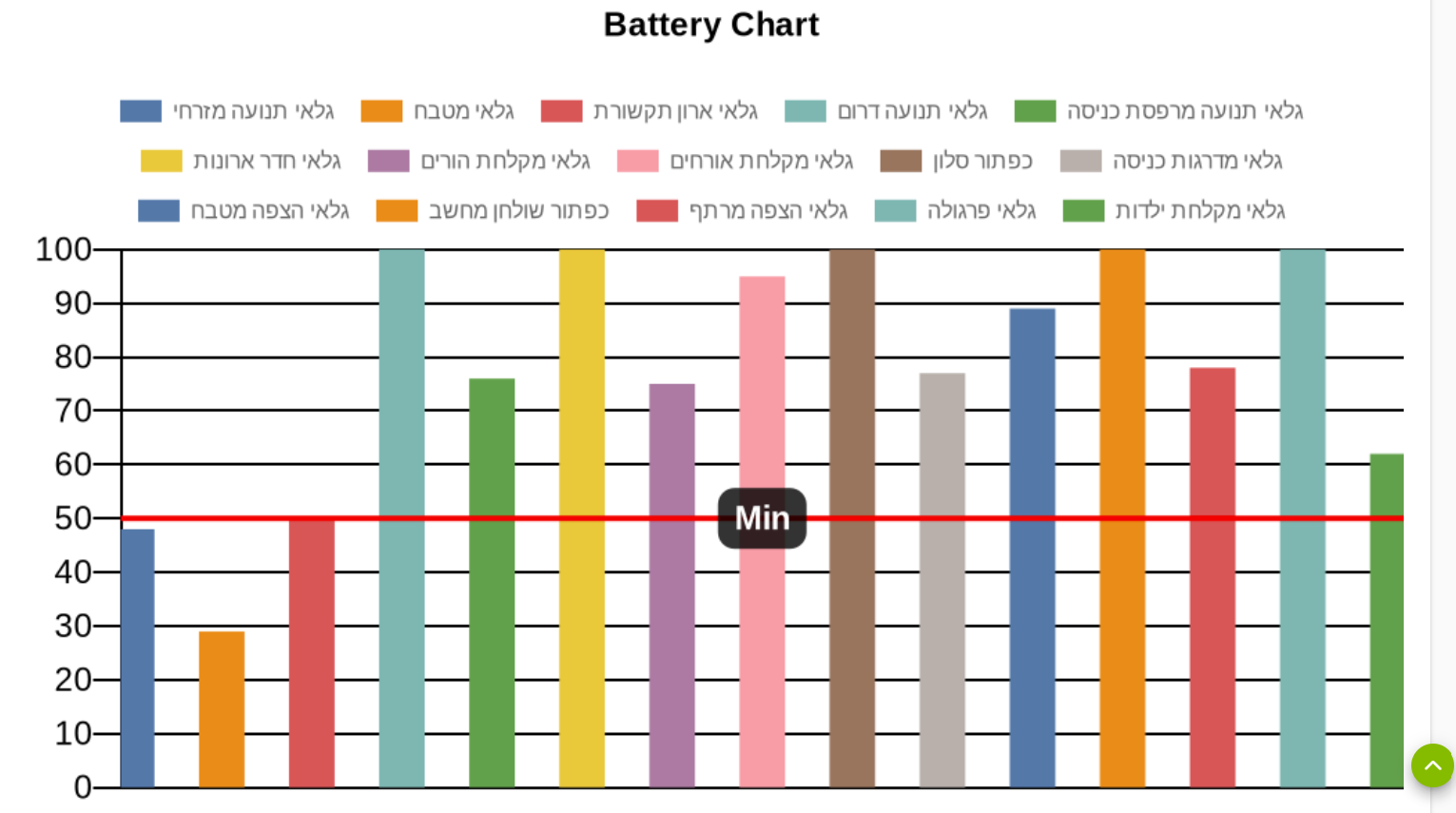
See examples.
Value is 0.2:
Value is 1:
Value is 10:
Value is 50:
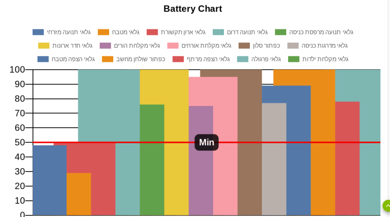
I'm a bit stumped on this. Not behaving as the chart.js documentation says it should. And still not sure why it's cutting off the first and last bars. Seems like the previous version worked better for you, so reverting back to that, with more accurate language in the field description. Maybe @bptworld can take a stab at it if you still need?
Chart.js documentation:

https://www.chartjs.org/docs/2.9.4/charts/bar.html#barpercentage-vs-categorypercentage
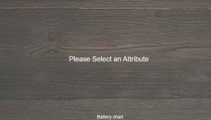
Are there step-by-step instructions? I just blindly created a "Quick Chart" child and a "Quick Chart Data Collector" child but don't know what those even do. Where exactly do I select the devices as the sources for the data to chart? I looked at the virtual device that is created but don't know what to do with that.
I am not aware of detailed guide but, in general there are two options. You either use a collector file to collect data that will later be used by the virtual device to chart it or you use the virtual device directly to collect and chart the data.
I can try and assist from my experience if you tell me what are you trying to achieve.
I think I figured it out! 
-
Create 'Quick Chart' child and related virtual device.
-
Enable 'Get data from device event history' and choose the devices and attributes to chart
-
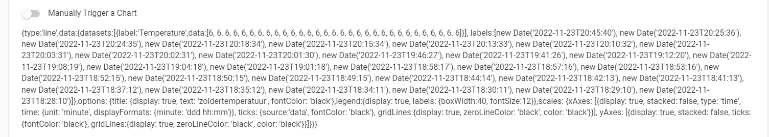
Toggle 'Manual Trigger a chart' to generate a chart on that page to check if it's working.
-
To add the chart to dashboard, add the virtual device to dashboard, use template 'attribute' and attribute 'chart'. If the chart tile is invisible, then go back to the child chart and run 'manual trigger a chart' to create the chart image used by the tile.
-
If event history is not enough data, then add a 'Quick Chart Data Collector'
-
Choose the device/attributes to capture into a file.
-
Set update frequency to 'manual' and toggle 'get data now'. This will immediately create the output file, which is needed for the next step. Now change the update frequency to whatever you like, like every hour.
-
Edit first 'Quick Chart Child' and set toggle to 'Get data from file'.
-
Specify file from 'Quick Chart Data Collector' (if the file is missing, then you need to go back to the collector and use 'get data now').
3 Likes
Is there a way to use a virtual button to trigger a manual update of a chart? I want to set the chart update frequency to 'manual' and then have a virtual "refresh" button next to the dashboard chart to update the chart. I know there is a way to use a virtual device to enable/disable the chart, but I don't think that is what I'm looking for. I will also have a collector that updates the data file every hour.
Being able to trigger a chart update from another device will also add more flexibility to the update frequency. For example, one can schedule a rule to trigger the update at a specific time (eg: midnight / one-a-day) or at a lower frequency (eg: every 6 hours).
Regarding the feature:
This app can be enabled/disabled by using a switch...
Switch Device(s) to Enable / Disable this app (When selected switch is ON, app is disabled.)
I use this to disable chart generation from late night to morning, but the switch logic seems backwards. So essentially: When switch is ON, chart is OFF?
But seems easier to remember if reversed: When switch is ON, chart is ON...
Unless you name the switch Chart Killer.
So it looks like there is a 250 points limit to graphs. Is there a way to reduce the number of points without reducing the number of days or changing the frequency that the collector gets data? LIke being able to specify a limit per-day?
I have a collector getting data every hour. It seems inflexible if I need to change that frequency. From the chart size, would it work if:
- specify limit of days (existing)
- specify limit per day (new)
So if the collector's frequency is m, then there should be m points per device per day. If there is a daily limit set, it's just m/daily-limit = n and then only chart every nth point for that day.
For example, if collector is hourly, then m = 24. Then if daily limit is 4, then 24/4 = 6. So the chart will graph every 6th point for that day.
Better yet, if we know the total chart limit is 250, then how about an auto option to calculate the daily limit based on collector frequency and number of devices.
Another option is to specify the number of points per day and just create the chart based on that and have the number of days stop when the total points is reached.
For example:
chart limit C = 250
devices D = 4
chart length in days L = 7
points collected per day based on frequency F = 24
So points per day = F / ((C/D)/L) = 24 / ((250/4)/7) = 2.6 so round down to 2 points per day.
Hope my math and logic is correct.
Another idea is to specify:
- the start and end time of the chart window (if date is omitted, then assume current date)
- a time offset option
Then you can use the above options to create separate daily charts for the last x number of days:
- today: date: blank, time: 12am - 12am, offset: 0 hours, update freq: hourly
- yesterday: date: blank, time: 12am - 12am, offset: -24 hours, update freq: 24 hours
- today-2: date: blank, time: 12am - 12am, offset: -36 hours, update freq: 24 hours
etc
By breaking up the charts by day, you can avoid the points limit but still be able to see a long history of data. Probably need to set the min value to chart so all charts are at the same scale.
1 Like
Hi @bptworld ,
Sometimes I get this image in the dashboard:
In the log it says:
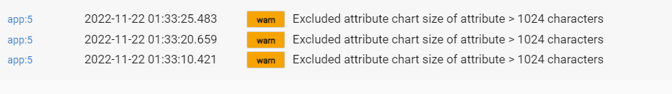
But in the device page events I see chartLengh of 131:

Isn't it that the limit is chartLengh is less than 1024?
HE has the only say in what's allowed to display on the dashboard. It's seeing something we are not and it thinks it's bigger than it is. Nothing we can do about it.
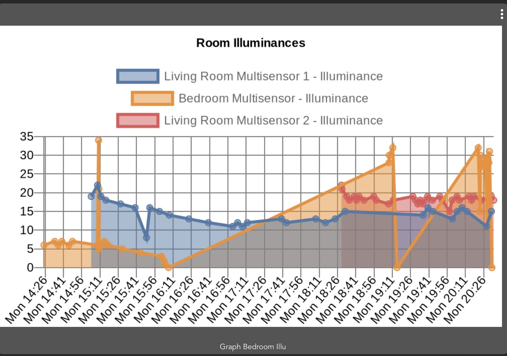
For information, I’ve been having the same issue as @amithalp for some of my charts.
Furthermore, most charts no longer show their x-axis and associated labels. If I open the app, and manually trigger a new chart then the axis come back, but disappears after the next automatic update.
Chart in the dashboard
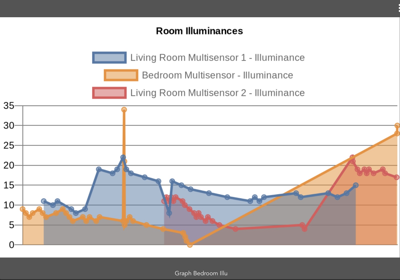
Chart in the app after a manual trigger
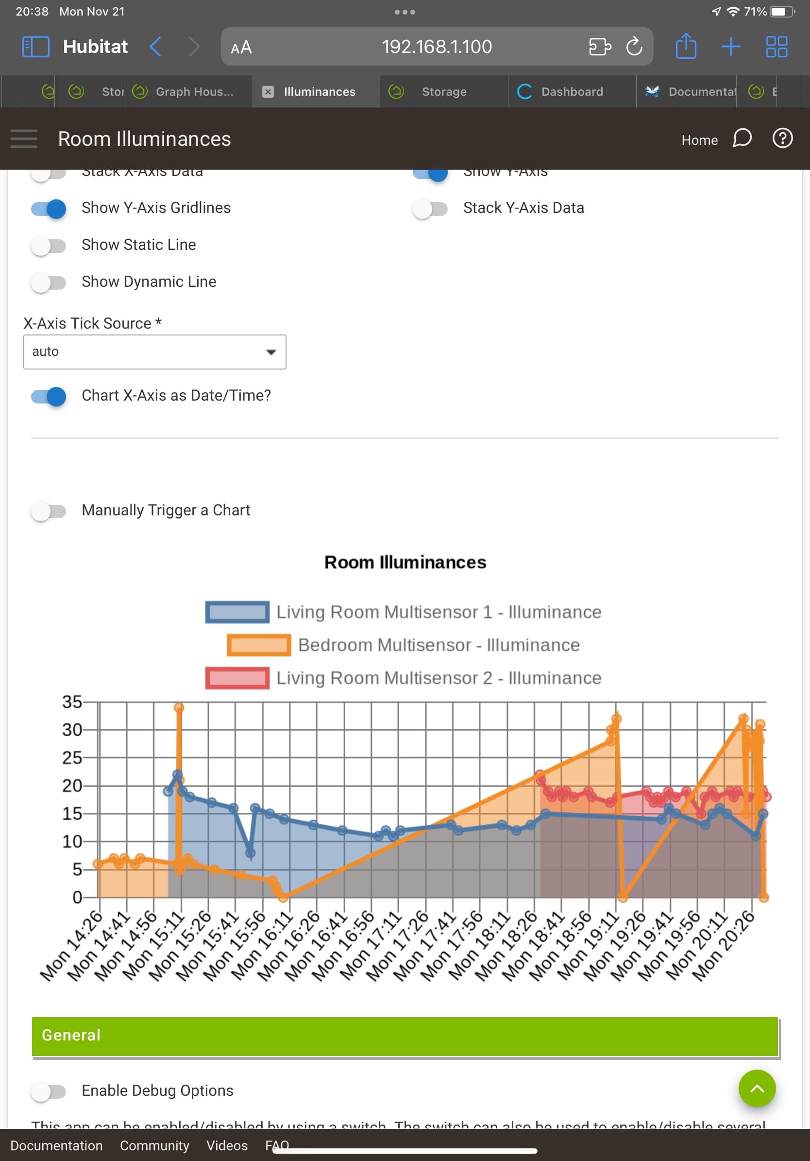
Chart in the dashboard after the manual trigger
Hello folks,
I'm quite new to Hubitat, just having migrated from Fibaro Yubii.
That went all very well, except for graphs. I'm tryng to make Quickchart work, following this thread, but this is what I get :

the data file works ok, the sensor data is recorded as you would expect, but no graph.
what am I doing wrong ?
Just guessing here. Did you remember to name your file with .txt at the end?

