![]()
1 Like
Hi @bptworld ,
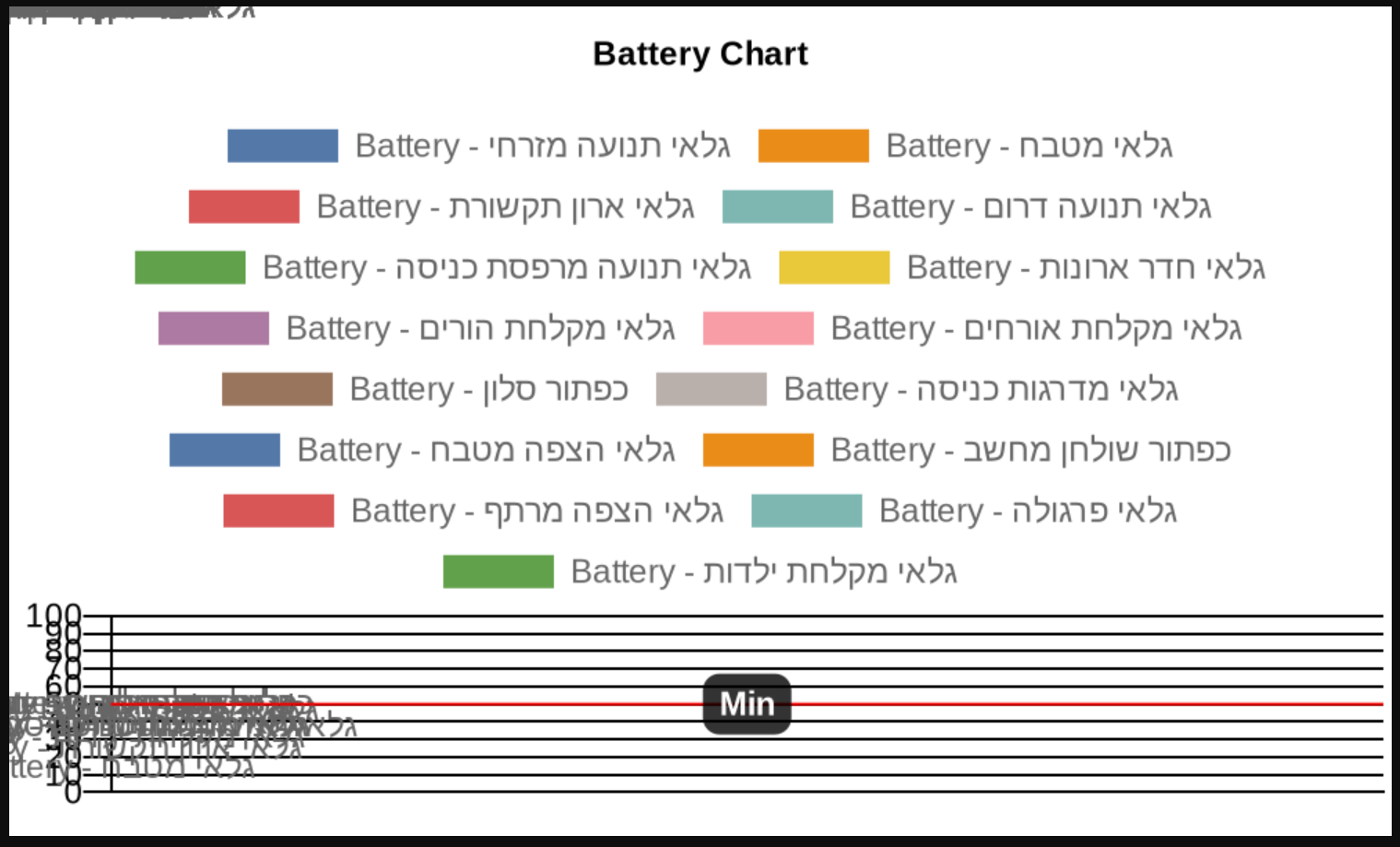
Since last updates one of my charts looks like this:
with the following log:
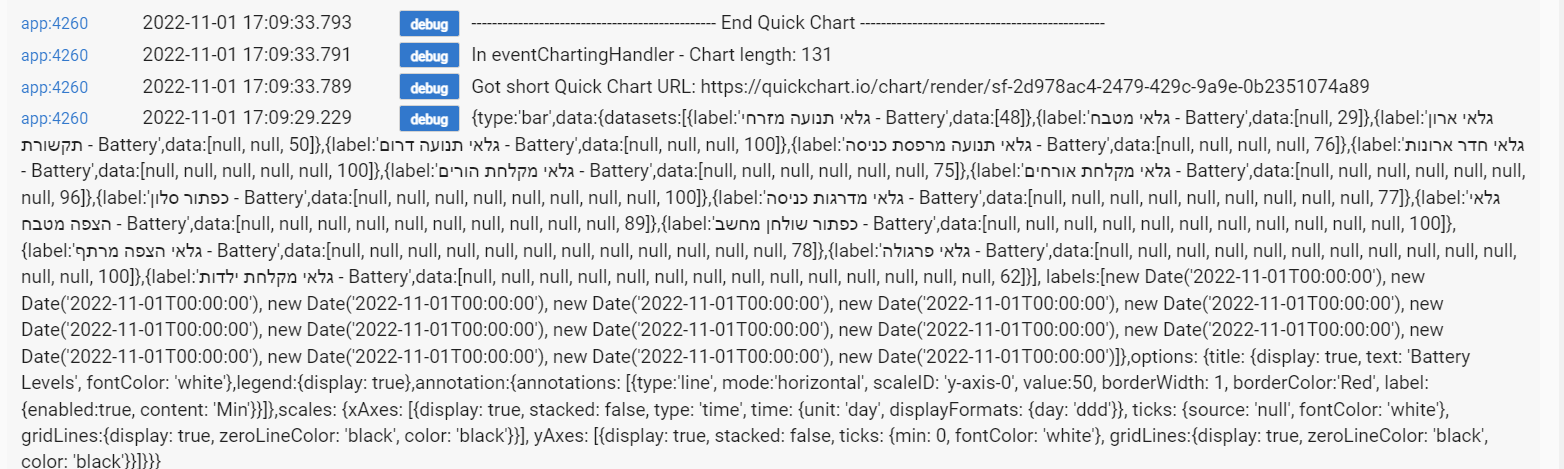
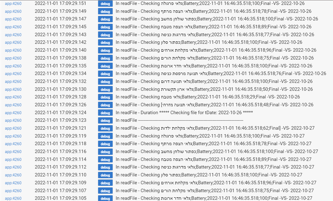
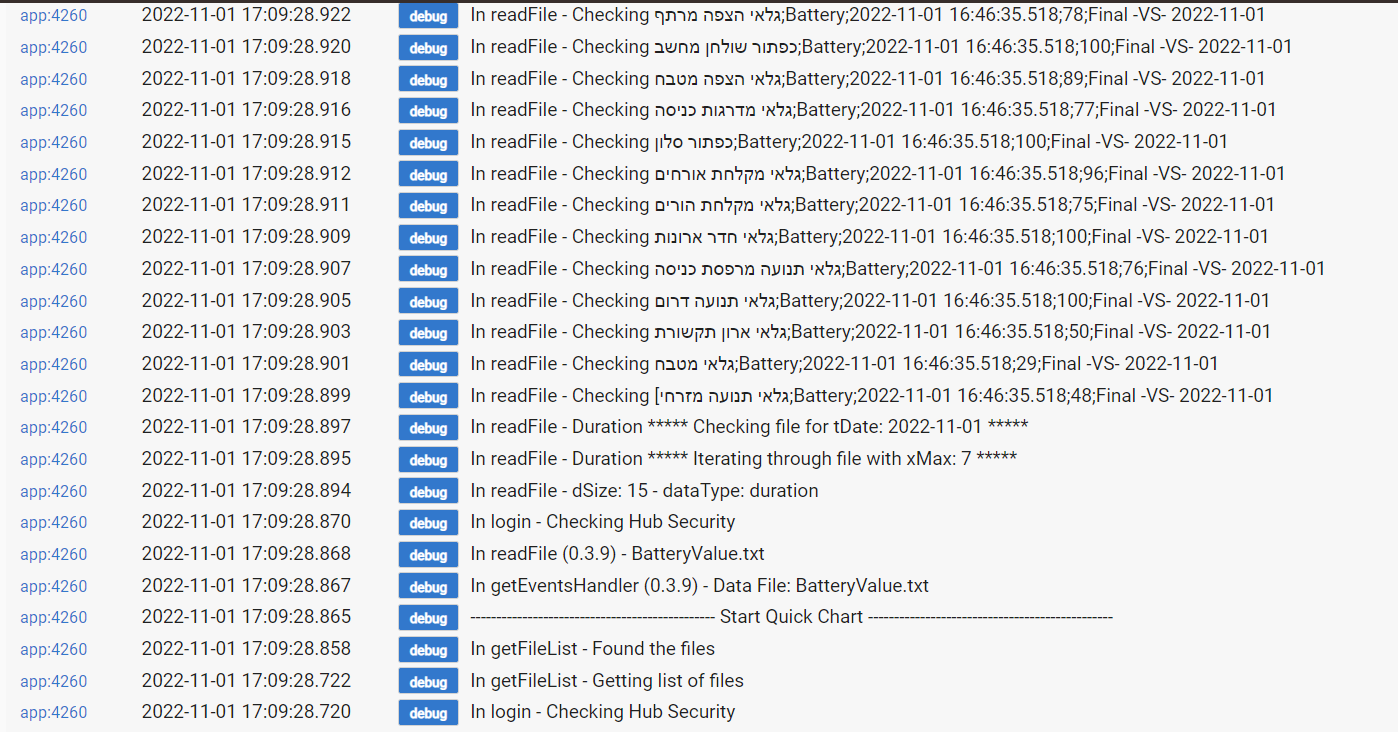
What is wrong?
Can you go into the app, press Done again, and see if that resolves it? Make sure to select the tick source - that's probably the problem.... I will propose an update that makes this more backward compatible...
Did that now. No change
Auto is selected. Still no change


Not sure then. The last update shouldn't have impacted that. But some of those Hebrew characters look like they use single quotes - which would mess things up. Have you tried with non-Hebrew characters?
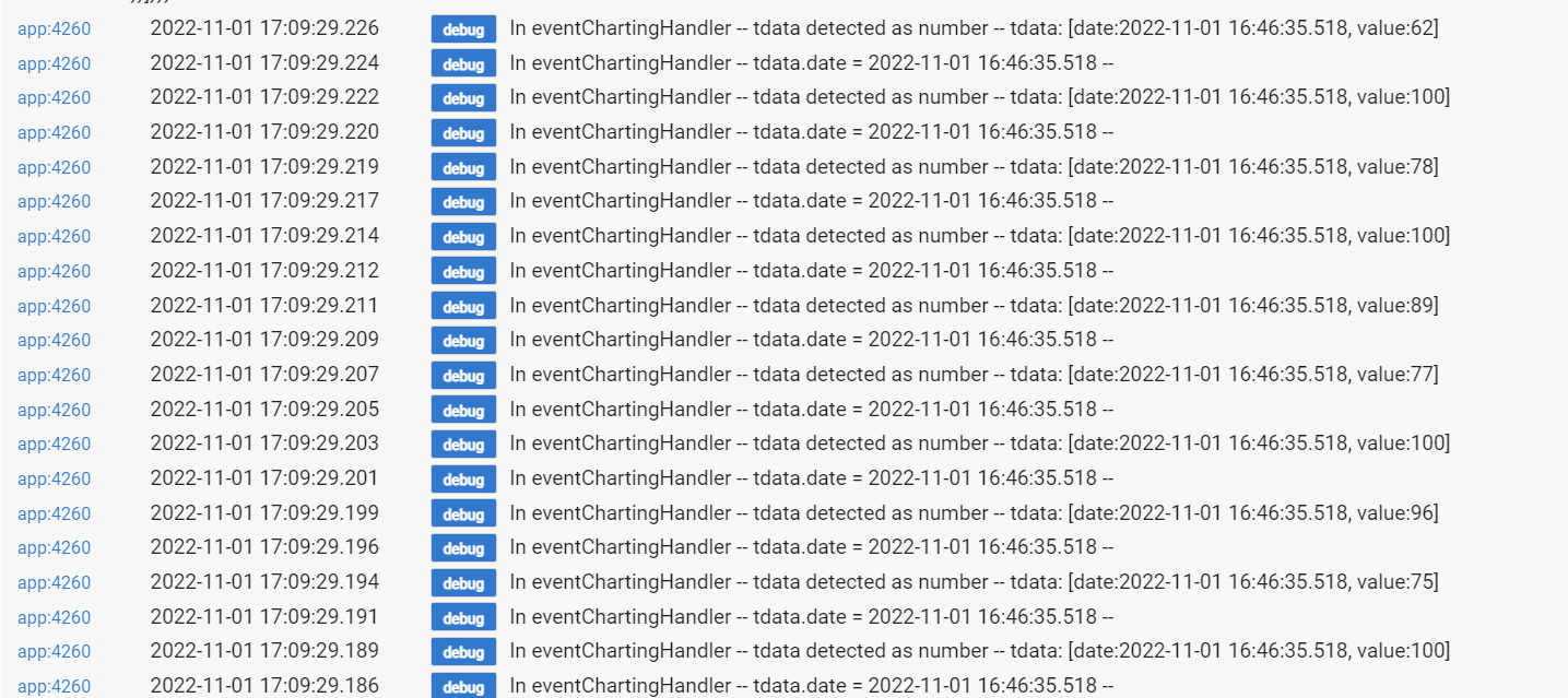
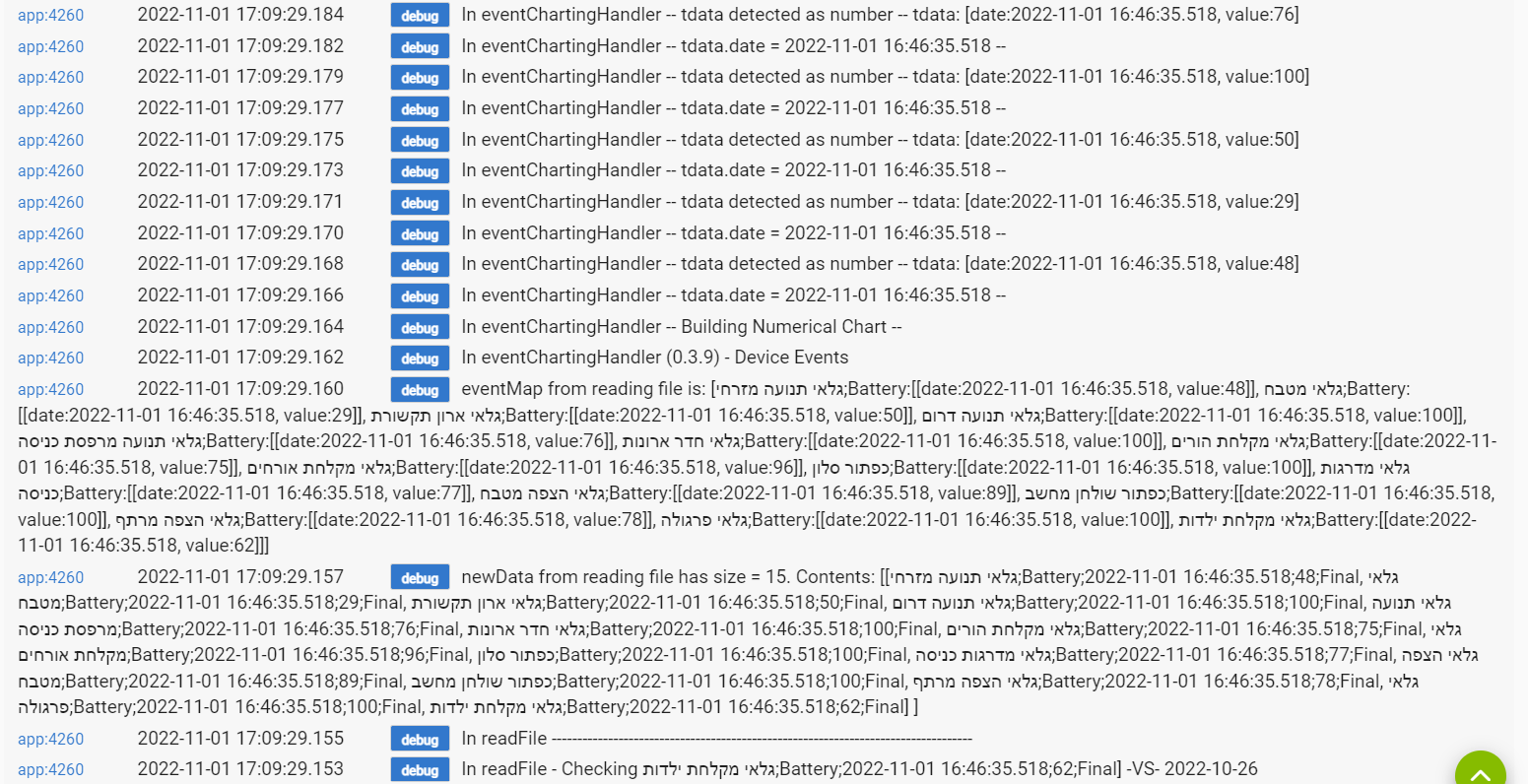
Going to need the log output
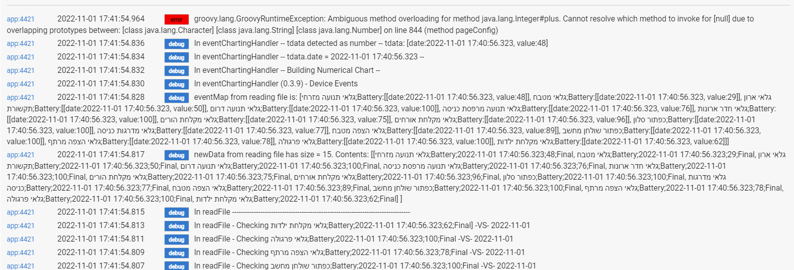
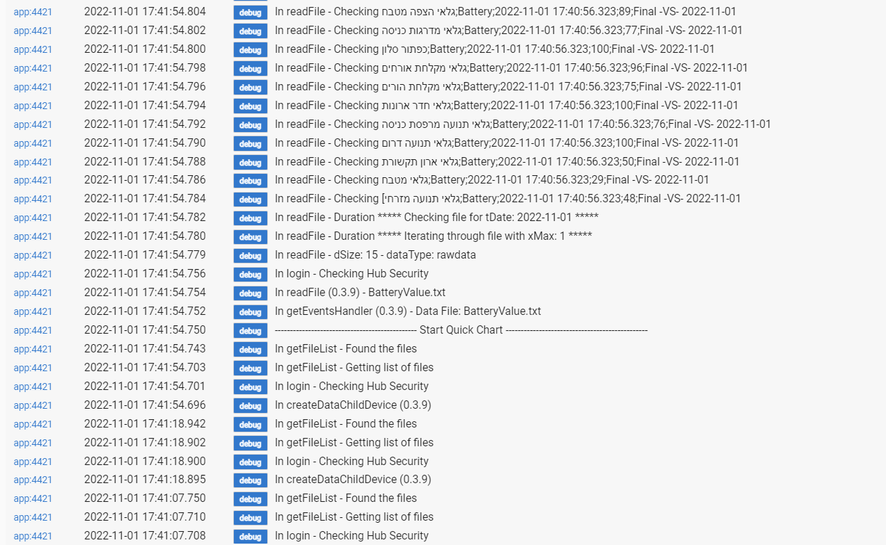
Null data for some reason. I incorporated a few updates here, if you want to copy/paste into your app code and test (which would be helpful). Otherwise, can wait until Bryan is able to incorporate into the bundle.
EDIT: this is not likely to resolve your first issue, which may or may not be related to the Hebrew font... but gets in the right direction hopefully towards that end
1 Like
Updated the app code.
Deleted a recreated the child app again.
No error this time 
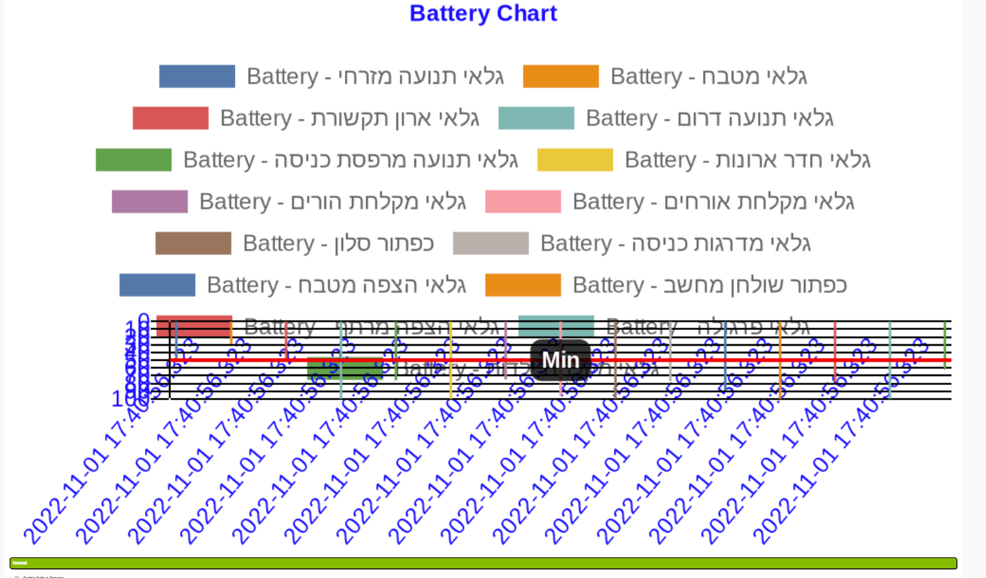
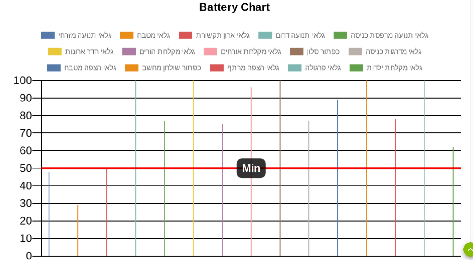
But the chart looks like this:
I do not think Hebrew is the problem as it do gets to the chart correctly
Edit - it looks like the devices values (battery level) is presented but not spread across the X axis.
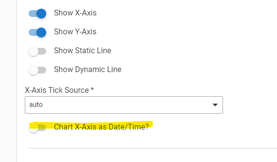
Got it. I didn't think about this use case where you don't care what the X-Axis is (since you're charting battery levels taken at a certain snapshot in time). Here's an update that allows you to choose whether or not to chart the x-axis as date/time. In your case, you would choose NOT to chart the x-axis as date/time, since you don't want all values to be charted on the x-axis according to the time at which the values were captured. Try it and see if that fixes your issue. Note that I wrote this to chart x-axis as date/time by default, so you'll need to explicitly 'uncheck' this option (and you may want to check and uncheck it to make sure the setting takes)
1 Like
Just choose the option to hide the x-axis (i think this is what you did before in a previous post)
1 Like
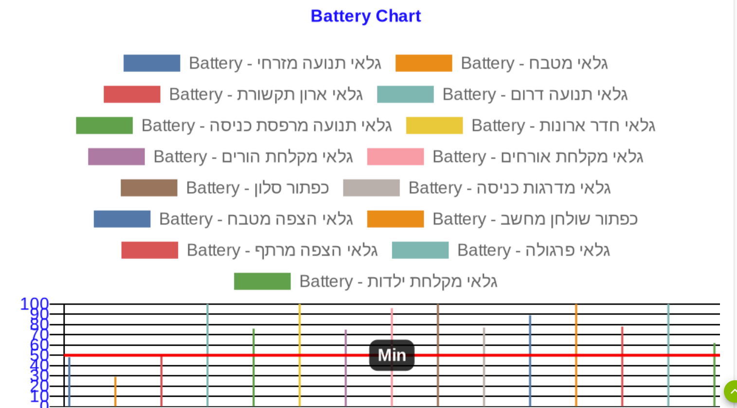
You were right.
This is how it looks like now.
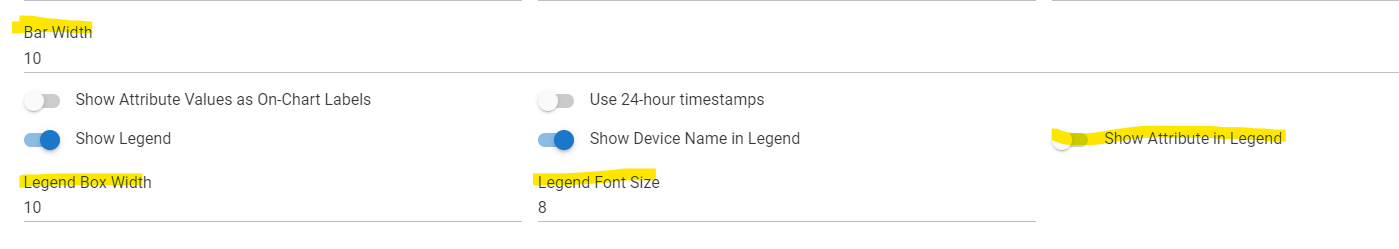
Is there any chance that future releases will include the option to control the width of the columns?
Also, an option to reduce the size of the legend (so the chart itself will be more visible) will be very much appreciated.
Thanks a lot for your efforts.
I think this should help with your setup.
Added Bar Chart Width Configurabiity; Improved Legend Configurability
- you can remove the attribute name from your chart, since all you care about is the device name
- you can reduce the width of the colored boxes in the legend
- you can reduce the font size in the legend
- you can configure the bar chart width
If that doesn’t quite do it for you, I noticed in the code that @bptworld might be working on a way to filter the legend device name to where you could effectively shorten it.
https://github.com/lnjustin/QuickCharts/blob/main/BPTWorld.QuickChartChild.groovy
2 Likes
New bundle...
0.4.1 - 11/02/22 - Added Bar Chart Width Configurabiity; Improved Legend Configurability - @JustinL
1 Like
Hi Guys (@bptworld and @JustinL) you are amazing and your hard work is very very very much appreciated.
All additional features are working for me.
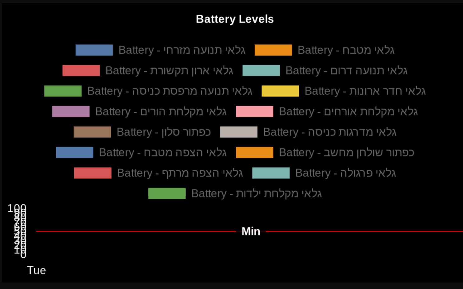
One thing I noticed is that using the chart to present 15 devices (battery level attribute), if I use the default Bar Width (1), all devices are on the chart but there is a lot of "unused" space:
But if I try to better use the space by increasing the bar width (any number bigger than 1), not all devices are presented. See example with Bar Width = 10:
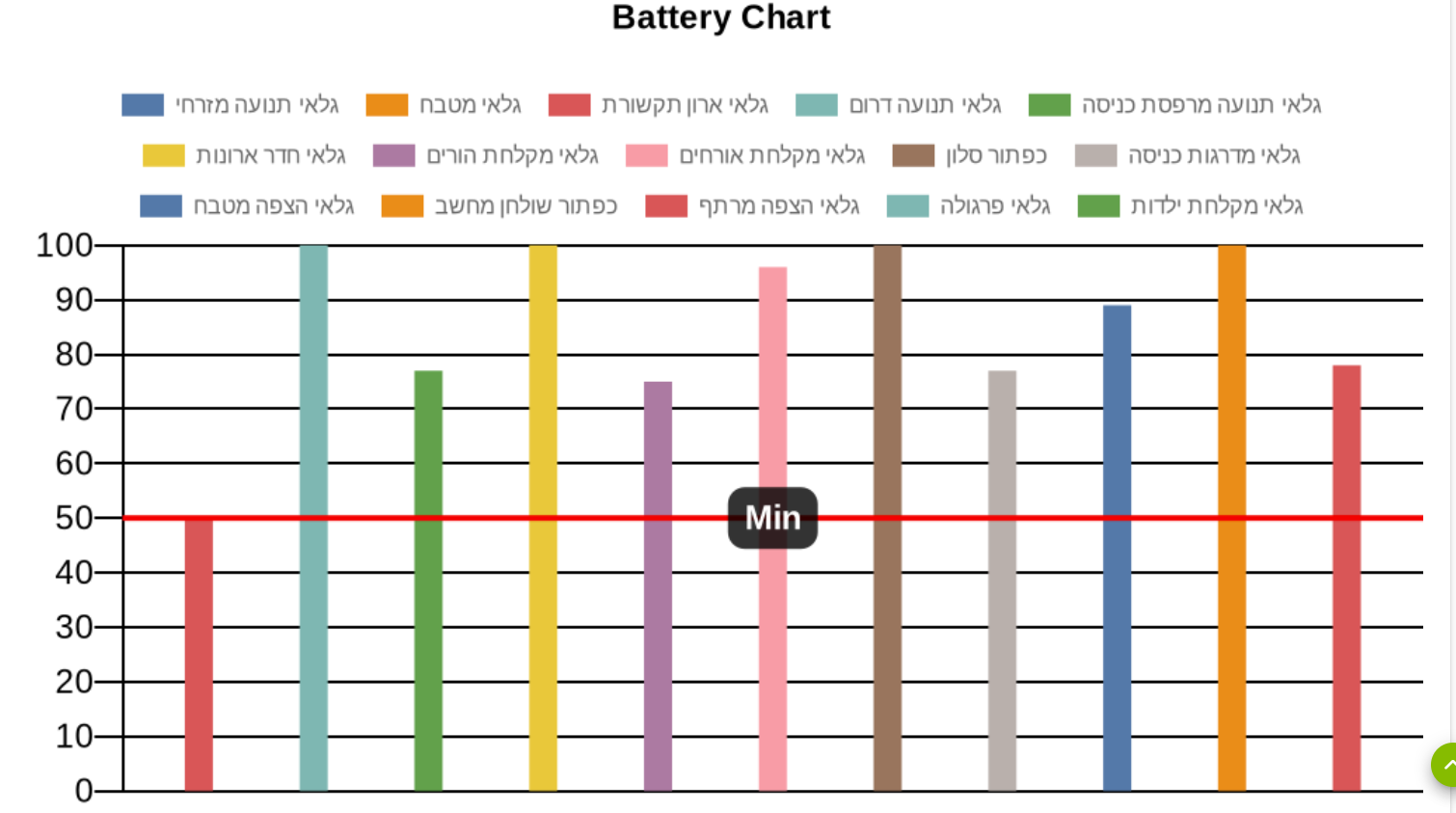
A work around would be to split devices into 2 different charts I guess. Unless there is an option to better utilize the "landscape"
Once again, thank you.
Amit
That's weird. What happens if you put "flex" in for the bar width?
Chart.js documentation says " If set to 'flex' , it computes "optimal" sample widths that globally arrange bars side by side."

