Topic here is labeled "HubiGraph" which I prefer but the app itself is name "Hubigraphs", so...when are you going to pick your favorite?
Are you waiting for the app to exit Beta before adding it to Hubitat Package Manager? I think that @dman2306 has provisions in place for Beta apps. This app is changing so often it would be amazing to have it in there!
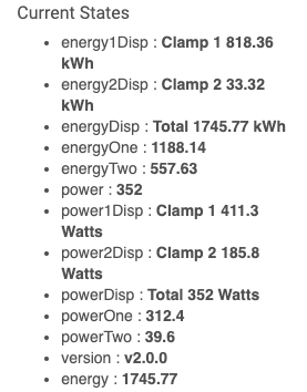
I have a Power sensor that spikes during inrush as a compressor is turned on for a refrigerator. So I will get a logged entry of 768W instead of the normal 150W and it messes up the graph because it's for such a short time that I should ignore it. Would it be possible to have a max value the I could set so the graph when smoothing could ignore these entries. I have also seen some voltages go negative for some reason and I would like to ignore negative values on those devices.
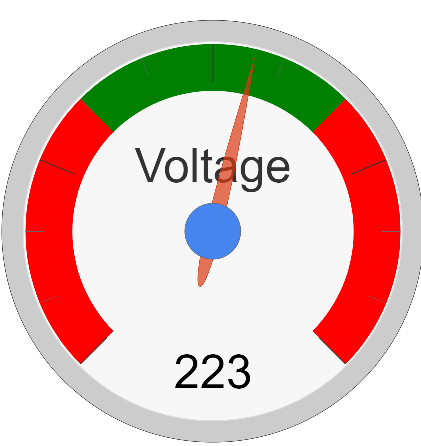
Thanks so much for the hard work on this. The gauges are so cool too...
I have not really looked at the package manager. I'll need to look into it.
Please look through the options under left/right axis. You can already set the min/max value. I would suggest maybe 0 and 150? Let me know if that functionality is broken.
@thomas.c.howard
Okay, thanks that seems to sort out the gauge, only issue now is (sorry) it does not show the gauge number units and this was working before, so I use V for my volts this just now shows 224 no V.
This is for all gauge number units now.
Minor issue I forgot to report prevously and just ran into it again when the browser auto-filled the field. If you are entering the graph axis format for time and you accidentally use a capital A for AM/PM instead of a small a (i.e. hh:mm A) you get an error that cannot be recovered from. You have to delete the graph and start over.
Notice the scale? Looks like you had a “bad data spike”. On the longer timespan it seems to be average out (I have no idea how Google Graphs figures that out — min/max/mean).
Try this — same graph as above but set the yaxis min and max to something that matches the other graphs.
Also, look through your data via the web app. Bet you $$$$ you’ll see the data spike.
What could be happening? The graphs that are built for “immediate display” query the database. The “live graphs” get data directly from the endpoint. Am I saying that the database could have errors? Yes, yes I am. I have learned a lot over the past weeks and one of them is that sometimes the database gets corrupted (has errors). For the most part, it doesn’t matter, then some fool comes along and actually starts using it; a lot. Well, you know how the story goes.
@thomas.c.howard, this is a really nice package. The line graph is working very well for me, but I have a couple of issues/suggestions about the time line:
--when displayed as a tile, everything looks good except that when I "hover" over an event it doesn't give accurate start/stop/duration information. It always says the event was a full day long.
--when I double click the tile to expand it, the hover works fine but I lose the labels on the x axis. My "presence" graph (various motion detectors & doors) is 1 week long, and I lose all information about which day is which. That info is present in the tile
-- Finally, in both tile and expanded mode there is always an extra "event" at the very right edge of each timeline. If I hover over it, it happened NOW and is 0 minutes long.
Not trying to nit-pick, just thought you might want the feedback.
Thanks for the feedback. I will look into the issues (when I get a chance). One thing; the extra event on the left is a place holder so the timeline shows up correctly (I.e. spanning the whole selected time). It is a quirk with Google graphs.