Refresh the page. The list pages look like this now:
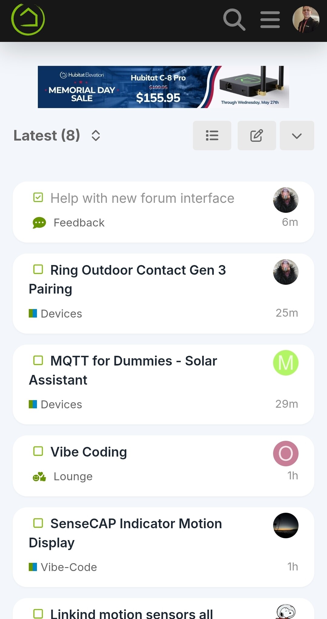
It seems like when you were a kid, and double spacing made the essay seem longer, lol.
In other words, too much white space between topics.
It sounds like the Foundation theme is just right for you 
I have no idea what you’re talking about, but is it user selectable, lol?
I’m still looking for dark mode, lol.
Dark mode with too much dark space, or dark mode color scheme in general?
Or, Dark Matter. Lol.
That I can't help you with. They still don't know what it is.
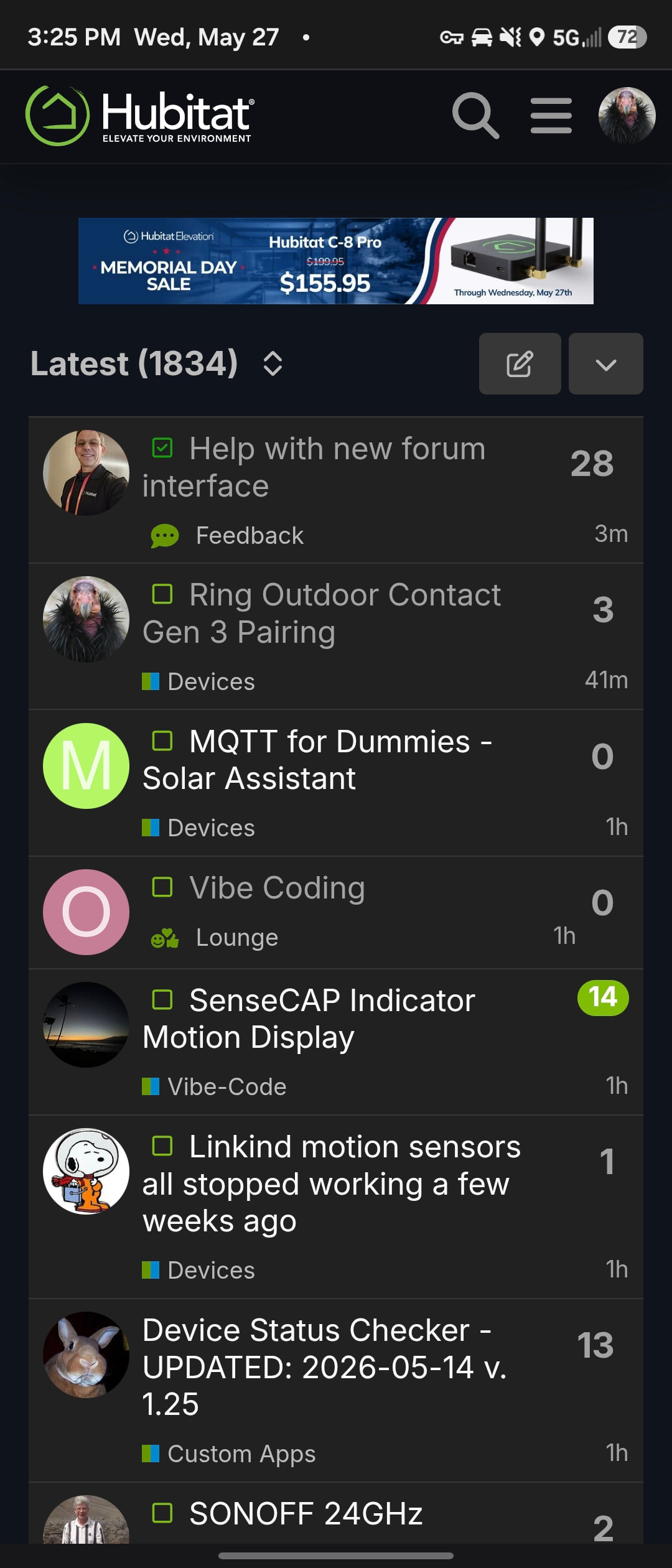
Found preferences, and I am now in the Foundation.
Sort of like George Costanza. 
But seriously, I like it.
Yeah, the dark theme has not been updated, yet.

Didn’t the previous desktop version allow selection of “latest/new/unread/top” threads? New version on my desktop doesn’t show “Top”.
Top has been removed, but can be re-added.
I see that all four can be selected from the pulldown menu. Is adding "Top" a preference thing for each user, or if added, it shows for everyone?
I used it quite a bit.
Must be added to everyone. I put it back.
Thanks @bobbyD for the rapid response and fixes to the forum.
Thanks.
Where is this located. I don’t see it on the hub or at my.hubitat.com