Well it does not refresh go back.
But it does not even allow to pick a colour. It allows to choose but when you click it should save it and go back and ends up doing nothing.
I potentially agree.. but Nowadays we do 80% plus of our online activity on mobiles not on pcs. In fact I rarely use my pc nowadays.
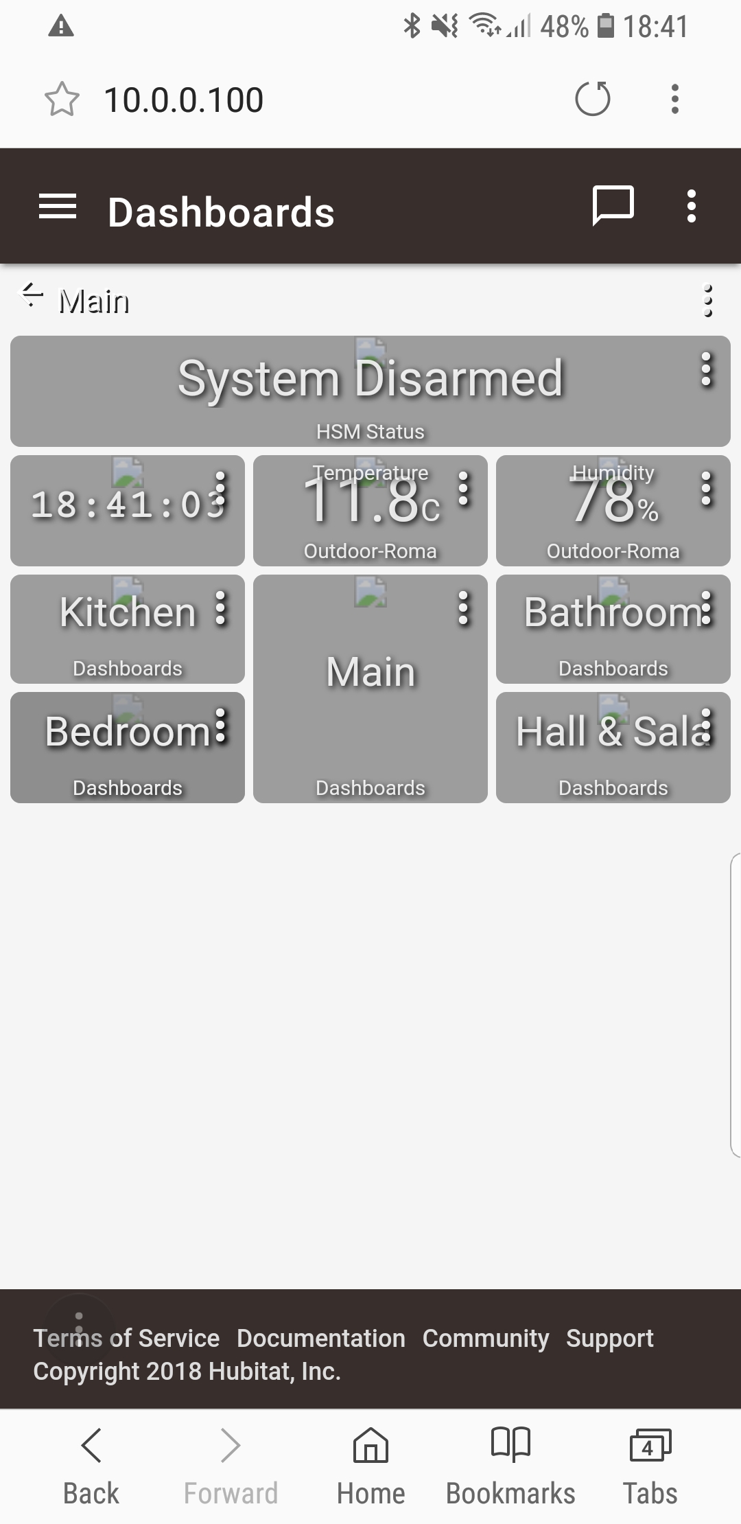
@patrick the most bizarre thing just happened I just updated to latest hot fix and most of my images on the dasboard are not loadinh, they are all valid and from the same website.
I had to reboot the hub for them to show up again. Just fyi
Edit: Reboot didn't solve the problems the images are not loading. Tried from 3 different devices e browsers.
I think I did not make my request clear. I would like to be able to change the default template (for instance, white icon, black background) and be able to make it global for all new dashboards. as well as being able to export that template to existing dashboards.
Would love to see a nicer looking dashboard too but for the sake of making it easier for others to help, is it possible to just expose CSS as an advanced feature? This way we can hide what we dont want, change sizes/colors/fonts of things etc... then people can share the CSS for those who don't know how to write it themselves.
For instance, I'd love to make the tiles have rounded corners, but i understand that as a feature, that's super-low on the priority list.. given access to CSS, i can do that in about a minute. (Currently looking at Maker API to make my own dashboard cause i find the included one so lacking, unfortunately).
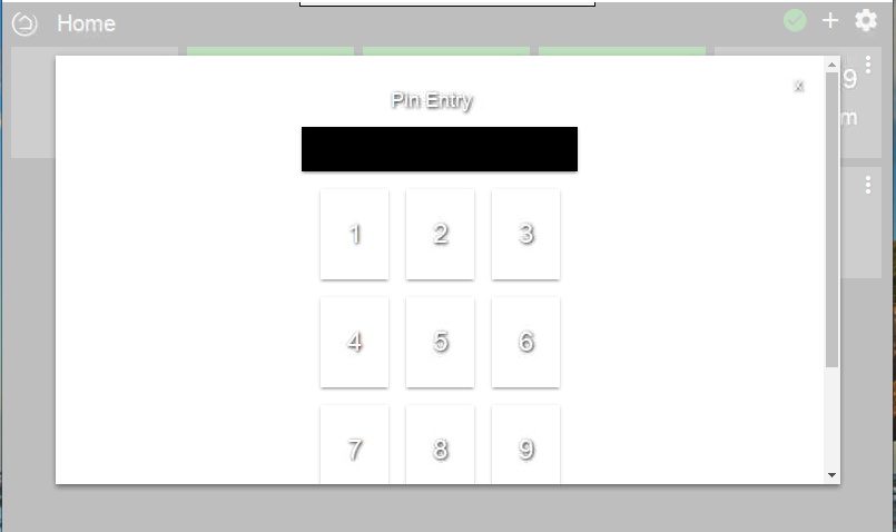
I have a request for the dashboard that is serious enough I won't use it yet. The Pin Entry screen requires me to scroll to press enter. I'm using a Raspberry Pi Display with 800x400 resolution and should be able to enter the pin without a scroll.
Thanks for your feature request. I've added it to the list. Given that you can scroll to use the keypad, this isn't the highest of priorities to address.
I'm sorry to hear you don't consider this request important. For me is a poor enough user experience I will have to find a different solution for home security
Not sure if this is a request or I just don't know how to do it...I'm using the link template to view cameras through Blue Iris. But while using the IOS app, I can't find a way to return from a live camera view back to the dashboard. There's no X, back button or dashboard icon. I can click on settings or geofence but I automatically go back to the camera view when I click on Dashboard. The only thing I've found to work is to close the app and restart it.
Description: allow multiple devices to be selected (by name, ie. "water sensor") or type, or arbitrarily via checkboxes next to the device description, then added to a dashboard in a single operation, with automatic layout.
Example Use Case: I just added 15 water sensors to my network, and created a dedicated dashboard for them. I would be extremely tedious to require a human being to repeatedly point & click & click & click to add each device...that's the kind of operation that computers should do. (In my case, I added one device to the dashboard, copied the resulting JSON to a file, edited it, then copied & pasted it back to the devices advanced page...but that's not a universal solution.)
Description: allow file export/import of a dashboard JSON definition to/from local storage on the platform running the web browser accessing the hub.
This would enable much easier dashboard creation, editing, sharing, and versioning -- improving both the individual and community experience, while reducing the chance of error involved in manually copying & pasting large swaths of JSON-formatted text.
Would also like the dashboard tiles to be able to dynamically resize to screen width to avoid horizontal scrolling on mobile devices. Creating multiple versions of a dashboard for each client device (desktop, mobile) is cumbersome.
I also agree that a drag and drop dashboard editing interface is pretty much expected in this day and age. I'm using SharpTools.io as they've got it figured out when it comes to ease of designing and editing a dashboard. I can't imagine trying to design a dashboard and then edit it later on when I add new devices using Hubitat's dashboard editor. However, I would love to have local control from my wall mounted tablet but the editor is too much of an issue so I deal with cloud based control.
It might be just me, but any time I have to write CSS to get the dashboard to work I view that as a "fail". Sure it's good to suggest it to people so they can get what they want, but your average user is never going to figure that out or know what to do there. I'd really love to see the dashboards get some serious TLC. They look beautiful if I view them through the lens of the kind of UIs that were stunning when Windows 95 was released, but that was 25 years ago now...
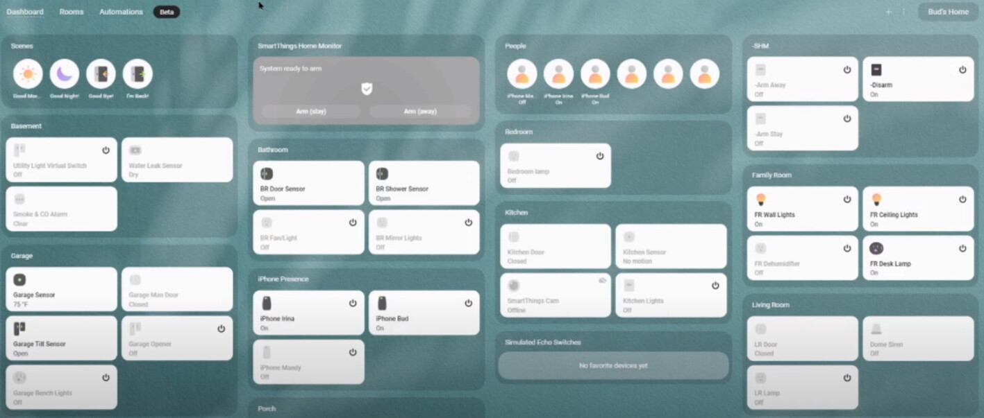
Compare it to the new SmartThings dashboard that is currently in beta: