Not exactly sure what's causing this. But I assume it centers correctly if you don't have a col width set in gear options?
Something is causing an offset when setting col width. Have to track down the cause. Setting this to 220 for me centered the content as well, but might vary depending on settings.
1 Like
actually, it appears its a bug with material icons... try he-blank instead of just "blank" for the icon name
@patrick I didn't want to make a new thread, so thought I would stick this here.
Nice job on the new dashboard. It is really a leap and bounds improvement over v1. Kudos!
6 Likes
Is it possible to have the dimmer slider shifted to the bottom of the tile so I don't accidentally touch it when turning the lights off/on?
@Smartsmartsmart Just put a bit of tape over it. 
1 Like
I have made the icons bigger so they cover most of the tile and the sliders have shifted closer to the bottom so don't need to 'put a bit of tape over it' 
1 Like
Any chance of removing the "whiteout" effect when you have a window open? It would make it so much easier to choose colors if we could see them accurately reflected while we have the template editing window open.
Sure, there's a chance... You must be on Safari or Firefox. That effect doesn't show up in chrome... Gotta love browsers...

I'll add it to the list...
1 Like
 Well actually, I am on chrome... Although I just noticed there's an update waiting, and no clue how long that's been there. Hang on.
Yeah, it's still there... it's just a slight transparency, not a full whiteout. Chrome v. 73.0.3683.86
It's not fixed, it's a slight white filter on Chrome, but on Safari and Firefox the effect is far more blurred.
but on safari:
That filter for blur is not being rendered in chrome, so you can see the white transparency...
1 Like
aHa, I see. Well yes, I was referring to the white transparency itself.
Better dashboard scaling on mobile devices would be VERY welcome (@patrick) . As it is now I have to have a separate set of dashboards for mobile from my desktop ones because the scaling doesn't work well on mobile devices and text/dimmer sliders spill out outside of the tiles.
Actually, truth be told I just use SharpTools on my phone 99% of the time, because it sizes and scales perfectly on both desktop and mobile...
1 Like
If you remove the column width and column height values from options, and make sure you set the number of rows and columns to match your tile layout, the dashboards scale. I use the same dashboards on all my Android an iOS devices as well as my 65 inch TV.
1 Like
I have done that. Still doesn't fit.
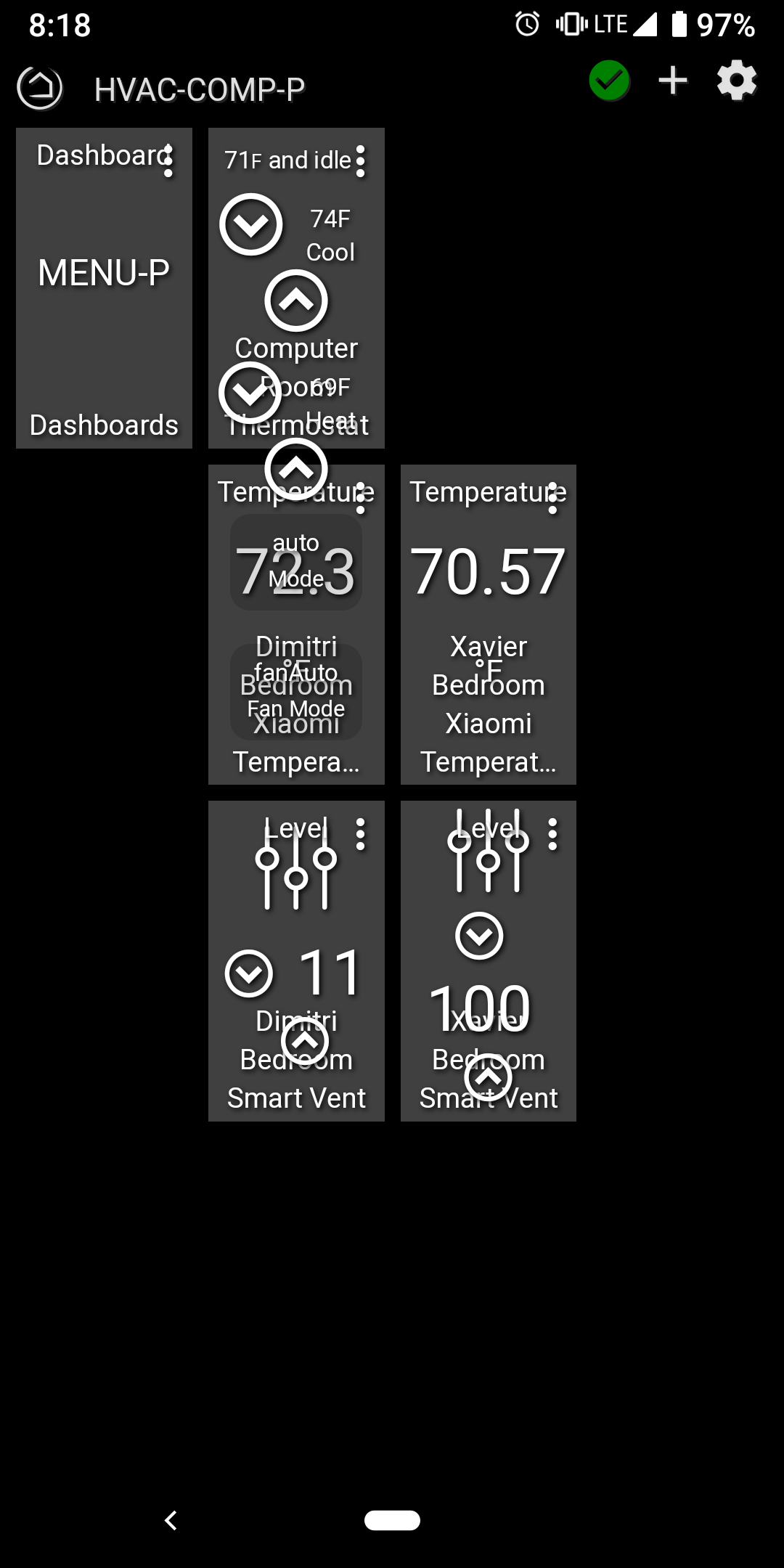
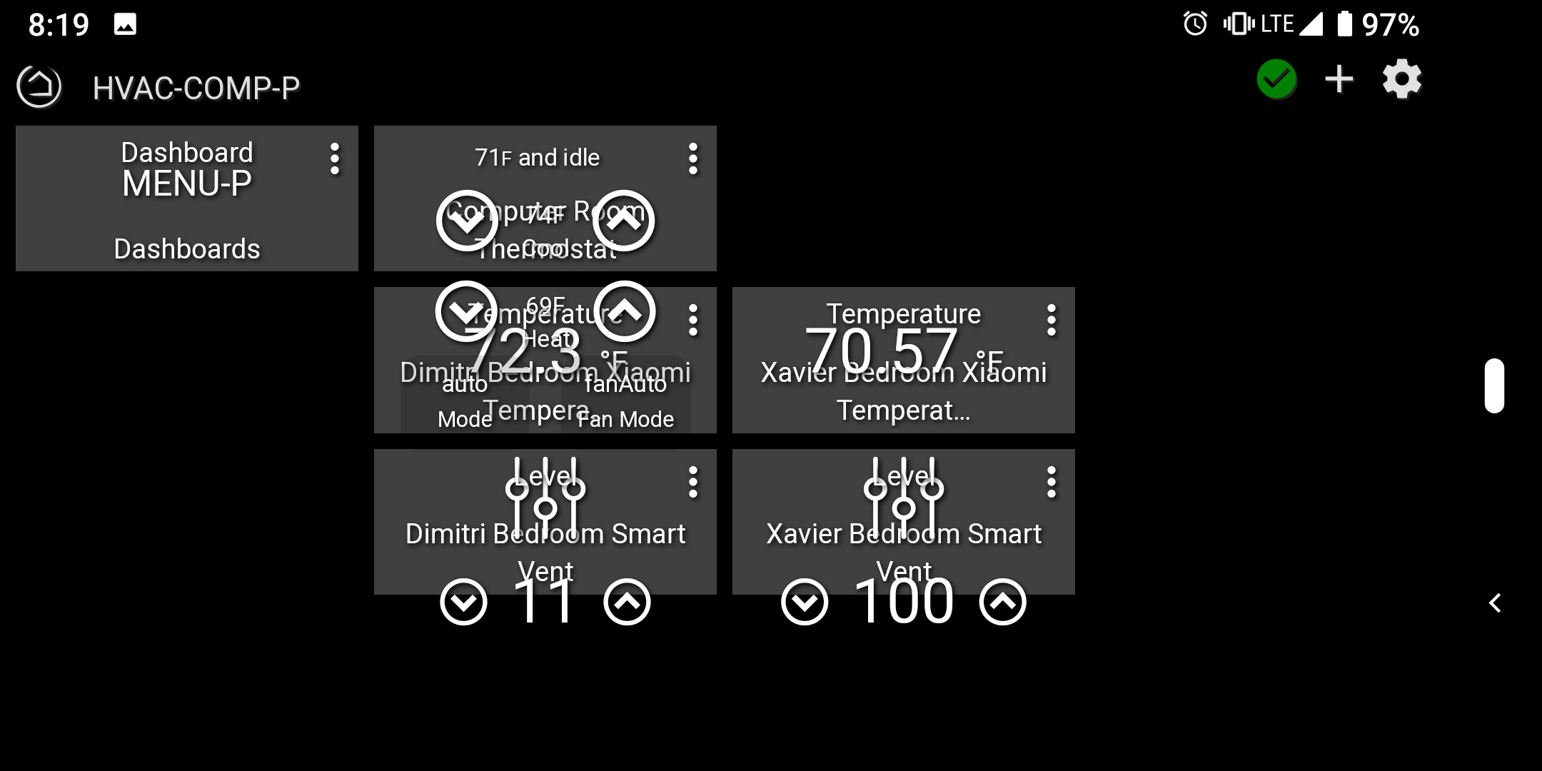
For instance, I have a 4x4 dashboard with one of the tiles being a thermostat tile.
In portrait mode the up/down adjustment arrows don't fit in the tile width-wise.
In landscape mode the up/down adjustment arrows don't fit in the tile height-wise.
Making it 3x3, like this example should be, helps but the buttons still don't fit.
So... I have a 2x2 dashboard I use for thermostats on my phone. Just had to give up some tiles.
I am so used to thinking of a dashboard in landscape mode I rarely look at them otherwise. In your case they don't scale well. If the column width and height were percentages????
(thanks for splitting the other topic and putting these posts in this thread @mike.maxwell !)
I don't deny that maybe I'm doing something wrong or sub-optimal. I just assumed it was how the dashboard tiles are rendered.
On SharpTools it makes the tile a defined size (and always scaled/readable), and just adjusts screen layout as needed (adds scrollbars) to show everything.
There are pro-con either way. Fixed layout is nice so you know where tiles are/should be, adjustable flow of tiles is nice as it is screen size independent.
Lol!!! Shows I'm getting old.
I was actually LOOKING right at the orange "C" and I STILL typed the wrong name...
Thanks @chuck.schwer !