QC.io has no limit posted, this forum has not limit posted, is there actual limit known, I only have 250 points and it gives me limit error... I am ok to reduce it but to what value?
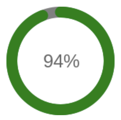
There's been a number of chart types that are in the dropdown menu, but that aren't actually supported. Two of those types are a radial gauge chart and a progress bar. With a newfound need for those, I have now added support in the app for them. The new chart types justified rearranging the user interface a bit, or at least the code for it, since otherwise new chart types like this will make it unruly. Check it out to see what you think. There's still a number of chart types that are in the dropdown list but that aren't actually supported yet, including pie charts, doughnut charts, and gauge. I might can help take a stab at one or more of those at some point, especially if someone raises a need for it, since they aren't too much different than the radial gauge and progress bar. In the meantime...
0.5.0 - 02/22/22 - Reorganize User Interface to be more flexible for other chart types; Added support for radial gauge chart and progress bar; Added user-defined chart height; Define custom states with numeric ranges
EDIT: Hang tight, I meant to add the option to have custom colors per value or value range
EIDT2: Ok done. Can now specify colors per value or value range
As @bptworld mentioned in the edited first post, I've volunteered to maintain Quick Chart, at least while he takes a coding break. I've released the latest version on GitHub and in Hubitat Package Manager, and @bptworld has taken the code off Bundle Manager to avoid conflicts. I'm not entirely sure what would be required for transitioning to the HPM version, but perhaps someone else can comment on that.
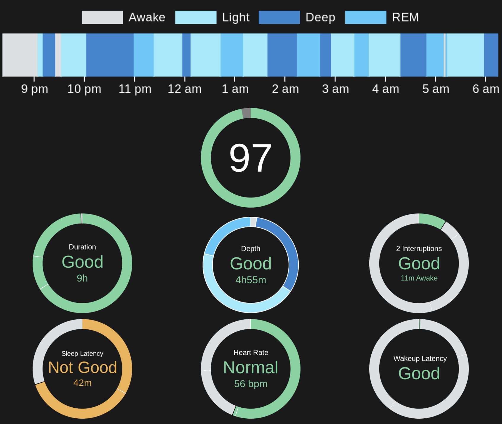
I have added considerable new features over the last two weeks, including support for doughnut charts and pie charts. And a new chart type called 'radial progress chart" that is basically a circular progress bar, with customizable ranges. These are all highly customizable in fact. The center of the doughnut chart can display the sum of all or some attributes, the percentage of some or all attributes, the value of an attribute from the same or a different device, or any static label. Some example charts that are now possible are shown below from my Withings sleep dashboard:
There is. If you click on the chart now, you'll get the link. However, that link changes every time the chart is updated. I assume you need a persistent link?
but generally how would you chart quick chart then? there is no unique URL that you can call the chart? how would you use it (even outside Sharptools) i didn't get how to use it (beside the preview)